From $19.9

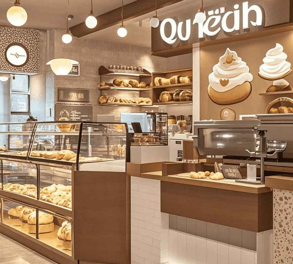
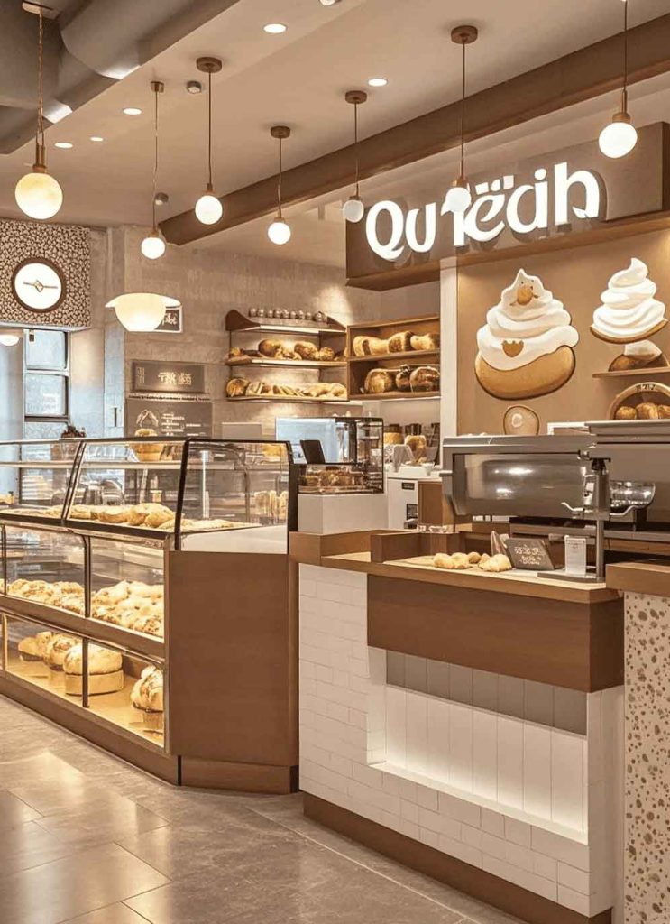
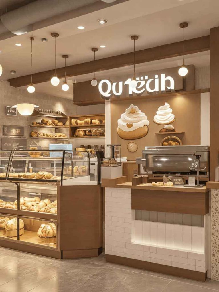
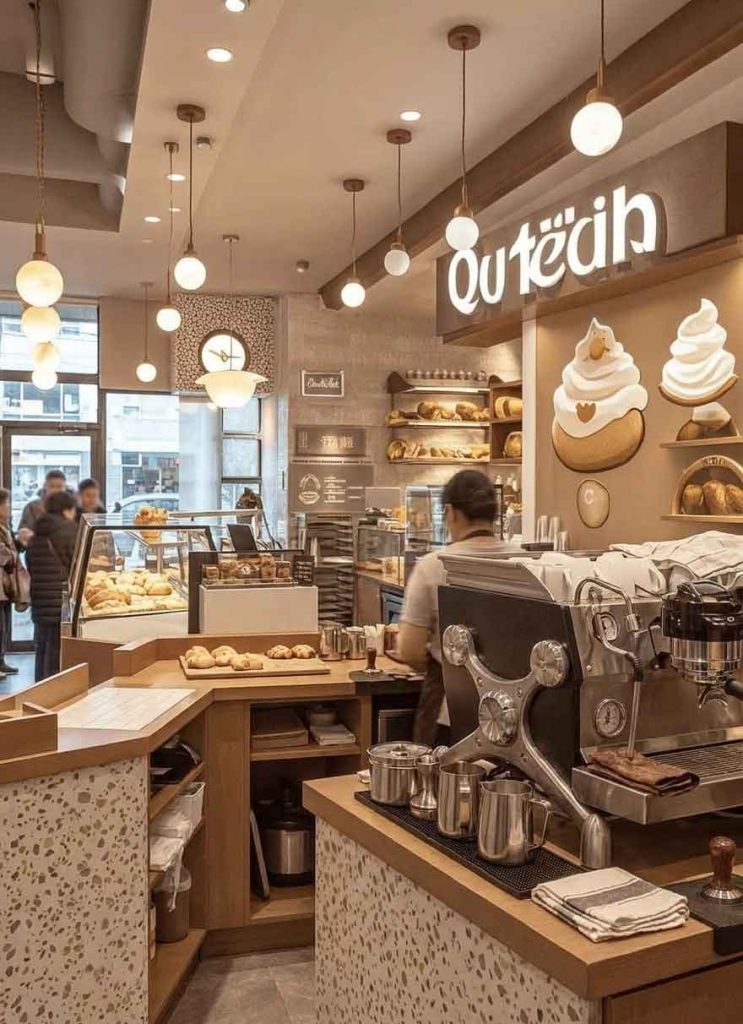
This case study presents the bakery signage design for a wood-toned, creamy latte-colored bakery that prioritizes warmth and approachability. The storefront design uses natural wood tones and soft cream accents to create an inviting visual experience that mirrors the comforting qualities of freshly baked goods. The signage strategy focuses on making customers feel welcome before they even enter.
The design concept draws inspiration from the bakery’s product itself—golden baked crust, creamy fillings, and natural ingredients. The primary signage uses a custom script typeface that feels hand-lettered and artisanal, suggesting the handmade quality of the baked goods. The color palette combines warm wood brown, creamy latte beige, and soft butter yellow, creating an appetizing visual temperature that triggers positive associations with fresh baking.
The layout places the brand name prominently above the entrance with supporting messaging—”BAKERY · CAFE · PATISSERIE”—subtly integrated into the window design. A secondary hanging blade sign extends perpendicular to the facade, capturing side-traffic attention.
The primary sign uses CNC-routed solid wood letters in oak with a clear satin finish, allowing the natural wood grain to show through. The letters are mounted on a warm cream-painted aluminum composite panel that provides a clean backdrop without competing with the wood texture. Backlit halo illumination in warm white (3000K) outlines the letters in the evening, maintaining the warm ambiance after dark.
The blade sign uses a wood frame construction with a routed and painted MDF face, matching the primary sign’s aesthetic at a perpendicular viewing angle. Window graphics use gold metallic vinyl for elegant accents, with UV-protective coating for long outdoor life.
The warm wood-toned bakery signage successfully creates an emotional connection with passersby. Customer surveys indicate the storefront’s welcoming appearance was a primary factor in initial visits. The natural materials have aged beautifully, with the wood developing a richer patina over time. The installation demonstrates how material warmth in signage design can communicate brand values—quality, craftsmanship, and genuine care—before a single word is read.
Browse more related signage design projects from our portfolio:
Need custom design for your business? Contact our design team for a personalized consultation.