From $19.9

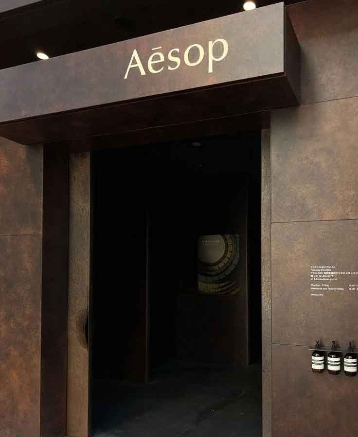
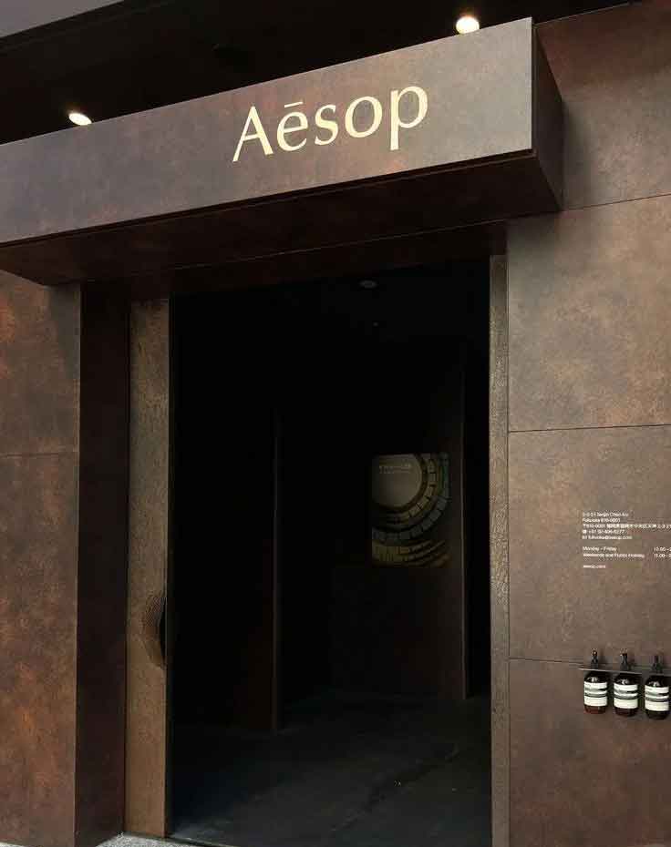
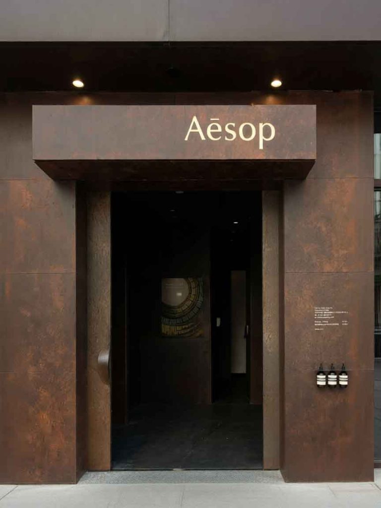
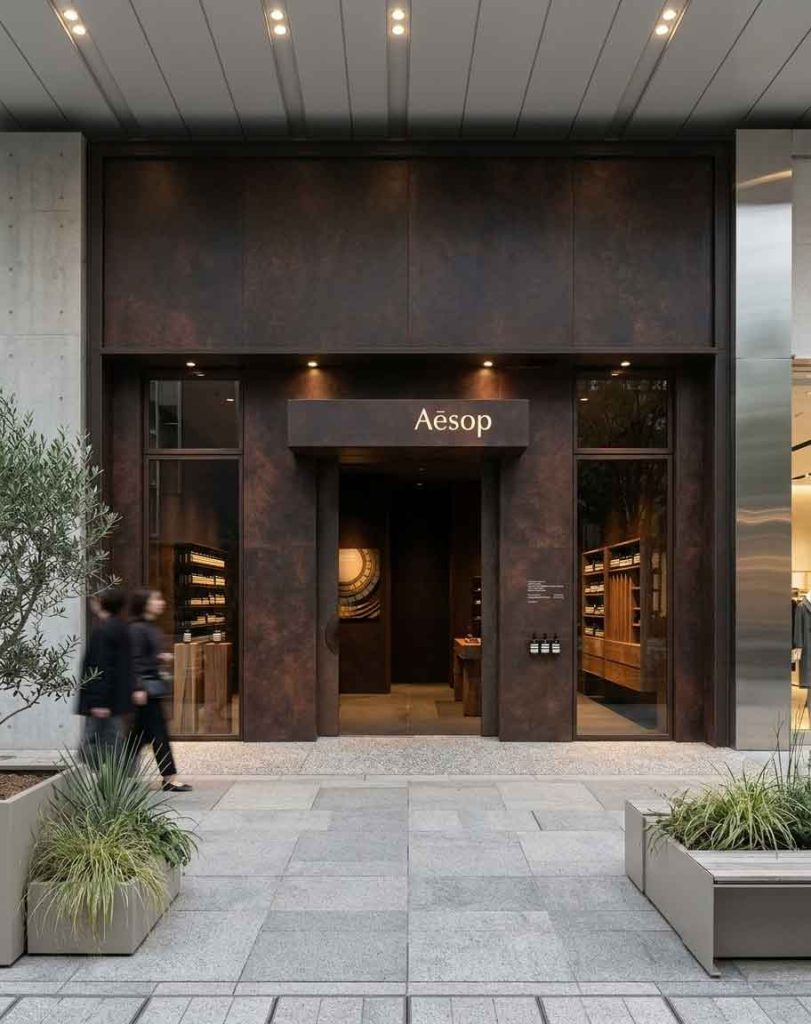
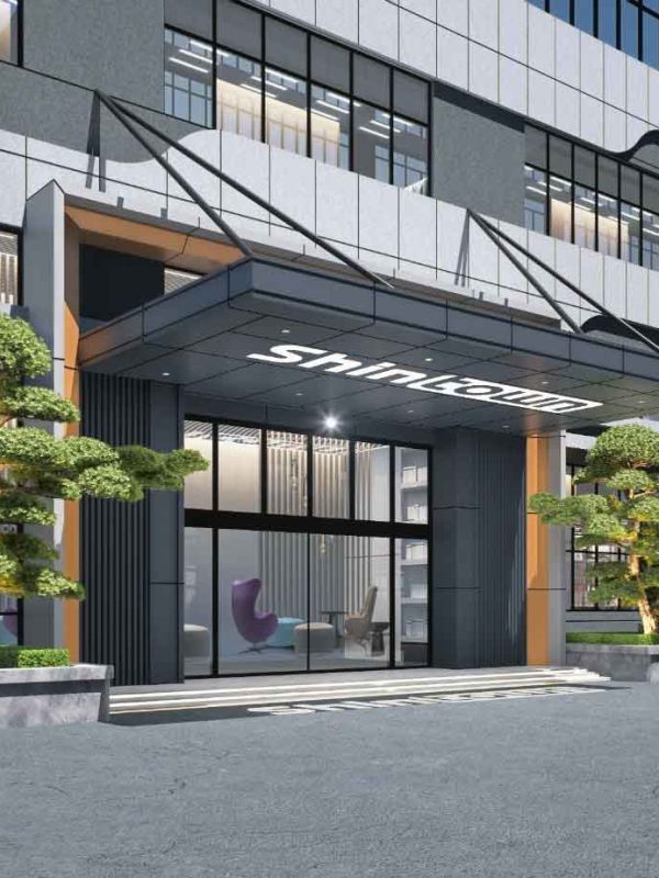
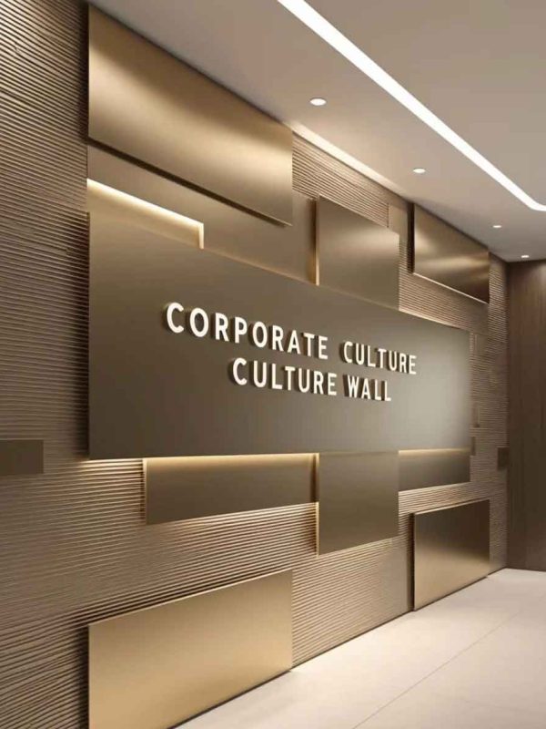
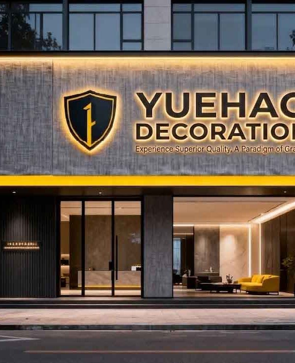
This retail / commercial signage and storefront design project demonstrates how thoughtful visual communication can transform a commercial space into an engaging brand experience. Every design decision — from material selection to lighting placement — was made with the dual purpose of attracting attention and communicating the brand’s core identity.
A predominantly black facade with subtle wood-grain accents — the overall look is just incredibly sophisticated! The expansive black backdrop creates a bold, modern statement, while the warm wood details soften the edge and add a layer of refined texture. It’s a perfect balance of sleek and inviting, proving that a dark palette, when paired with the right natural elements, can feel anything but cold. Under the right lighting, the wood grain comes alive, giving the entire storefront a premium, curated feel that effortlessly stands out. ✨
Industrial elements bring raw authenticity to the design. Exposed materials, structural honesty, and utilitarian details create a compelling contrast with softer finishing touches, resulting in a space that feels both grounded and aspirational.
Natural elements are woven throughout the design to create a biophilic connection that softens the built environment. Greenery, organic textures, and natural material finishes introduce warmth and life, making the storefront feel inviting and restorative.
Lighting plays a defining role in this design. Custom neon and LED installations create a layered illumination strategy that transforms the space from day to night. The warm, diffused glow of neon signage adds emotional resonance, while accent lighting highlights key architectural features and brand touchpoints.
The color palette was carefully selected to reinforce brand recognition and emotional impact. Strategic use of accent colors against neutral foundations creates visual hierarchy, guiding the eye naturally toward signage and entry points while establishing a memorable visual identity.
Wood elements were selected for their natural warmth and timeless appeal. Each piece is treated with protective finishes that preserve the organic grain pattern while providing durability against weather exposure and daily wear. The integration of wood with other materials creates a layered tactile experience.
The signage system combines high-quality LED neon flex with precision-fabricated letterforms and mounting structures. Weather-sealed connections and robust power systems ensure consistent performance across all operating conditions, while adjustable brightness settings allow the sign to adapt to ambient light levels.
Industrial materials like steel pipes and raw finishes are intentionally left visible to celebrate the beauty of functional construction. These elements are paired with refined details to create a balanced aesthetic that feels both authentic and intentional.
The completed commercial storefront installation delivers measurable impact on foot traffic and brand visibility. The strategic placement and design of signage elements maximize exposure during both daytime and nighttime hours, delivering continuous marketing value. The professional, polished appearance builds customer confidence and establishes the business as a trusted establishment in its community.
Interested in a custom storefront sign design? Contact Y Design Guide for a free consultation.