From $19.9

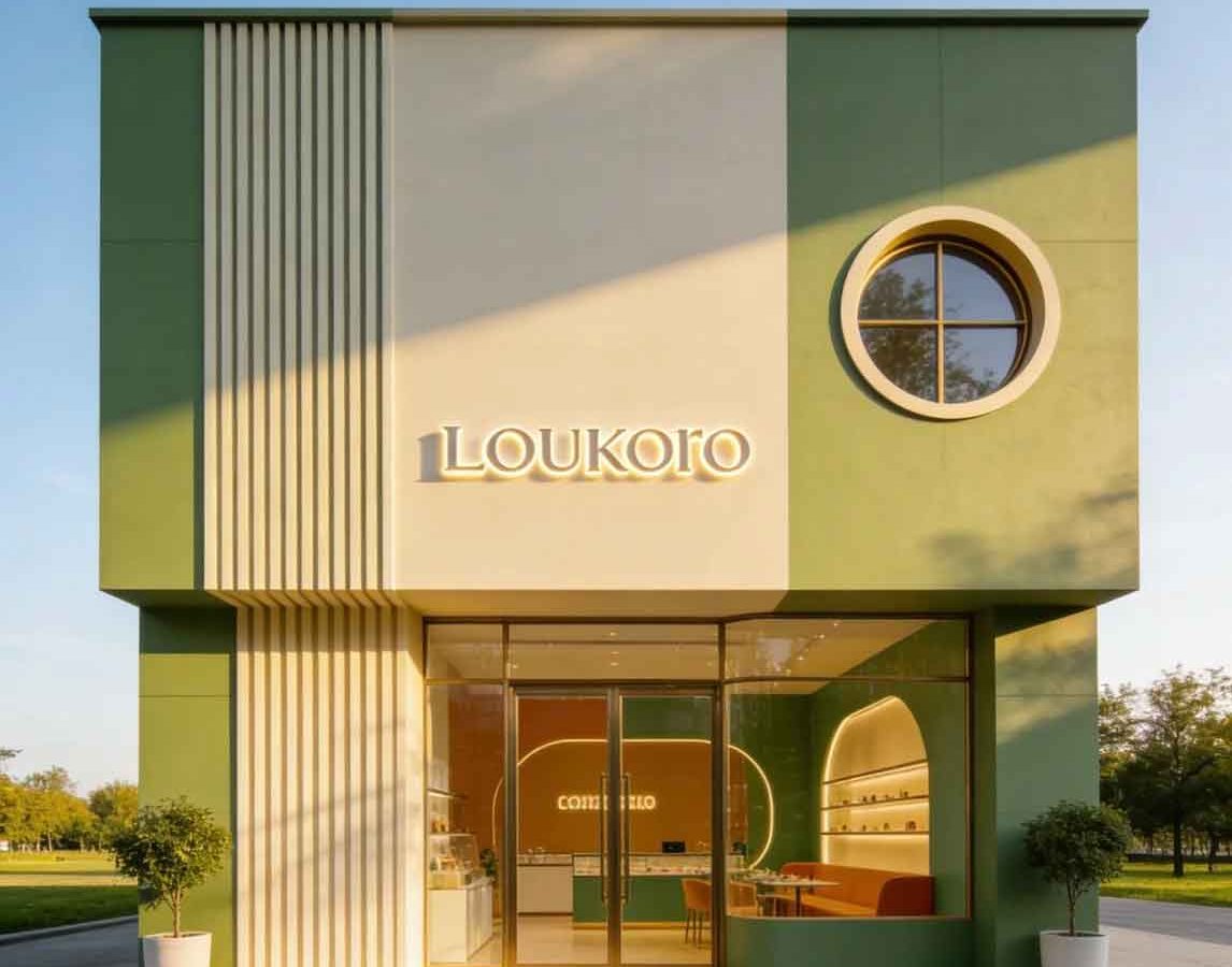
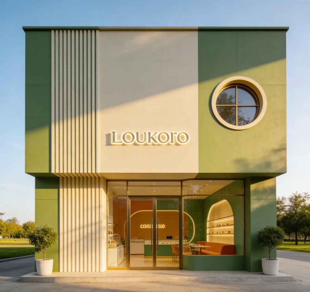
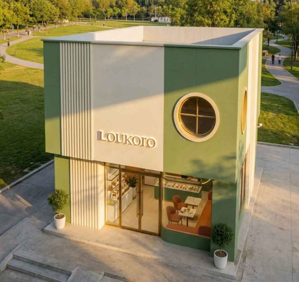
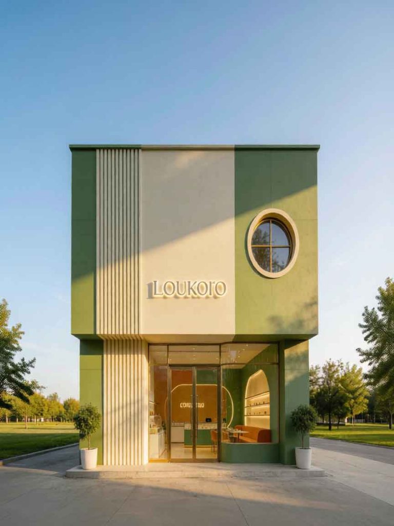
The design concept for “LOUKOTO” focuses on establishing a sophisticated, chic, and organic brand identity for an upscale boutique café or retail flagship. Located in a scenic urban park or modern lifestyle plaza, the architecture naturally interacts with daylight and surrounding greenery. The goal of this design is to blend high-end geometric modernism with warm, natural aesthetics, positioning the storefront as a visually striking landmark that exudes calm, warmth, and curated luxury.
As illustrated in 4.jpg, the storefront features a freestanding, two-story block pavilion that relies heavily on bold geometry, symmetry, and a distinctive color-blocking strategy.
The Palette: The exterior uses a harmonized tri-tone scheme consisting of sage green, cream white, and warm champagne-gold accents.
The Textures: The left side incorporates elegant vertical slats that introduce shadow lines, while the top right features a poetic, circular porthole window that softens the structure’s sharp edges.
The signage system must seamlessly integrate into this architectural rhythm rather than feeling like an afterthought.
The main brand name is mounted directly onto the central cream-colored stucco column of the upper facade, serving as the ultimate visual anchor.
Typography: The text is rendered in an elegant, custom-serif typeface. The gentle curves and subtle line-weight variations of the lettering evoke a sense of high fashion, timelessness, and artisanal care, perfectly matching the lifestyle character of the building.
Material & Finish: The letters are crafted from solid metal with a brushed champagne-gold finish. This texture mirrors the metallic detailing of the glass door frames below, unifying the top and bottom of the storefront.
Lighting Technology: The signage utilizes a backlit LED halo system with a warm color temperature ($3000text{K}$). During golden hour and evening transitions, this creates a soft glow behind the gold letters, providing exceptional readability while ensuring the brand name appears to float gracefully on the facade.
To add spatial depth, a secondary backlit brand script is visible through the floor-to-ceiling glass entrance. Positioned on the curved interior feature wall, this inner glow works in tandem with the primary exterior signage, drawing the eyes of passersby deep into the warm hospitality experience within.
The success of the signage relies heavily on how it interacts with the facade’s open lighting scheme. The design avoids loud or flashing illumination. Instead, hidden linear light strips under the building’s overhang and behind the interior arched displays cast a soft gradient across the green and cream surfaces. This technique emphasizes the premium texture of the materials and allows the main “LOUKOTO” gold sign to pop elegantly against its clean, light background.
By combining an elegant serif typeface, a premium champagne-gold color story, and sophisticated backlit halo lighting, the signage design for LOUKOTO masterfully elevates the storefront. It transforms a geometric concrete structure into a welcoming, high-end destination that effortlessly balances modern architecture with warm, organic hospitality.
design for your business? Contact our design team for a personalized consultation.
Browse more related signage design projects from our portfolio:
Need custom signage design for your business? Contact our design team for a personalized consultation.