From $19.9

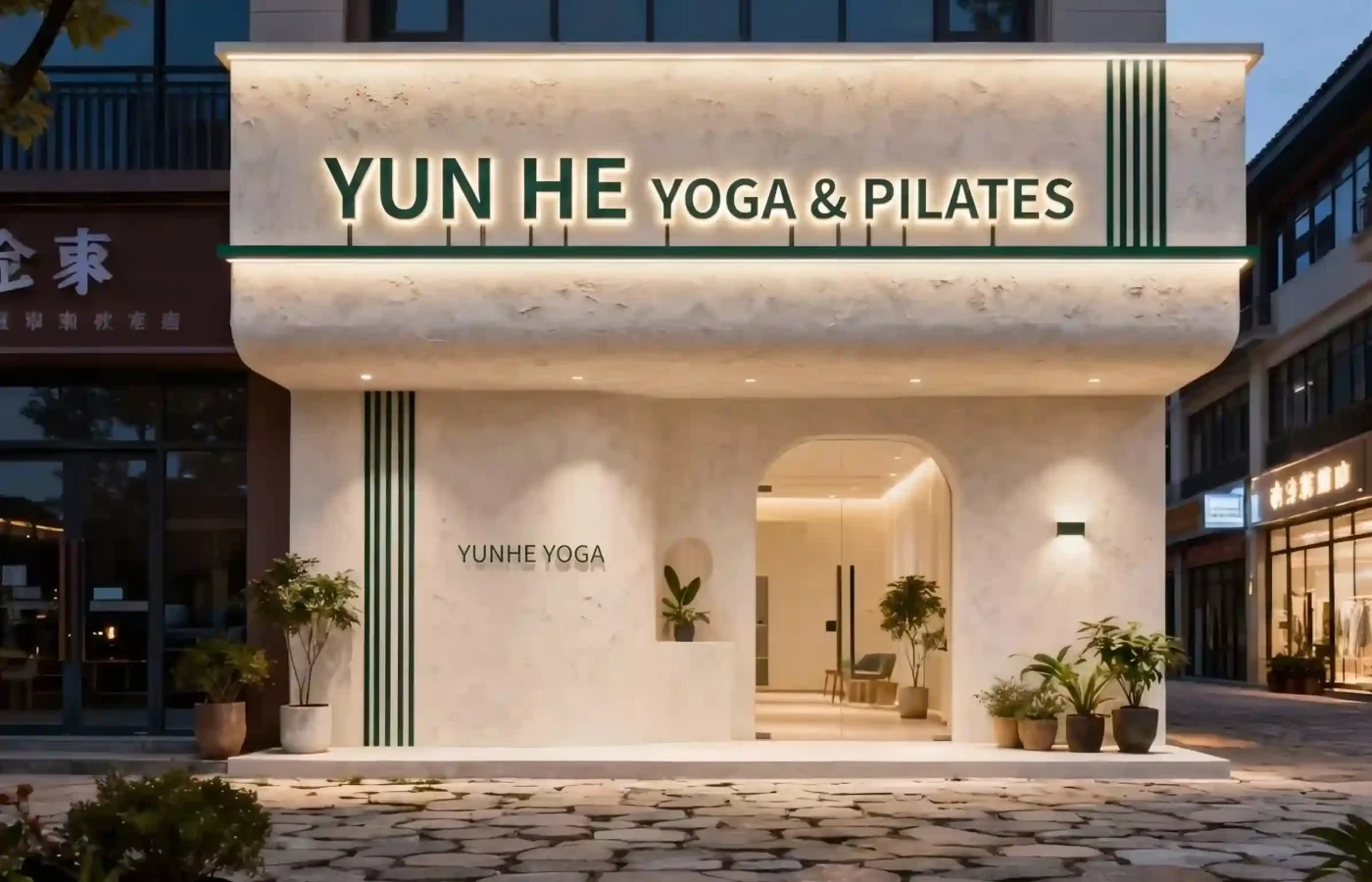
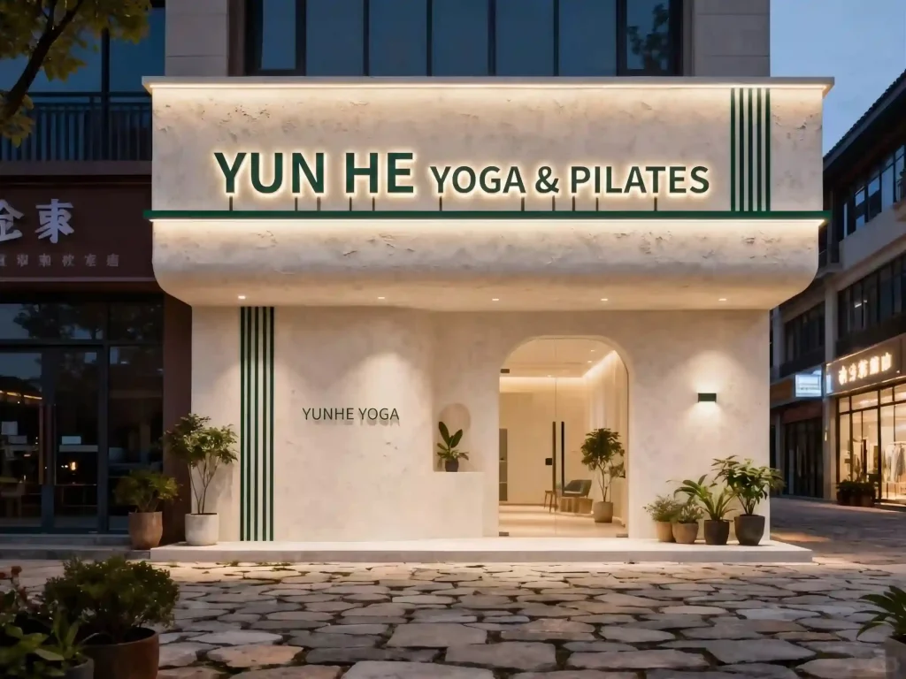
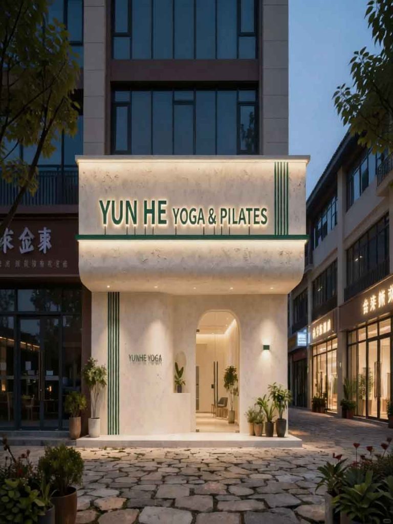
The fundamental challenge for the “YUN HE YOGA & PILATES” storefront was to communicate a premium wellness experience (balance, strength, and serenity) while ensuring brand recognition in a mixed-use commercial district. The solution centers on an integrated architectural signage system that transforms the entire facade—text, materials, and lighting—into a single, cohesive brand beacon. This approach is rooted in elevated organic minimalism, bridging nature and structure.
The Core Brand Mark: The central element is the name “YUN HE,” a phonetic translation of the original Chinese (“云禾,” suggesting clouds and grain). This name was chosen for its soft, universal sound and its connection to the natural world.
Typography and Form: The letters for “YUN HE” utilize a bespoke, high-end sans-serif font. The character forms are slightly elongated and rounded, mimicking both the natural growth patterns of bamboo and the fluid, precise movements of a yoga pose. A matching weighted font is used for the descriptors, “YOGA & PILATES,” maintaining a single-line, balanced horizontal composition.
Material and Lighting: This is a masterclass in textures. The letters are dark bronze-patina metal, providing a deep, grounding contrast to the light facade during the day. However, their defining feature is the backlit halo lighting. Hidden warm-white LEDs are integrated into the rear of each letter, casting a soft, diffuse glow against the textured plaster. This creates a powerful “halo effect” that is simultaneously crisp (for legibility) and gentle (for ambiance), perfectly matching the studio’s serene atmosphere.
Texture as Context: The entire facade is a rough, textured, creamy-white stucco plaster. This material adds an organic, handmade quality, contrasting with the precise lines of the metal signage. It ensures the sign is not just a label, but part of a curated space.
Architectural Dialogue: We intentionally aligned the main signage with the architectural details. The new vertical green batten element on the upper-right facade is mirrored by a vertical green slat pattern on the ground-level pillar (retaining the small, simple text “YUNHE YOGA”). This verticality and natural color story are picked up by the extensive use of potted greenery, creating a vertical garden effect that leads the eye directly to the main entry, a beautifully curved archway that frames the warm interior.
The “YUN HE” signage is a complete expression of brand intent. It is clean, legible, and premium, yet it retains a soft, organic soul. By combining custom typography, sophisticated backlighting, and curated materials, this design ensures that every patron, from a distance or up close, instantly understands the studio’s commitment to balance, precision, and tranquility.
design for your business? Contact our design team for a personalized consultation.
Browse more related signage design projects from our portfolio:
Need custom signage design for your business? Contact our design team for a personalized consultation.