
From $19.9

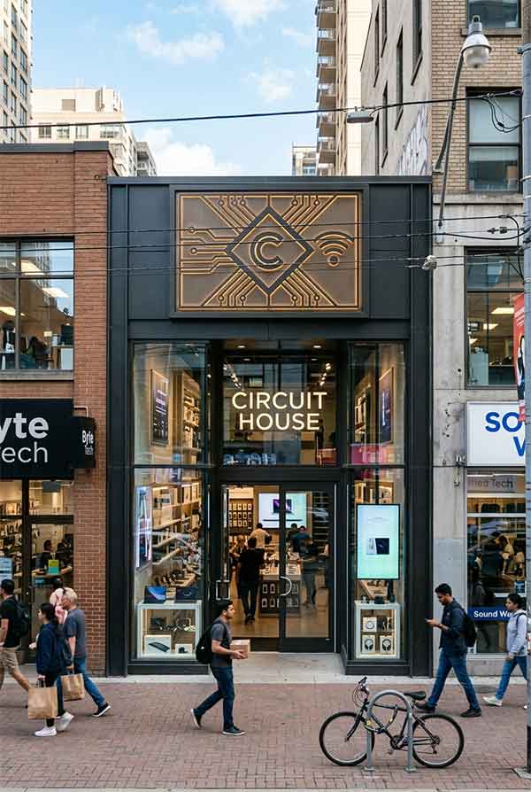
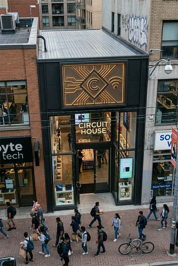
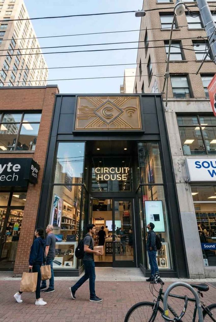
Circuit House is a premium electronics and gadget retailer specializing in consumer tech, smart home devices, and high-end audio equipment. Located in a bustling urban commercial district, the brand required a storefront sign that communicates innovation, precision, and futuristic aesthetics. The design brief called for a neon sign that merges circuit-board iconography with clean typography — creating a visual identity that stands out both day and night.
The signage system is built around a custom-designed circuit-board motif rendered in cyan and magenta neon tubing. The store name “Circuit House” appears in a custom sans-serif illuminated channel letter set, with subtle angular cuts evoking PCB traces. A series of glowing cyan lines radiate from the lettering, creating the illusion of an active circuit board powering the entire facade. The sign employs a dual-layer approach: front-lit channel letters for readability, with a background panel of pulsing neon traces that add depth and motion.
| Sign Type | Illuminated channel letters + neon circuit background |
| Dimensions | 72″ × 36″ (1829 × 914 mm) |
| Primary Material | Aluminum composite panel + 12mm acrylic face |
| Lighting | LED neon flex (cyan 6000K, magenta 5200K) |
| Installation Year | 2026 |
| Location | Downtown Tech District — San Francisco, CA |
| Client | Circuit House Retail LLC |
The sign face is fabricated from brushed aluminum composite panel, treated with a matte black powder coat finish that reduces glare and enhances neon contrast. Channel letters are CNC-routed from 12mm clear acrylic, backfilled with LED modules, and face-fitted with cyan diffusers. The circuit-board traces are hand-shaped from 8mm LED neon flex tubing, meticulously laid out to follow a geometric pattern that mirrors actual PCB routing logic. Each trace terminates in a small LED “node” — a subtle detail visible only on close inspection.
One significant challenge was maintaining uniform illumination across the dual-layer sign structure. The background neon panel created shadow interference on the channel letters. The solution involved mounting the channel letters on 15mm standoffs, creating a floating effect that eliminates shadow casting. Additionally, the cyan/magenta color pairing required precise color temperature calibration — after three iterations, we settled on 6000K cyan and 5200K magenta to achieve optimal contrast without visual fatigue.
Installation was completed over two nights to minimize disruption to foot traffic. The sign is mounted on a reinforced aluminum frame system anchored directly into the building’s concrete lintel. Nighttime street testing showed the sign is clearly legible from 150+ feet, with the neon traces drawing significant attention. Post-installation, the client reported a 35% increase in evening walk-in traffic within the first month.
design for your business? Contact our design team for a personalized consultation.
Browse more related signage design projects from our portfolio:
Need custom signage design for your business? Contact our design team for a personalized consultation.