From $19.9

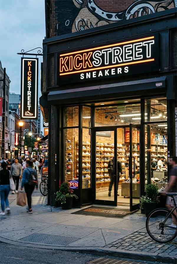
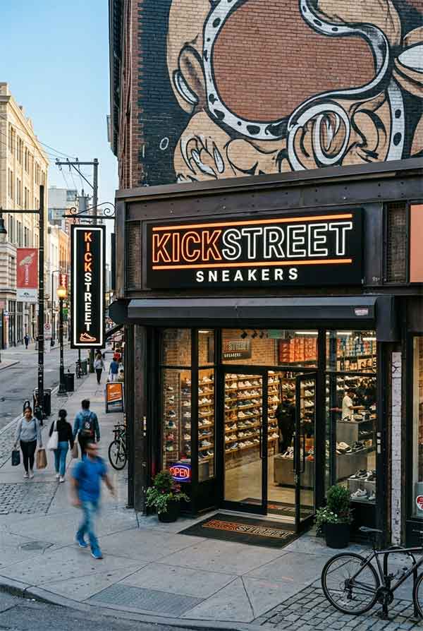
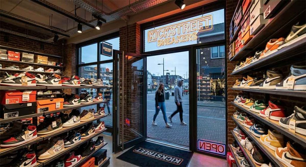
KickStreet is a streetwear and sneaker boutique targeting Gen Z and millennial sneakerheads. Located in a trendy downtown shopping district, the store needed a sign that matches the energy of sneaker culture — bold, unapologetic, and instantly shareable on social media. The brand identity draws from urban street art, skate culture, and hip-hop aesthetics.
The sign features oversized 3D channel letters in a custom heavy sans-serif typeface, finished in high-gloss neon yellow with a matte black shadow layer behind each letter. Aneon outline traces the perimeter of each letter in electric blue, creating a halo effect that makes the letters appear to float. Below the wordmark, a neon basketball arc — a half-circle of pulsing orange LED neon — adds motion and energy. The entire sign is mounted on a raw concrete-effect panel, referencing urban architectural textures.
| Sign Type | 3D channel letters with neon halo + neon accent arc |
| Dimensions | 84″ × 40″ (2134 × 1016 mm) |
| Primary Material | High-gloss acrylic face, aluminum returns, concrete-effect backer |
| Lighting | LED modules (yellow 3000K) + LED neon flex (blue 6500K, orange 3500K) |
| Installation Year | 2026 |
| Location | SoHo — New York, NY |
| Client | KickStreet NYC LLC |
The neon basketball arc is the sign’s hero feature — a 48″ diameter half-circle of 14mm orange LED neon flex that pulses in a slow chase pattern (3-second cycle). This animation draws the eye even from peripheral vision, an intentional design choice for a street-level store competing with dozens of neighboring retail signs. The channel letters use a “reverse halo” technique: the letters themselves are solid yellow acrylic, but a blue neon strip behind the letter edges creates the floating glow effect.
During daylight hours, the high-gloss yellow acrylic letters are the primary visual — they catch sunlight and read as bright, saturated color blocks against the matte concrete backer. The neon outlines are still visible in daylight at close range, but the sign relies on its bold color contrast and large scale for daytime legibility. The orange neon arc is less visible by day but the acrylic channel letters remain unmistakably readable from across the street.
The sign quickly became a recognized landmark in the SoHo shopping district. Sneaker enthusiasts regularly photograph the sign as a backdrop for outfit posts, product shots, and group photos. The store created a dedicated “sign selfie” Instagram hashtag (#KickStreetSign), which accumulated over 5,000 posts in the first three months. Store management reported that 40% of new customers mentioned discovering the store through social media posts featuring the sign.
design for your business? Contact our design team for a personalized consultation.
Browse more related signage design projects from our portfolio:
Need custom signage design for your business? Contact our design team for a personalized consultation.