From $19.9

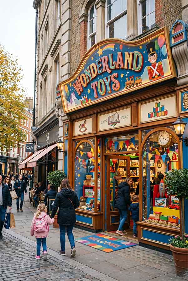
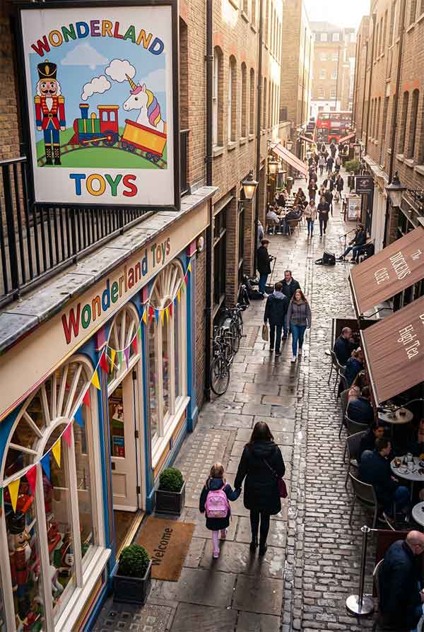
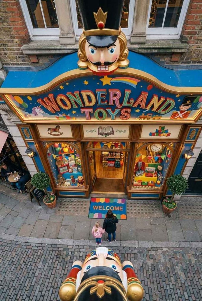
Wonderland Toys is an independent children’s toy store in a family-oriented shopping district. The store carries educational toys, art supplies, and imaginative play sets. The sign needed to appeal to two audiences simultaneously: children (who should find it magical) and parents (who need to perceive quality and safety). The design challenge was creating something whimsical without being chaotic.
The sign uses a colorful geometric framework: a series of interconnected triangles, circles, and squares in primary colors (red, yellow, blue) that form a playful canopy-like structure above the store entrance. The word “WONDERLAND” is spelled in rounded, playful channel letters in alternating colors — each letter a different shade from the primary palette. Small neon stars and moon shapes are scattered between the lettering, creating a “storybook night sky” effect.
| Sign Type | Colorful geometric channel letters + decorative neon shapes |
| Dimensions | 78″ × 44″ (1981 × 1118 mm) |
| Primary Material | Acrylic letters with colored diffusers, aluminum frame |
| Lighting | RGB LED modules (programmable), LED neon flex for stars/moon |
| Installation Year | 2026 |
| Location | Family District — Seattle, WA |
| Client | Wonderland Toys Inc. |
The sign incorporates geometric shapes commonly found in early childhood education — triangles, circles, squares, and hexagons — each assigned a primary color. Parents subconsciously associate these shapes and colors with educational value, while children respond to the bright, varied palette. The stars and moon elements serve double duty: they add whimsy for children while creating a “bedtime story” association that emotionally resonates with parents.
A subtle interactive feature was added: a small button at child height near the entrance that, when pressed, triggers a 10-second sequence where the neon stars “twinkle” in a slow random pattern and the moon changes from crescent to full. This creates a moment of delight that turns the act of entering the store into a memorable ritual. The feature runs on a low-voltage sensor system and activates automatically during business hours.
The sign quickly became a local landmark for families with young children. Parents regularly stop to photograph their children in front of the colorful geometric display. The interactive star-twinkle button is especially popular — store staff report that children often ask to press it multiple times. The sign’s playful but structured aesthetic has been praised by local design publications for balancing child appeal with parent-friendly sophistication.
design for your business? Contact our design team for a personalized consultation.
Browse more related signage design projects from our portfolio:
Need custom signage design for your business? Contact our design team for a personalized consultation.