From $19.9

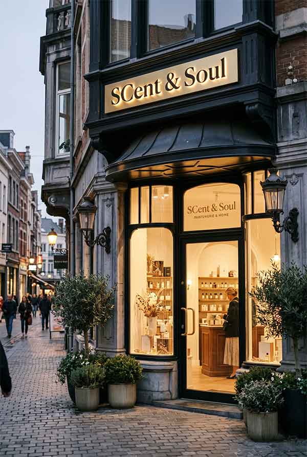
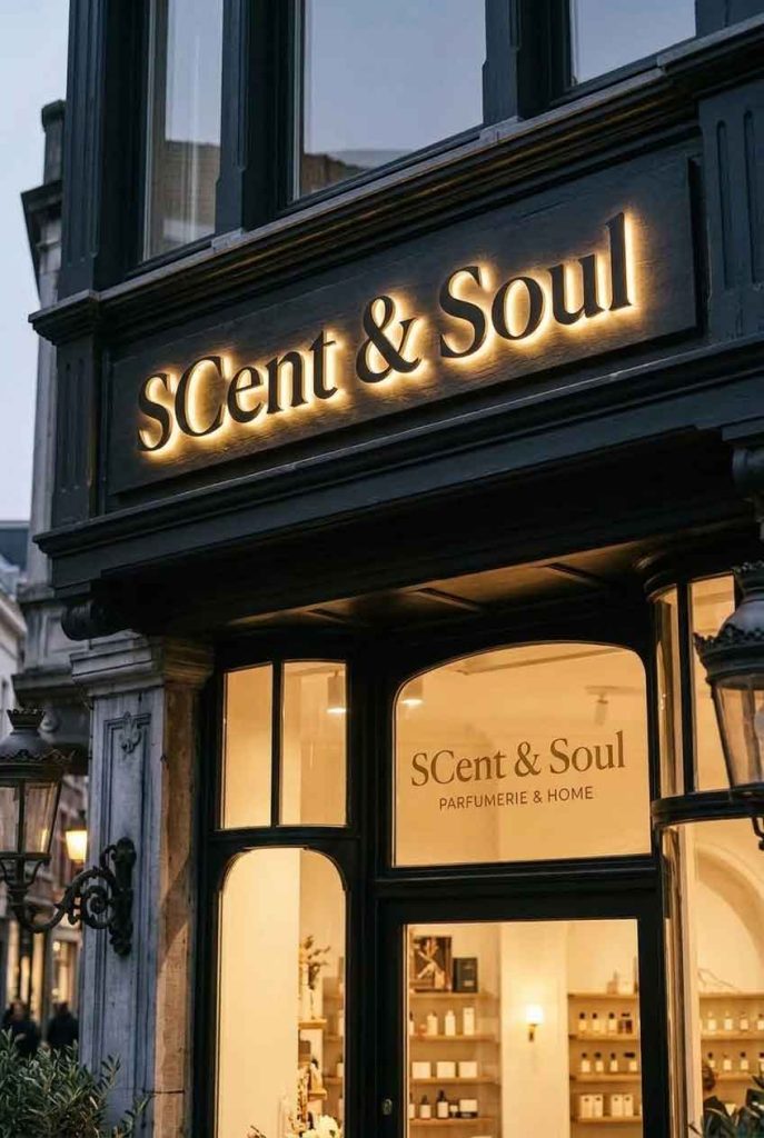
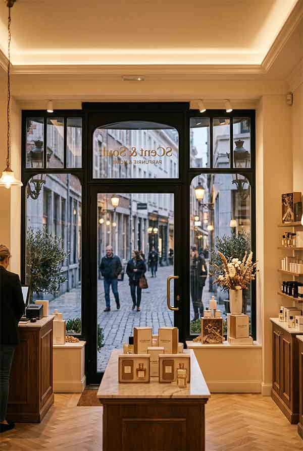
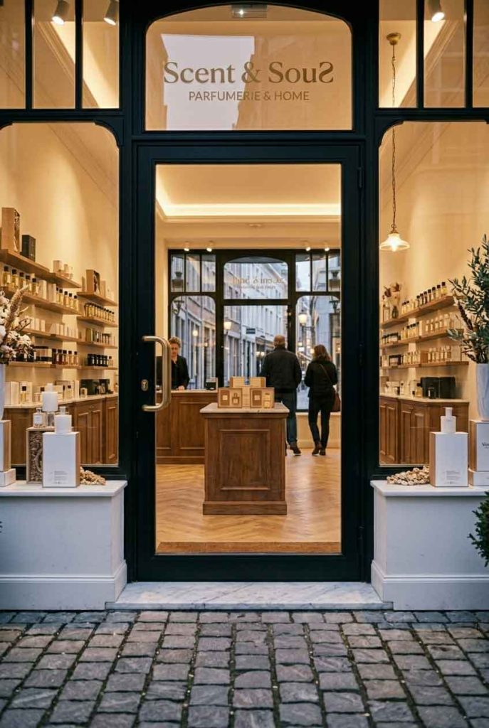
Scent & Soul is a niche fragrance boutique offering artisanal perfumes, scented candles, and aromatherapy products. The store occupies a narrow storefront in a historic downtown arcade. The brand’s philosophy — that scent is an expression of inner self — needed to be reflected in a storefront that feels intimate, sensory, and personal. The sign must whisper, not shout.
The sign is a study in dual-tone minimalism. The brand name “SCENT & SOUL” is rendered in two distinct neon colors: “SCENT” in a soft lavender (subtle, ethereal) and “& SOUL” in a warm rose gold (grounded, warm). The ampersand is a delicate hand-drawn lowercase symbol in white neon, connecting the two halves. The entire sign is mounted on a backlit alabaster-style backer panel that diffuses a gentle ambient glow, giving the impression that the entire sign is carved from translucent stone.
| Sign Type | Dual-tone LED neon lettering + backlit alabaster panel |
| Dimensions | 48″ × 22″ (1219 × 559 mm) |
| Primary Material | LED neon flex (lavender, rose gold, white), alabaster acrylic panel |
| Lighting | Lavender 4000K + Rose Gold 3200K + White 4500K |
| Installation Year | 2026 |
| Location | Historic Arcade — Boston, MA |
| Client | Scent & Soul Fragrances LLC |
Every design decision was made with sensory experience in mind. The lavender neon was chosen for its association with relaxation and aromatherapy — research shows that the color lavender can trigger olfactory associations even before entering the store. The rose gold tone connects to the warmth of amber and vanilla fragrance notes. The alabaster backer panel uses a textured surface with subtle veining patterns, resembling natural stone and adding a tactile visual quality even though it’s never touched.
The historic arcade’s architecture features marble floors, brass railings, and ornate ceiling details from the 1920s. The sign’s clean, minimal lines provide a deliberate contrast to the ornate surroundings — the eye is drawn to the modern neon glow against the classical backdrop. The sign’s mounting system was designed to be completely reversible, as required by the arcade’s historical preservation guidelines, using custom brackets that clamp to existing architectural features without drilling.
The sign has been featured in multiple “Best Storefront” roundups and a local segment on boutique retail design. Fragrance enthusiasts specifically seek out the store for its curated sensory experience, with the sign serving as the first “note” in the olfactory journey. The lavender-rose gold color combination has become so associated with the brand that the store uses it across packaging, shopping bags, and promotional materials.
design for your business? Contact our design team for a personalized consultation.
Browse more related signage design projects from our portfolio:
Need custom signage design for your business? Contact our design team for a personalized consultation.