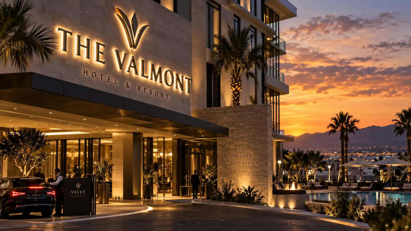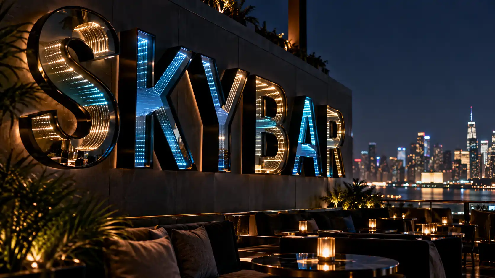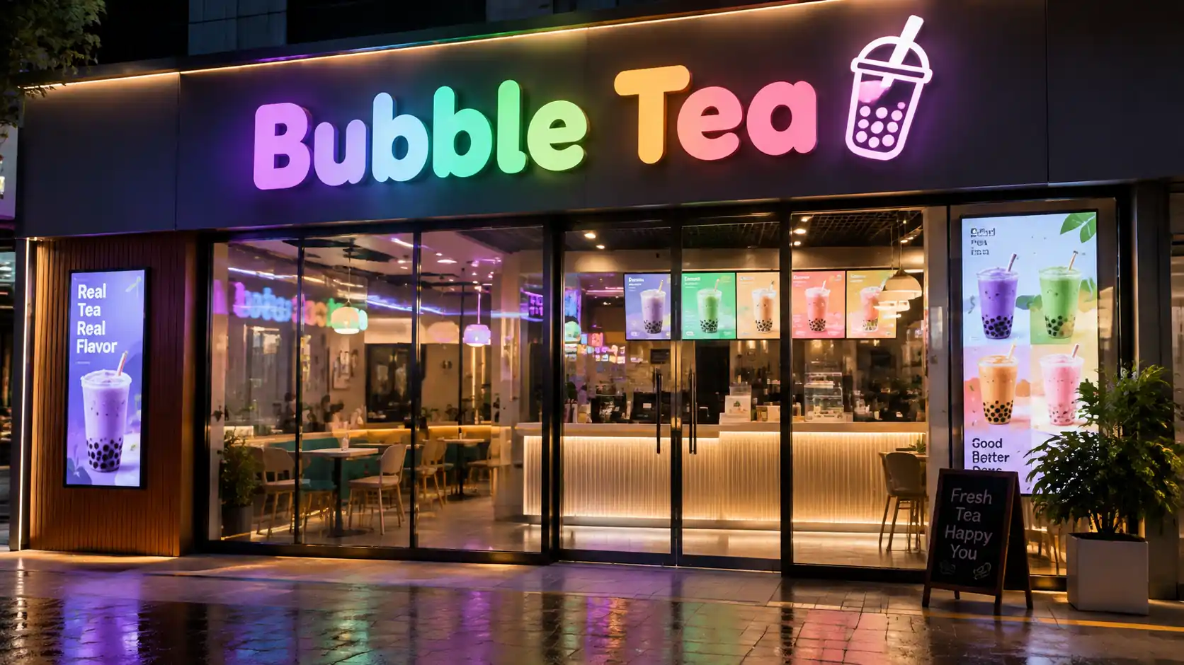
Brand consistency rarely gets the attention it deserves when a business signs a franchise agreement. The logo is approved, the colors go into the style guide, the store opens — and the sign is commissioned from whoever the local contractor recommended. Six months later, brand managers notice store number 18 looks like a different company.
For multi-location brands, channel letters are the highest-visibility brand asset a customer ever sees. At ten stores you have ten chances to drift; at fifty, drift is structural, not accidental. This guide covers how to keep every storefront consistent, from a single source of truth to how a remote install crew is verified on the day the letters go up.
Along the way, we recommend three companion reads: backlit vs face lit channel letters, backlit channel letter pricing, and halo lit letter materials. This piece does not re-cover those technical decisions — it assumes you have settled them and focuses purely on consistency across many sites.
Why Sign Drift Happens Across Multi-Location Brands
The mechanics of drift are mundane and specific. Once you understand them, fixing them becomes a project management problem instead of a mystery.
Different Local Vendors Make Different Calls
A franchisor specifies “24-inch illuminated letters” and one shop installs 24-inch acrylic halo lit units; another installs 24-inch aluminum face-lit units because their local vendor does not make halo kits. Same letter height, same logo, completely different brand experience at night. Neither contractor made an error — they both met the spec they were given, because the spec was ambiguous.
Permits Vary by City and Force Local Compromises
Munich, Miami, and Manila all have municipal bylaws on illumination, letter height, and mounting distance. A brand spec written for a suburban strip mall collides with a dense retail corridor permit. The local vendor then improvises, and each improvisation becomes precedent for the next store.
The Style Guide Is Designed for Print, Not Fabrication
Most corporate style guides specify CMYK and Pantone. They do not specify LED lumen output, transformer capacity, IP rating, or how the halo should read from fifty feet back. A print designer and a sign fabricator share the word “color” but mean different things.
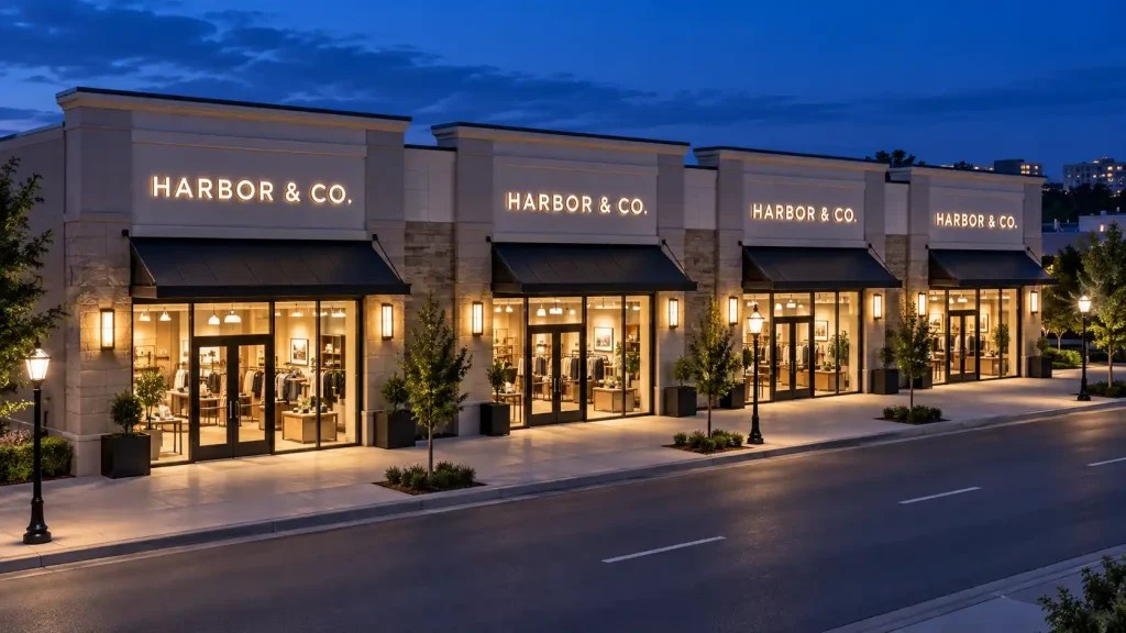
What Consistency Failure Costs the Brand
- Recall. A shopper recognizes a brand partly through the physical object on the storefront. Drift weakens that recognition loop.
- Trust. Locations with mismatched signs read as poorly managed, hurting foot traffic and franchisor credibility.
- Franchise disputes. Remediation — a second sign on an installed store — costs roughly 1.8x to 2.5x more, because the first one has to be removed.
Building a Sign Spec Sheet as the Single Source of Truth
Every storefront that is going to look the same starts with a document that removes ambiguity. A sign spec sheet is not a logo file — it is a fabrication-ready brief that a vendor cannot interpret in two ways.
Dimensions and Mounting
Specify letter height in millimeters and inches, projection depth, mounting bar offset from the facade, and clearance above grade. Add minimum and maximum letter heights for storefronts with unusual facades — a 12-foot sign reads fine on a 22-foot storefront; the same sign on a 15-foot storefront overwhelms the building.
LED Type and Transformer
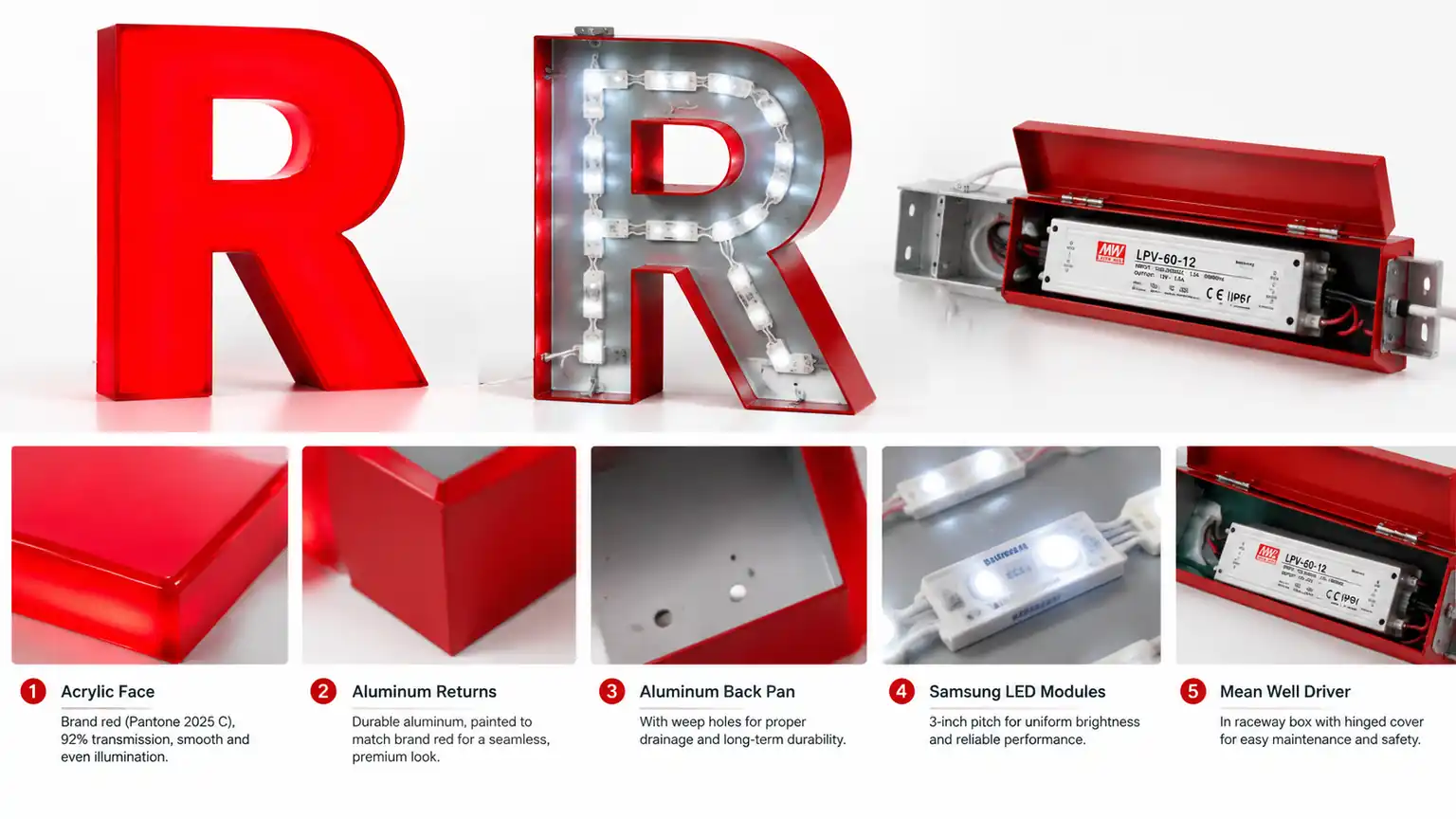
Call out LED wattage, CCT in Kelvin, beam angle, and dimming capability. Specify transformer capacity as a percentage of total LED load so a swap-in LED strip does not overload the driver. This is where “same-looking” signs end up at different brightnesses a year in.
Material and Color Finish
Material choice determines both visual character and longevity — our halo lit letter materials guide covers the trade-offs in detail. For a multi-location brand, the material decision is made once at the corporate level, and only the finish varies by store. Specify finish by material: RAL or Pantone for powder coat, TCC code for stainless, hex for acrylic, with a tolerance of Delta E under 2.
Master Template Files: Handing Off What Vendors Can Build From
A spec sheet is what a vendor reads. The template file is what a vendor loads into CAM software. Skipping the template step forces every shop to redraw the same letterforms, and each redraw introduces a subtle variation.
Dxf for Cutting and Dwg for Detailing
Provide the letterforms as a DXF at final production scale, with each letter as a single closed path and no overlapping geometry. Include a companion DWG with dimensions, mounting holes, and halo reveal geometry. Shops that fabricate themselves will use both; shops that outsource will use the DXF.
One Font, One Kerning, One Cap Height
If your logo uses a custom letterform, convert it to outlines at the corporate level and lock the file version. If it uses a licensed typeface, specify the exact version, kerning settings, and cap height. “Arial Bold” is not a specification.
Production Workflow: From Master to Delivery
Master File to Shop Drawing
Every production run should begin with a machine-generated shop drawing derived from the master DXF — not a hand-drafted interpretation. This makes the same letters producible by any qualified vendor, in any region, without quality drift.
Pre-Production Sample Approval
For new store formats or rebrands, produce one sample set and photograph it under three conditions: daylight, dusk, and full dark with the lights on. Approve the sample once, in writing, before volume production. Approving on a shop drawing alone is where most “we thought that is what you meant” disputes start.
Quality Control at the Factory
Ship a color reference swatch with every order and require the vendor to photograph the finished letters next to it before crating. Include a written QC checklist — letter spacing, halo evenness, finish defects, LED current — as an attachment the installer has to sign off.
Installation and On-Site Verification
Once the letters arrive, the local install crew has to place them correctly. This is the last line of defense before the sign is public.
Level, Spacing, and Alignment
Provide a template board or a laser-etched spacing diagram with the shipment. Letter spacing is a specific number, not “roughly one space width” — and it is where brands drift fastest because install crews eyeball it.
Pre-Light Verification Before the Lights Come On
Before energizing the sign, verify every letter is seated, every connection is dry, and every LED strip is the correct length. Once lights are on and a customer notices something is wrong, the fix becomes a public event and the cost climbs fast.
Multi-Location Costing and Volume Discounts
Consistency is not cheap at small scale. The economics flip at a certain volume, and it is worth knowing where.
| Order Size | Tooling and Setup | Per-Letter Cost Trend | Typical Consistency Risk |
|---|---|---|---|
| 1 storefront | Full — you pay it once | Highest | Low — only one variable |
| 5–10 storefronts | Amortized | Drops 15–25% | Medium — vendor coordination begins |
| 20+ storefronts | Nearly sunk | Drops 30–50% vs single | High — process discipline required |
For a multi-location brand, per-store cost only becomes predictable once you buy the letters as a single volume order against one spec sheet, rather than store by store. That is the difference between backlit channel letter pricing at retail and pricing at franchise scale. If you are weighing front-lit versus backlit across a rollout, settle it once and hold the line.
A Storefront Consistency Checklist
Run through this before signing off any new location. If any answer is no, do not approve the installation.
- Does the letterform match the master DXF at final scale?
- Is the letter height within the spec range for this facade?
- Is the material, finish, and color code the one specified in the brand guide?
- Are LED CCT, beam angle, and transformer capacity within tolerance?
- Has the pre-production sample been approved in writing?
- Has the installer photographed and signed off the QC checklist?
- Has the sign been verified before lights-on, and photographed after?
If you want to review product lines that hold up well across many locations, start with halo lit letters for premium brand signals or front lit letters for daytime-forward storefronts. For how the same system performs across retail categories, see the industries page.
Frequently Asked Questions
How do we keep channel letters consistent across stores in different countries?
Build the spec sheet once in international units — mm, RAL, Kelvin, IPX — and require every vendor to photograph the finished letters next to a color reference swatch before shipment. The spec does the translation; the swatch closes the loop.
Can we use local vendors for production and still hold consistency?
Yes, if and only if they build from your master DXF, use your approved finish, and photograph the final product against a reference before delivery. Without all three, local vendors will drift — small at first, cumulative by store thirty.
Do we need to approve a sample for every new location?
Not if the location matches a previously approved format on the same facade type. Approve one sample per unique facade material, then reuse that approval. A genuinely new facade type — glass curtain wall, for example — warrants a fresh sample, because the mounting solution changes.
How often should we audit existing installed signs?
At minimum once a year, and after any rebrand. LED output drifts, powder coat weathers, and mounting screws loosen. A scheduled audit costs a fraction of what remediation would once the sign has visibly degraded.