From $19.9

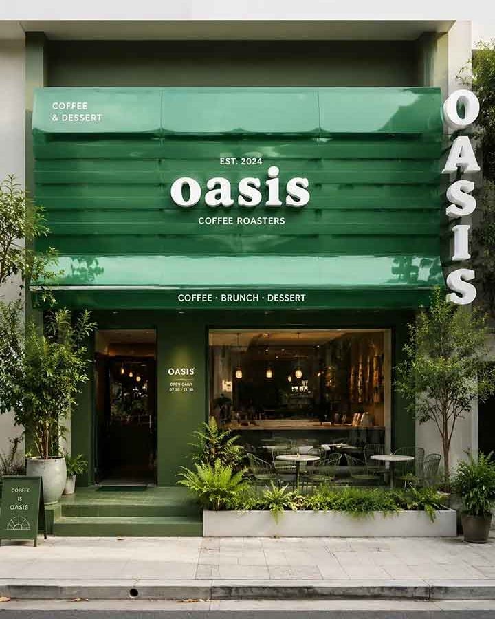
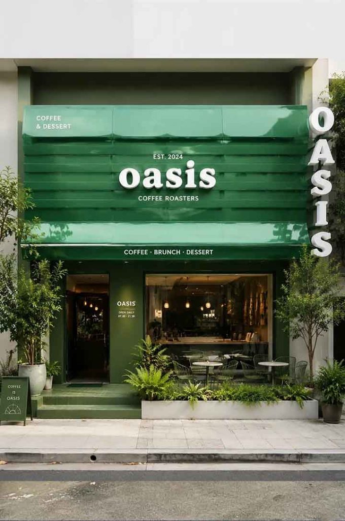
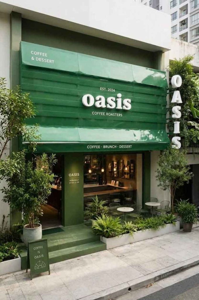
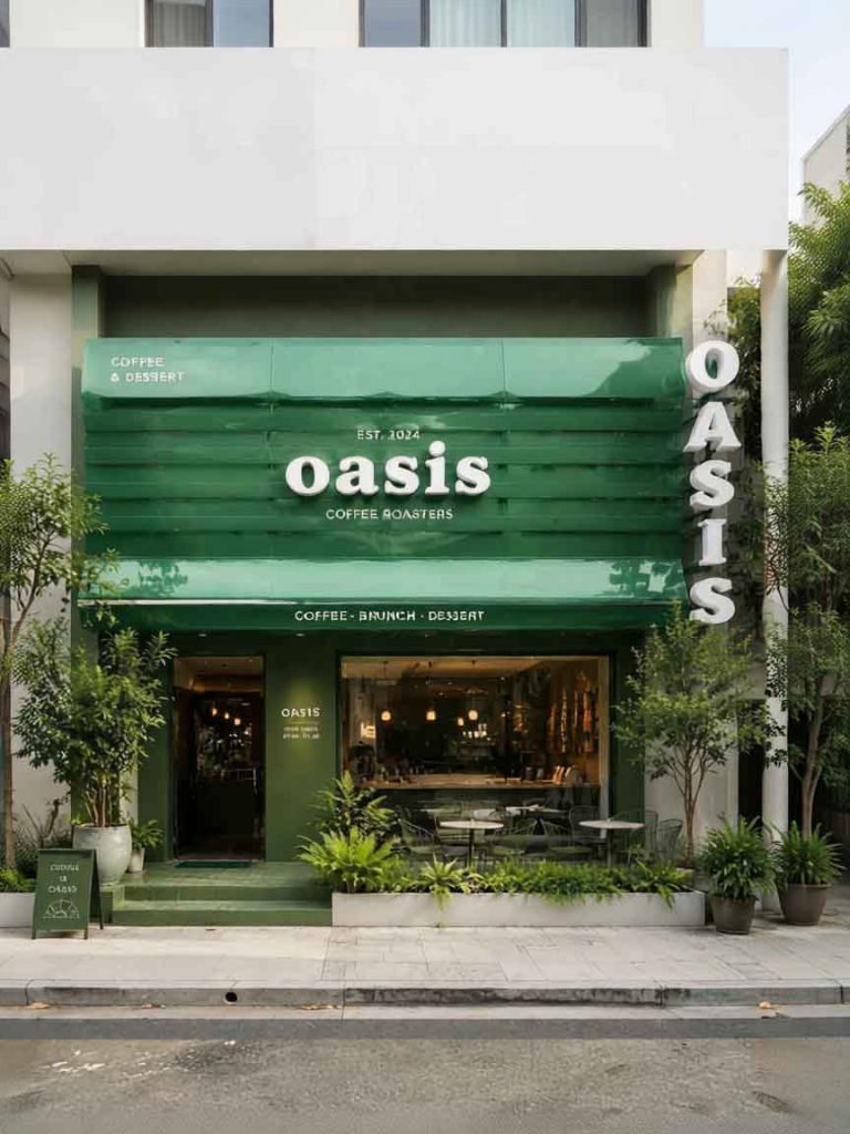
This case study examines the storefront signage design for “Oasis Coffee Roasters”, an upscale urban cafe. The design philosophy creates a literal and figurative “oasis” within the bustling cityscape. Using a sophisticated monochromatic green palette paired with crisp white typography, the facade establishes a refreshing visual sanctuary that draws the eyes of weary pedestrians while balancing retro architectural structures with contemporary minimalist branding.
The centerpiece is a massive multi-tiered horizontal awning structure in rich glossy emerald green, introducing depth, shadow, and architectural texture far beyond a flat conventional sign. The primary brand name “oasis” appears in lowercase bold serif typeface—the lowercase letters soften the brand presence while the clean serif edges maintain a premium artisanal quality. The 3D dimensional block letters in solid white create a stark high-contrast pop against the deep green background.
A subtle establishing mark “EST. 2024” sits centered above the main logo, and the brand descriptor “COFFEE ROASTERS” appears below in clean uppercase sans-serif, establishing trustworthy brand heritage. A brilliant vertical accent sign runs down the right-hand pillar spelling “OASIS” in large individual uppercase 3D block letters, ensuring maximum brand exposure from multiple angles.
The main signboard is constructed as a dimensional multi-layered awning system with a glossy emerald green finish. The brand lettering is fabricated from solid white 3D block materials, providing dimensional depth and shadow play throughout the day. The vertical pillar sign uses matching large-format individual 3D block letters in the same white finish. The bottom rim of the main awning features a subtitle reading “COFFEE · BRUNCH · DESSERT” to set functional expectations.
The deep forest-green paint extends down to window frames and entry walls, creating a seamless immersive color block. This is complemented by live potted ferns, tropical plants, and an elegant planter box along the outdoor seating area. The warm interior lighting through the large glass window contrasts beautifully with the cool green exterior.
The finished storefront delivers exceptional cohesive brand storytelling through architecture. By limiting the color palette to forest green and stark white, the design avoids visual noise and achieves a highly memorable premium aesthetic. The intelligent use of both horizontal and vertical dimensional signage ensures excellent readability from all approaches, while the natural integration of live flora brings the “Oasis” concept to life, creating an inviting urban sanctuary that stands out in the competitive cafe landscape.
Browse more related signage design projects from our portfolio:
Need custom design for your business? Contact our design team for a personalized consultation.