From $19.9

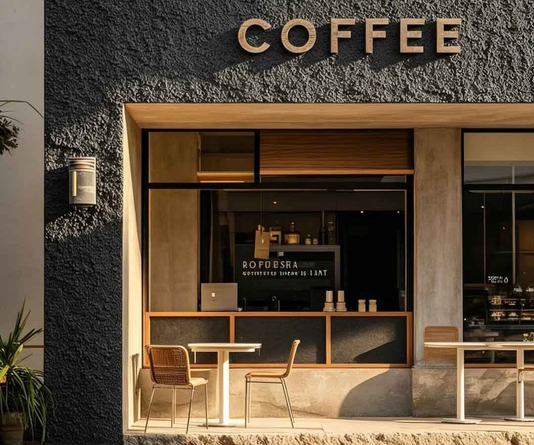
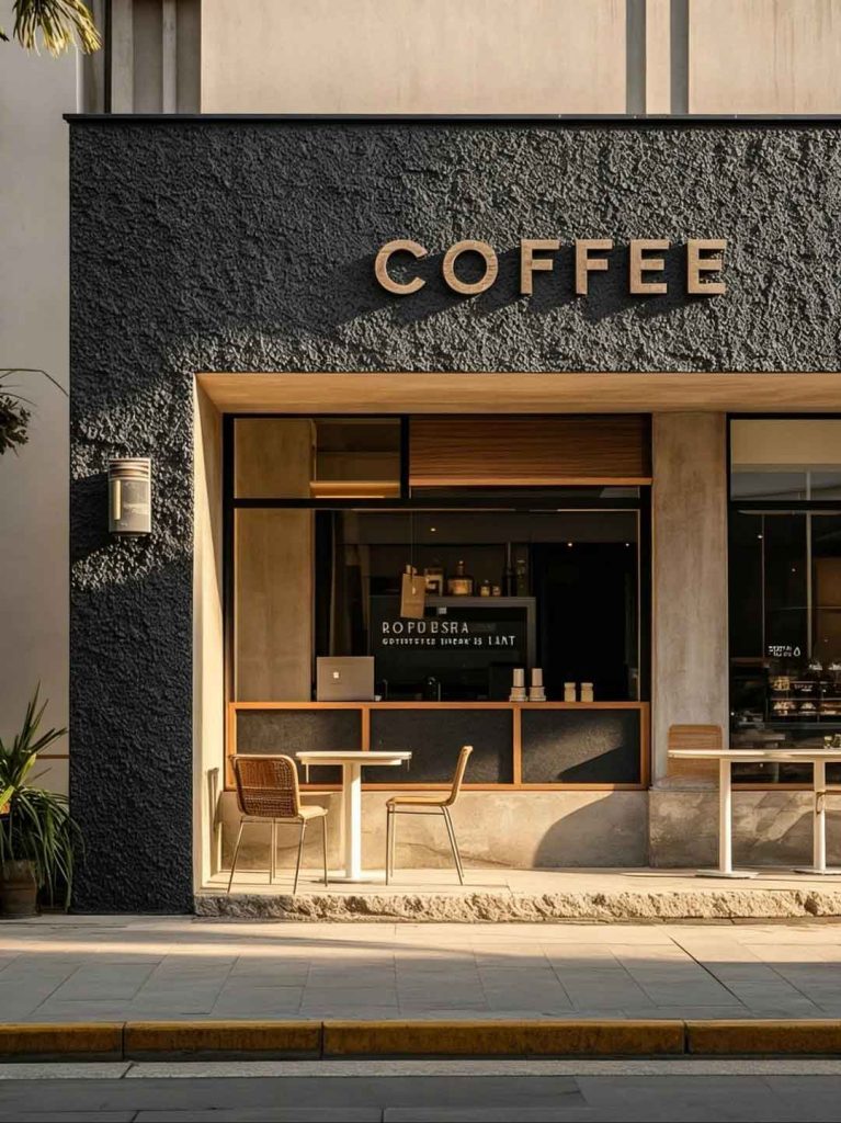
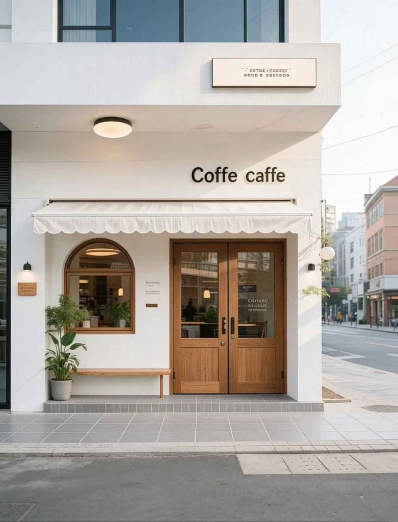
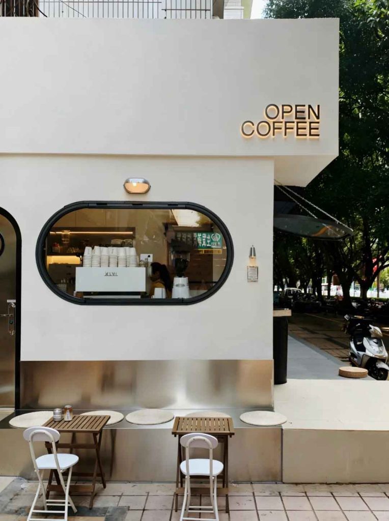
This case study explores a poetic approach to cafe signage design where natural light becomes a primary design material. The “Weaving Sunlight” concept uses translucent materials, perforated surfaces, and strategic orientation to create a storefront sign that transforms throughout the day as sunlight moves across the facade. The design captures the ephemeral beauty of natural light while maintaining clear brand communication.
The central idea treats sunlight as a design partner. The primary signage uses layered translucent panels that filter and color the light passing through them, creating ever-changing patterns on the interior floor and walls. The brand name is applied through a negative-space technique in the upper panel layer, allowing sunlight to define the letterforms rather than opaque materials. The color palette draws from sunrise and sunset tones—soft amber, warm peach, and cream—echoing the golden hour light that coffee drinkers cherish.
The typography is deliberately light and airy, using a thin sans-serif with generous letter spacing that appears to float when backlit. The overall composition feels organic and fluid, in contrast to rigid commercial signage conventions.
The primary sign structure uses a powder-coated aluminum frame holding multiple layers of acrylic panels in varying translucency. The outer panels use a frosted finish with selective transparency, while inner layers introduce subtle color gradients. Perforated metal screens create dappled light effects on the surrounding surfaces. All materials are UV-stable with UV-filtering properties to protect interior furnishings from solar damage while allowing the light-play effect.
The interior-facing side of the signage is finished with a warm wood veneer that catches reflected light. The overall assembly is designed for easy panel replacement if colors need refreshing.
The Weaving Sunlight installation creates a dynamic storefront experience that changes hourly and seasonally. Customers report lingering longer to experience the shifting light patterns, increasing dwell time and order value. The sign has become a talking point and photo subject, generating organic social media content. The project demonstrates how signage can transcend pure communication to become an experiential architectural element that enhances the customer experience.
Browse more related signage design projects from our portfolio:
Need custom design for your business? Contact our design team for a personalized consultation.