From $19.9

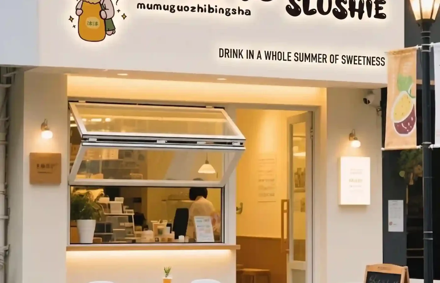
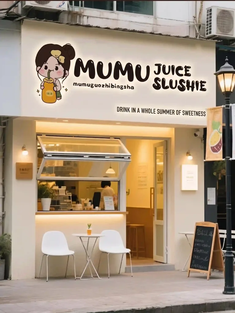
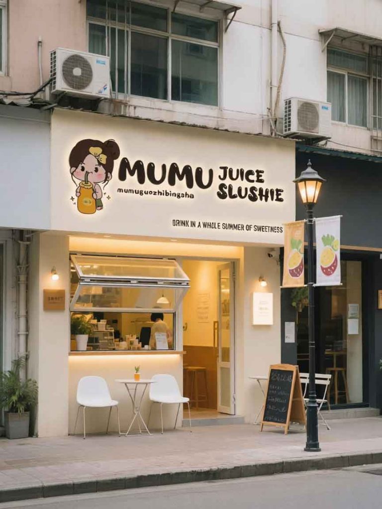
The primary objective for the Mumu Juice Slushie storefront signage is to convert a local, charming juice shop into an universally recognized destination for high-quality, hand-crafted fruit beverages and frozen desserts. The design balances a playful, accessible identity with a sleek, premium presentation that hints at artisanal quality.
The key challenges were twofold: translating the Chinese name into English while maintaining its brand equity and ensuring the entire facade—text, logo, and slogan—functions as a cohesive, glowing beacon of freshness on a busy street. Our solution centers on typographic excellence and a careful integration of hand-drawn warmth with modern lighting technology.
The Core Brand Mark: The central logo is a masterclass in approachable brand identity. We have taken the Chinese brand, mumu (meaning “wood” or “tree” and often used as a friendly nickname), and rendered it in a bespoke, thick, dark charcoal font. The letters are slightly irregular and weighted, mimicking the organic shapes found in nature and the hand-pressed nature of real fruit juice. To create a sense of refined polish and maximum nighttime visibility, these letters are backlit with a soft, warm LED halo. This provides a “glow from within” effect that is both luxurious and incredibly inviting, contrasting with the creamy facade.
Typographic Hierarchy: Directly adjacent to the main Mumu logo is the descriptive text, “JUICE SLUSHIE.” We selected a matching, similarly weighted but slightly more linear font to ensure maximum legibility. The two text elements work together to form a balanced, single-line unit. Below this, we have retained the specific Chinese Pinyin (“mumuguozhibingsha”) in a smaller, delicate font, acknowledging the brand’s origins and serving as a quality seal.
The Slogan: “Drink in a whole summer of sweetness.” Located in the lower right, this slogan uses a lighter, clean sans-serif font. This difference in weight establishes a clear visual hierarchy, allowing the brand name to dominate while the slogan provides a deeper, emotional takeaway. It’s an invitation, not just a label.
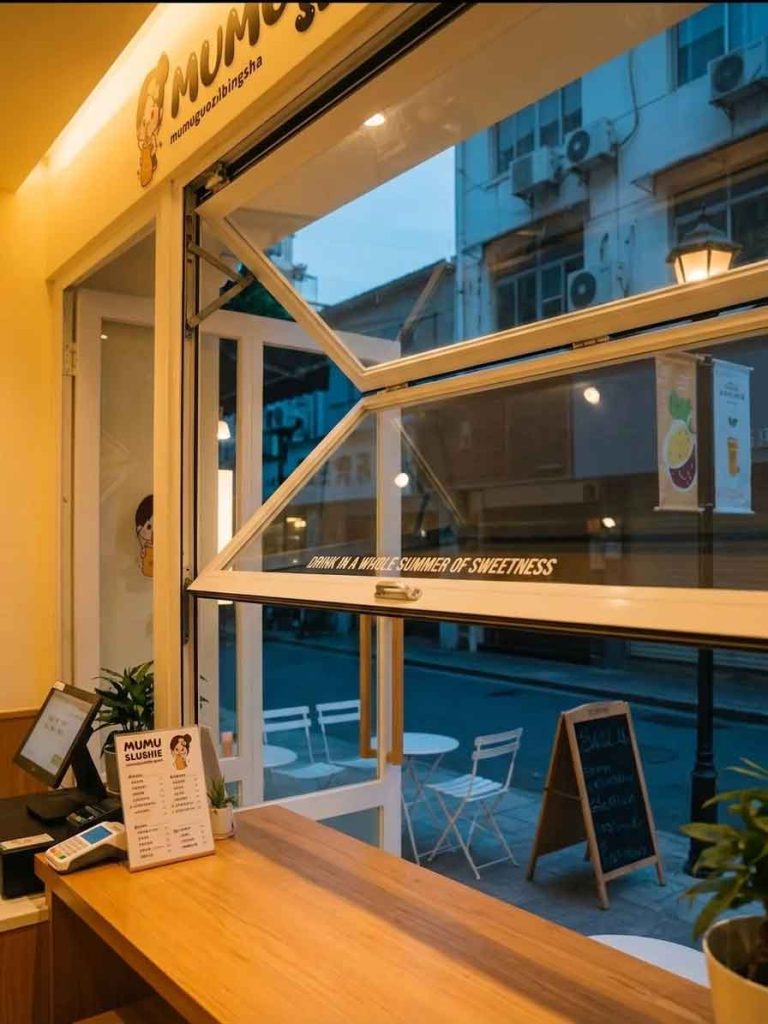
The signage does not exist in a vacuum; it is an extension of the building’s architecture. The main sign band is a creamy, warm off-white, acting as a clean canvas for the dark text. When viewed alongside the other elements—the charming cartoon icon (retained for personality), the cozy folded window with its warm interior glow, and the elegant street lamps—the whole composition creates a perfect narrative.
Mumu is a place where modern street culture meets old-world craftsmanship. The signage is bold yet soft, artisanal yet technologically precise. This design ensures that every patron, whether looking for a quick slushie or a curated juice blend, receives the same promise of warm, handmade quality before they even step through the door.
design for your business? Contact our design team for a personalized consultation.
Browse more related signage design projects from our portfolio:
Need custom signage design for your business? Contact our design team for a personalized consultation.