From $19.9

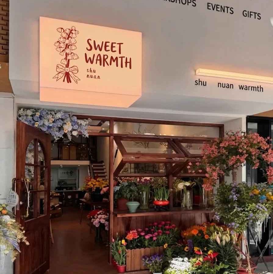
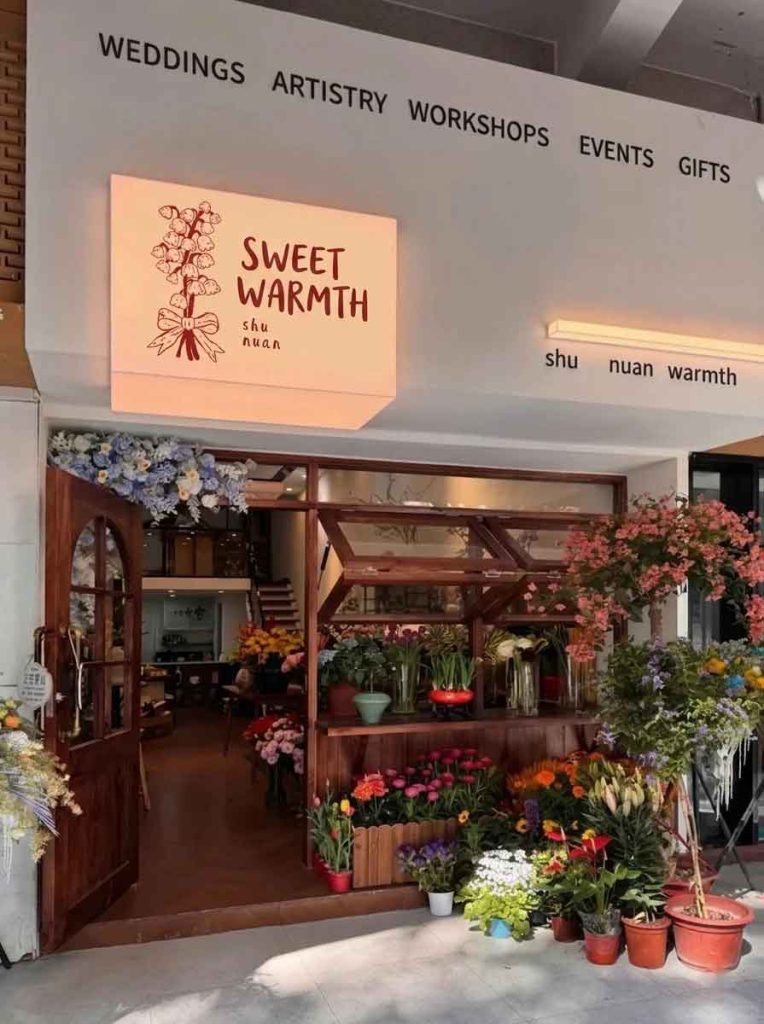
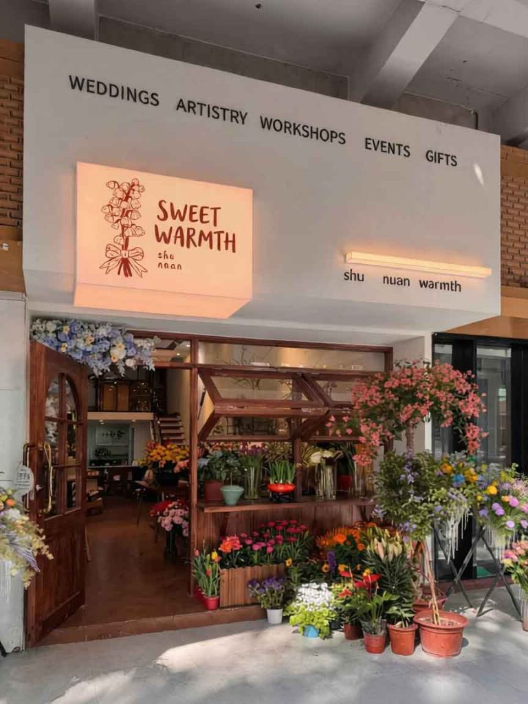
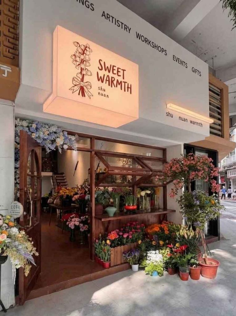
The project focuses on the rebranding and signboard localization of an artisanal boutique flower shop. In the original image , the storefront exudes a warm, pastoral charm characterized by rich wooden window framing, open-air floral displays, and a soft, glowing light-box signboard. The original branding featured the Chinese name (Shù Nuǎn, evoking a bundle of warmth) in a playful, hand-carved calligraphic style, along with its Pinyin and a list of services.
To elevate the brand’s reach in a cosmopolitan market, the redesign converts the primary and secondary text assets into English. The design imperative was to maintain the shop’s comforting, whimsical, and handcrafted aesthetic while establishing clean typographic readability.
The abstract, poetic sentiment of the Chinese name was translated into the inviting English name: “SWEET WARMTH”.
Font and Style: Rather than utilizing a rigid, computerized geometric font, the design employs a custom, hand-drawn sans-serif typeface. The organic variations in stroke thickness and slightly rounded edges perfectly mirror the playful, handcrafted soul of the original Chinese characters.
Color and Hierarchy: The text maintains the original dark terracotta-red hue, standing out sharply against the warm, creamy beige background of the illuminated box sign. The original Pinyin “shu nuan” is subtly preserved in a smaller size directly beneath the main title to honor its brand origins.
Mascot Preservation: The delicate line art illustration of a tied bouquet of lily of the valley flowers on the left side of the light box remains untouched. It serves as a vital graphic anchor, keeping the identity intimately tied to nature and romance.
The original Chinese text on the right wall was fully modernized to accommodate an international customer base:
Top Architectural Border: The upper rim of the facade now features a clean, widely spaced typographic banner reading: “WEDDINGS · ARTISTRY · WORKSHOPS · EVENTS · GIFTS”. This high-level categorization cleanly summarizes the business offerings from a distance.
Accent Strip: Beneath the linear architectural lighting strip, a subtle lower-case sub-branding line reading “shu nuan warmth” is added, harmonizing the modern exterior layout with the core light-box message.
The upgraded English signboard blends effortlessly with the existing architectural texture. The terracotta text color complements the rich, dark tones of the wooden French windows and the warm hardwood flooring inside. The soft, ambient backlighting from the main sign casts a gentle glow over the vibrant, cascading arrangements of hydrangeas, roses, and potted plants at the entry, reinforcing the shop’s core concept of being a cozy sanctuary.
Illustrates how a brand can transition into global accessibility without sacrificing its romantic, artisanal roots. By utilizing soft, hand-lettered English typography and maintaining the original warm color scheme, the storefront achieves an elegant, highly scannable presence that remains deeply personal and welcoming.
design for your business? Contact our design team for a personalized consultation.
Browse more related signage design projects from our portfolio:
Need custom signage design for your business? Contact our design team for a personalized consultation.