From $19.9

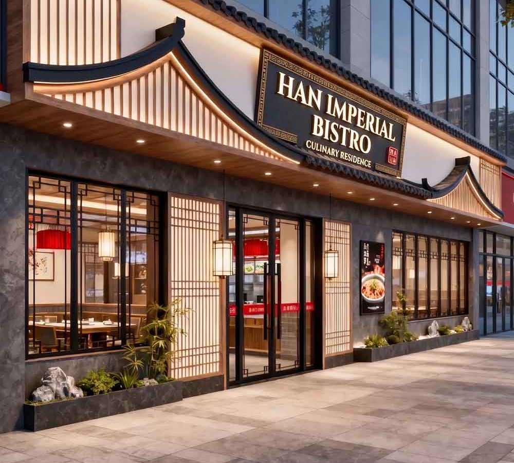
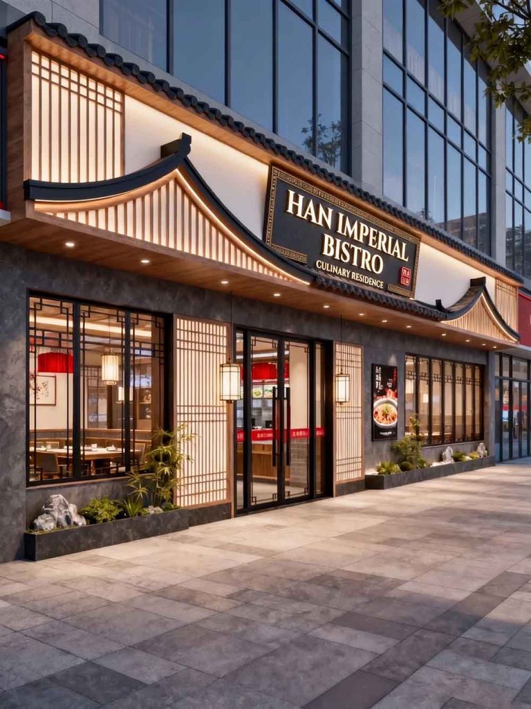
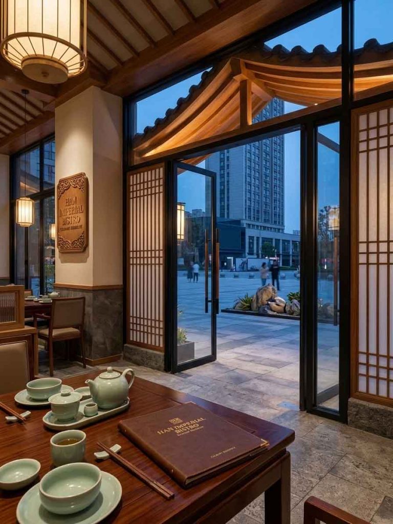
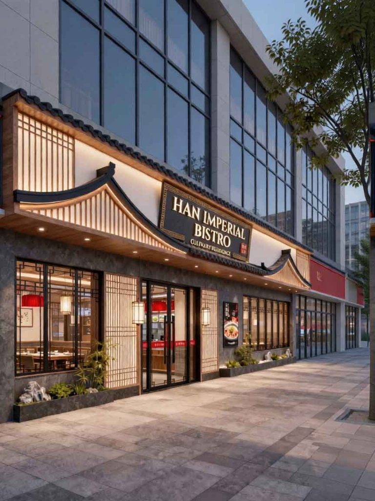
The subject of this architectural redesign is a high-end Chinese restaurant specializing in Han dynasty culinary traditions and cultural atmosphere. In the original image (3.jpg), the magnificent facade utilizes classical Chinese architecture, featuring a sweeping tilted roofline, timber latticework screen panels, and a central placard showcasing the name (Hàn Shí Tíng Fǔ).
To appeal to a sophisticated, international dining crowd while respecting the historical weight of the establishment, the primary objective of this project was to translate and redesign the main plaque into English. The main challenge was to introduce Latin typography without disrupting the regal, ancient Chinese atmosphere of the facade.
The majestic name —which evokes the feeling of dining within a grand imperial courtyard—was translated into “HAN IMPERIAL BISTRO”.
Font Selection: To retain the stately aura of traditional Chinese calligraphy, a refined, high-contrast serif typeface was selected. The sharp serifs and elegant proportions of the letters echo classical Roman stone inscriptions, creating a perfect cross-cultural bridge with the surrounding Chinese architectural details.
Layout and Dimensionality: The English title is split cleanly into two stacked lines—”HAN IMPERIAL” on top and “BISTRO” underneath. The letters are crafted as 3D dimensional blocks with a warm gold-leaf finish, catching the integrated spotlighting to gleam against the dark board.
The poetic nuance of (meaning estate or residence) was subtly carried over into a new English subtitle: “CULINARY RESIDENCE”.
Placement & Detail: This descriptive phrase is placed along the lowest rim of the text block in a smaller, clean sans-serif font. Furthermore, the ornamental gold geometric frame running along the border of the rectangular plaque was meticulously preserved, as was the small red vertical seal stamp on the lower right, anchoring the design in authentic oriental heritage.
The updated English placard integrates flawlessly with the surrounding facade elements. The golden text directly mirrors the warm ambient light radiating from the traditional paper lanterns flanking the entryway and the lighting built underneath the sweeping black tiled eaves. The contrast between the brilliant gold font, the charcoal gray stone walls, and the light wood accents maintains a balanced, stately rhythm across the entire property.
By utilizing structured, golden serif lettering inside the traditional framed plaque, the restaurant establishes an upscale, globally accessible brand presence. It clearly communicates a premium dining experience to international patrons while remaining deeply rooted in classical Chinese grandeur.
design for your business? Contact our design team for a personalized consultation.
Browse more related signage design projects from our portfolio:
Need custom signage design for your business? Contact our design team for a personalized consultation.