From $19.9

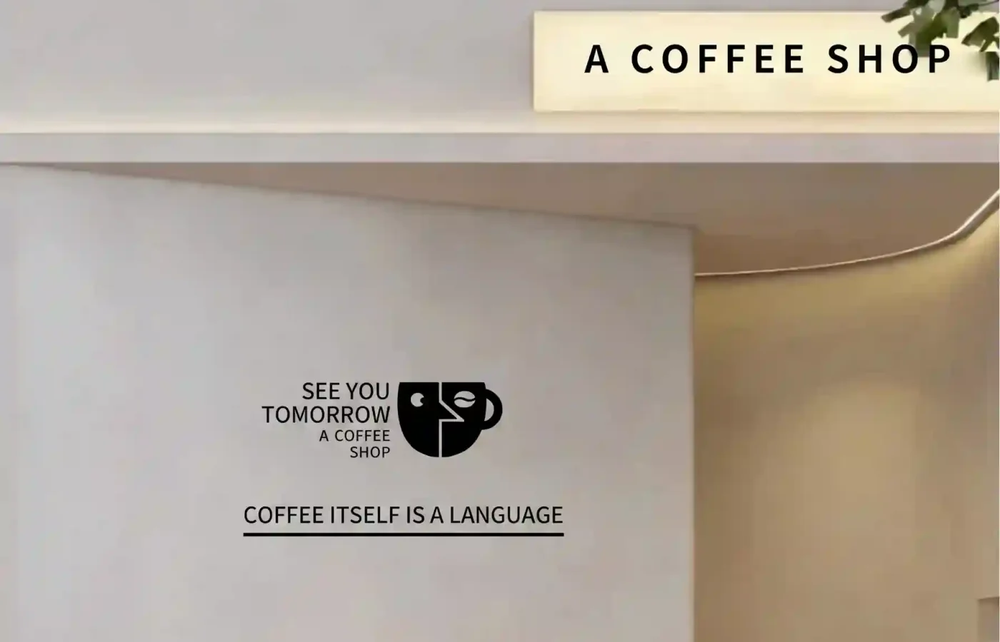
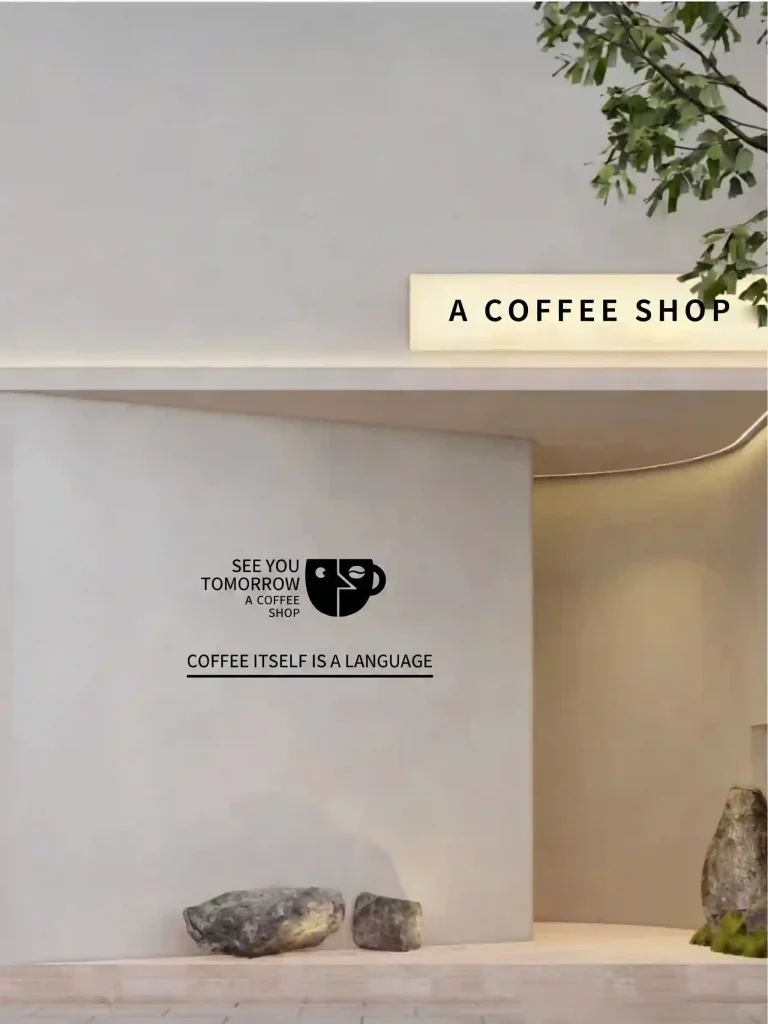
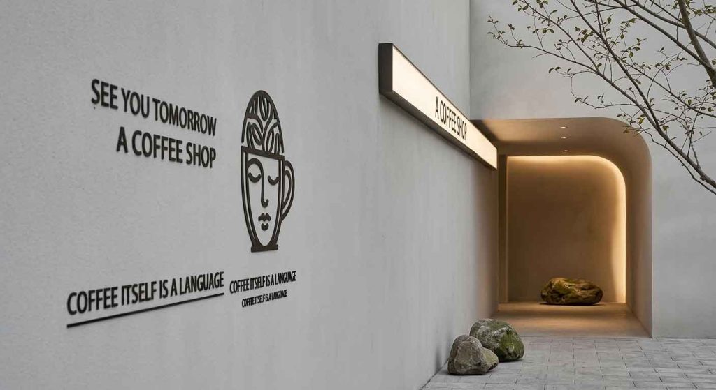
The objective of this design project is to create a highly restrained, artistic storefront signage system for a boutique specialty café named “A COFFEE SHOP”. Rooted in a mixture of modern industrial minimalism and Japanese Wabi-Sabi philosophy, the brand identity centers on slow living, quiet reflection, and poetic geometry. The design treats the storefront not as a loud advertisement, but as a silent, monolithic gallery canvas that welcomes urban commuters to pause, reset, and connect.
The facade features an expansive, seamless wall constructed from light-grey micro-cement or raw matte plaster.
The Geometry: The architectural lines are sharp yet fluid, utilizing a geometric overhang that casts soft, architectural shadows.
The Organic Accents: The coldness of the concrete is balanced by warm, natural landscape accents at the base—specifically, raw, unpolished mossy stones resting on a stone pavement, beneath the delicate overhang of nearby green trees.
The signage system is split into three distinct, low-contrast components to interact with this architectural layout gracefully.
Positioned subtly above the main doorway corridor, a sleek, elongated rectangular light-box is recessed under the concrete ledge.
Material & Illumination: The face of the light-box utilizes a premium frosted glass or milky-white acrylic panel, diffusing a warm, gentle ivory glow ($3500text{K}$).
Typography: The primary brand name “A COFFEE SHOP” is printed in a clean, bold, medium-weight sans-serif typeface with generous kerning. It serves as a crisp, structural landmark for pedestrians approaching from a distance.
Mounted centrally at eye level on the main micro-cement wall is the café’s primary graphic identity block, rendered entirely in a high-contrast matte charcoal black.
The Monogram: The focal icon is a brilliant abstract graphic combining a side-profile face and a coffee mug. The left side forms a simple face with a coffee bean eye, while the right side curves into a sleek mug handle, perfectly embodying the brand’s human-centric approach to coffee culture.
The English Brand Translation: Replacing the original Chinese text, the graphic is cleanly flanked by stacked English text reading “SEE YOU TOMORROW / A COFFEE SHOP”, using a balanced, clean sans-serif layout.
Underneath the core logo block sits a thin, continuous black horizontal rule that underlines the café’s driving philosophical manifesto: “COFFEE ITSELF IS A LANGUAGE.”
Execution: Translated from the original Chinese quote, this slogan is executed in a lighter, perfectly tracked sans-serif font. The underline acts as a geometric anchor, turning a simple wall statement into a high-end, editorial graphic installation.
The combination of crisp charcoal typography, an artistic face-mug icon, and a glowing ivory light-box blends seamlessly into the raw plaster architecture, proving that in a crowded urban landscape, a whisper can command far more attention than a shout.
design for your business? Contact our design team for a personalized consultation.
Browse more related signage design projects from our portfolio:
Need custom signage design for your business? Contact our design team for a personalized consultation.