From $19.9

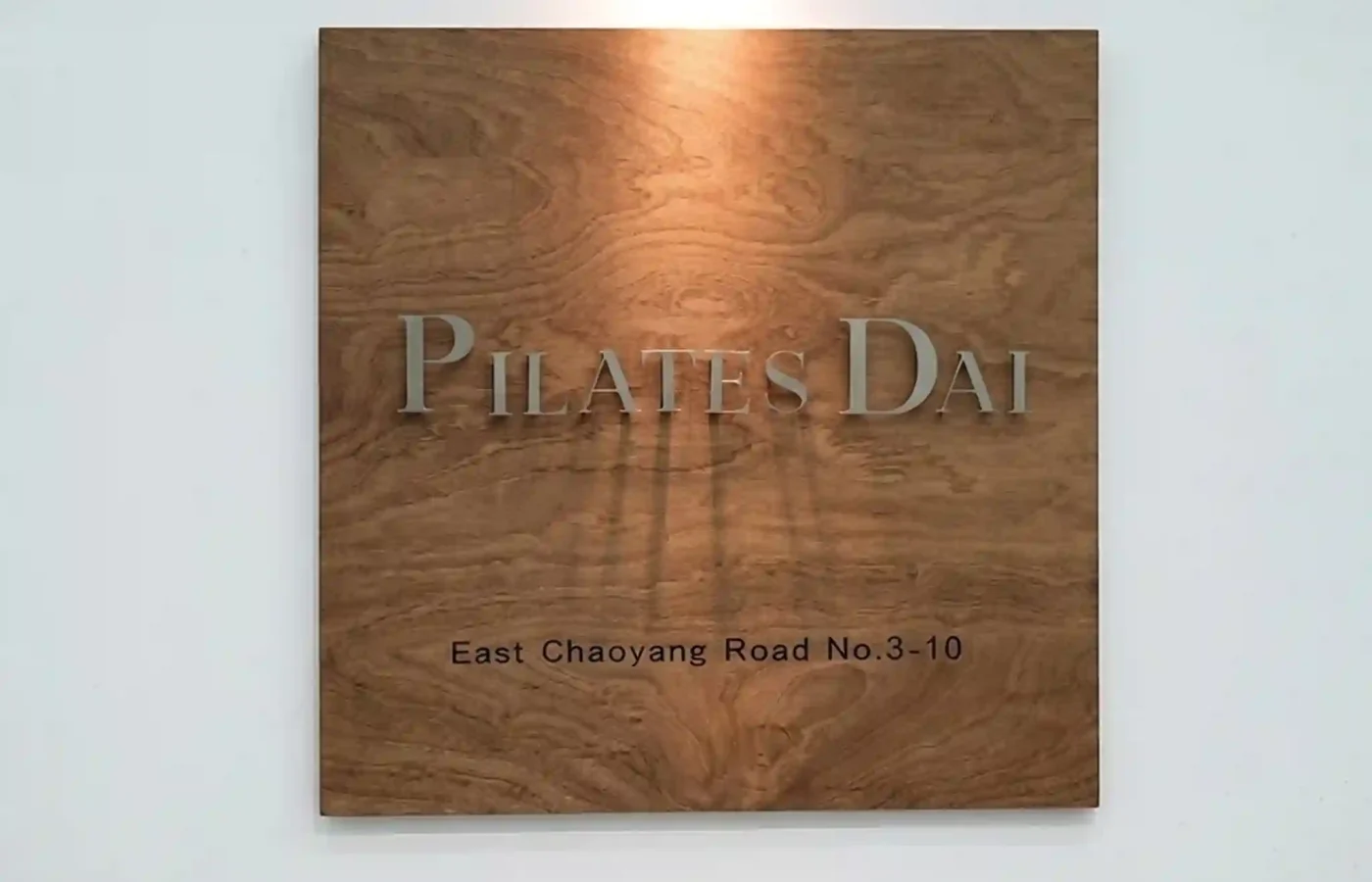
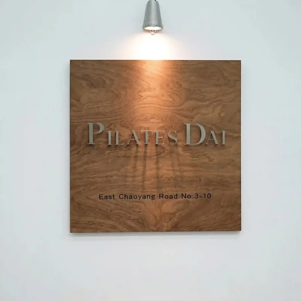

The objective of this design project is to create a refined, understated indoor plaque for “PILATES DAI”, a premium boutique wellness and fitness studio. The brand identity focuses on mindfulness, structural balance, and natural health. The signage is designed for an interior environment—such as an entrance lobby, a reception wall, or a corridor focal point—aiming to convey a sense of calm, tranquility, and high-end artisanal quality the moment clients arrive.
The design embraces a clean, organic-minimalist aesthetic. The plaque is mounted onto a smooth, matte white gallery wall, which provides a stark, uncluttered background that allows the signage materials to become the focal point.
The Backing Board: The sign is anchored by a square panel crafted from rich, natural walnut or teak wood. The organic, undulating wood grain pattern is left fully visible, introducing warmth, texture, and a grounded, earth-centric element to the interior space.
The main brand name is positioned centrally across the upper half of the wooden panel.
Typography: The text is rendered in an elegant, transitional serif font with sophisticated proportions. The high-contrast line weights and crisp serifs project a classic, trustworthy, and premium aesthetic, aligning with the precision required in Pilates training.
Material & Dimensonality: The letters are cut from solid, satin-finished frosted acrylic or brushed silver metal. This cool, metallic-grey tone contrasts beautifully against the warm brown of the wood. The letters are raised, giving them a three-dimensional presence.
On the lower portion of the plaque, the functional address “East Chaoyang Road No.3-10” is crisply etched or printed directly onto the wood surface.
Execution: Shifting to a clean, understated sans-serif typeface in a dark charcoal tone, this text provides essential geographic details while respecting the visual hierarchy. It anchors the floating brand name above.
The defining characteristic of this design installation is its reliance on precise directional lighting:
The Fixture: A sleek, conical metallic spotlight is mounted directly above the plaque on the white wall.
The Effect: The fixture casts a warm, concentrated cone of downlight over the top edge of the wooden board. This overhead illumination catches the raised edges of the “PILATES DAI” letters, casting soft, elongated vertical shadows down the face of the wood grain. This intentional shadow play adds profound depth and an ever-changing textural quality throughout the day.
By successfully merging the organic warmth of a natural wooden backing with crisp, silver-serif typography, the plaque for PILATES DAI achieves a timeless aesthetic of quiet luxury. It proves that indoor corporate signage can transcend basic identification, transforming into a beautiful architectural art piece that communicates wellness, balance, and meticulous craftsmanship.
design for your business? Contact our design team for a personalized consultation.
Browse more related signage design projects from our portfolio:
Need custom signage design for your business? Contact our design team for a personalized consultation.