From $19.9

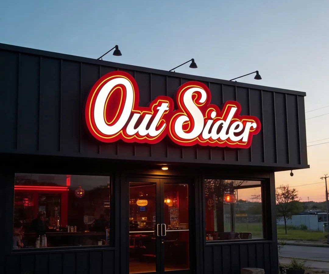
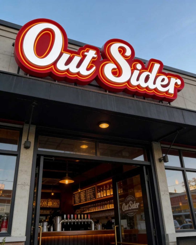
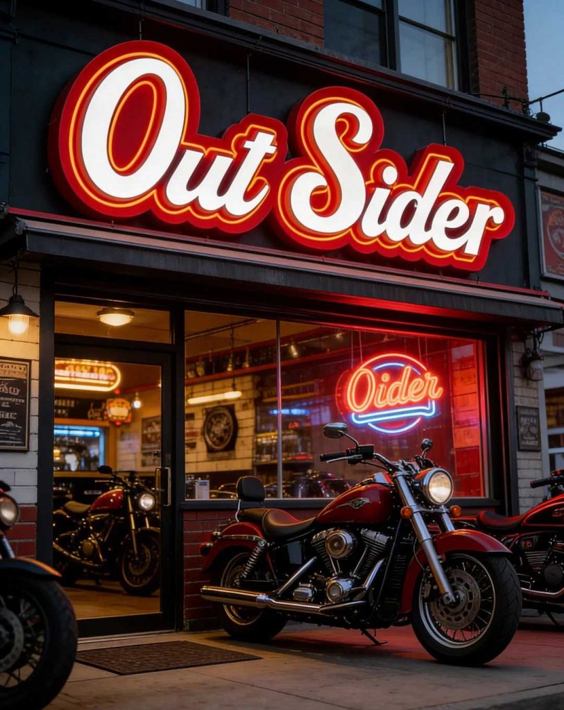
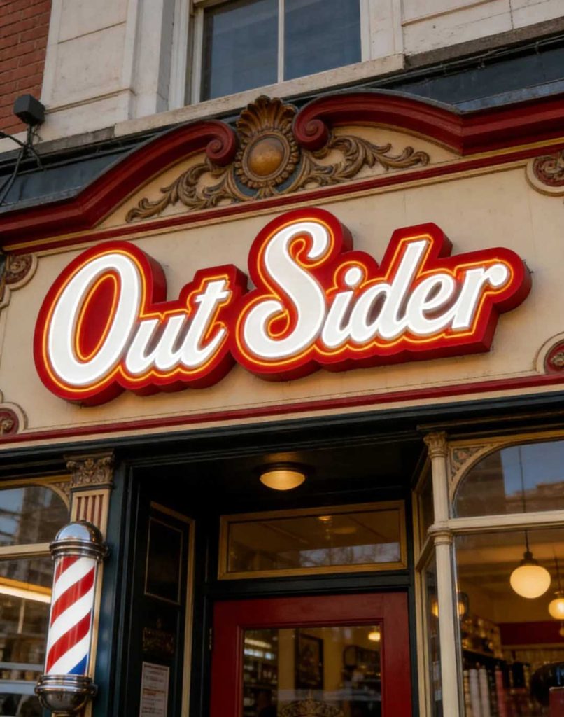
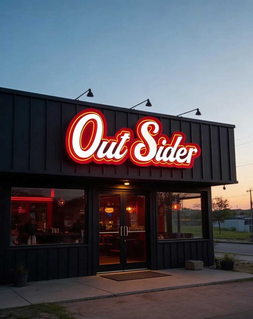
The combination of a 3D letter shell with a neon light strip represents one of the most versatile signage solutions for small and medium-sized businesses. This installation uses thick red letter shells with warm white neon lighting wrapped around the contours of each character, creating a layered visual effect that reads differently depending on the time of day. During daylight hours, the bold red letter forms stand out against virtually any background material — brick, concrete, wood, or glass — acting as a confident retro sign that communicates personality at a glance.
When evening arrives, the sign transforms. The warm white neon strips cast a soft halo around each letter, creating a glow visible from significant distances. This dual-mode visibility is the core of its traffic-generating capability: it captures attention actively during the day through bold color, and passively at night through warm illumination. Businesses using this configuration report measurable increases in foot traffic, with some owners noting a 30 percent uplift in store visits and a corresponding increase in spontaneous photography and social media check-ins.
The typographic treatment is a critical element of this sign’s effectiveness. The letterforms use a rounded handwritten script style that feels casual and unrestrained, avoiding the formality of serif typography and the coldness of sans-serif block letters. This handwritten quality gives the sign a personal, approachable character that resonates particularly well with hospitality and lifestyle businesses — motorcycle shops, bars, American-style restaurants, and casual dining establishments all benefit from the relaxed energy the calligraphy conveys. The rounded edges also catch and reflect neon light more effectively than sharp angular forms, maximizing the glow effect at night.
Behind the aesthetic appeal is serious engineering for outdoor durability. The letter shells are fabricated from high-density polyurethane or fiberglass, chosen for their resistance to warping and moisture absorption. A multi-layer automotive-grade paint system provides UV protection that prevents fading even under years of direct sunlight. The neon strips are enclosed in flexible silicone tubes that are fully waterproof and dustproof, rated to IP65 for outdoor continuous use. All electrical connections are housed in sealed junction boxes with weatherproof gaskets. The result is a sign that requires virtually no maintenance beyond an occasional wipe-down, delivering reliable performance through all seasons.
Every element of this signage system is customizable to match the specific needs of the business. Font style, letter size, color, and lighting temperature can all be adjusted. The letter shells can be produced in any color from the full RAL or Pantone spectrum, allowing the sign to either match an existing brand palette or introduce a new accent color. The neon strip color is equally flexible — warm white produces the classic retro effect, but cool white, red, blue, green, or RGB color-changing options are available for a more contemporary look.
The installation photographs demonstrate the sign’s adaptability across architectural contexts. On old red brick, the red letter shells harmonize with warm tones while the neon creates a modern counterpoint. Mounted on an industrial shipping container, the sign reads as a natural extension of the urban aesthetic. On a retro carved stone storefront, it reinforces the vintage character. The sign looks as though it belongs — as though the building itself has been waiting for those glowing letters. Many owners report that after switching to this illuminated letter set, their shop became a local landmark, with patrons photographing the sign and tagging the business on social media.
The success of this signage approach can be attributed to three converging factors. First, the dimensional letter shells create physical depth that flat signs cannot match — the shadows during the day and the halos at night give the sign a sculptural presence that reads as substantial and permanent. Second, the neon strip lighting taps into deep cultural associations with neon as a marker of nightlife and urban energy, triggering an emotional response beyond mere visibility. Third, the handwritten calligraphy communicates approachability, signaling that the business behind the sign is a place with character and story.
For business owners evaluating signage investments, the key takeaway is that a sign does not need to cover an entire facade to be effective. A small number of well-crafted dimensional letters, thoughtfully lit and positioned, can outperform a massive flat-panel sign in both visibility and memorability. This installation proves that the measurable return — more foot traffic, more photo check-ins, more word-of-mouth discovery — justifies the investment many times over. When a sign blends retro and contemporary elements, making passersby want to come in and sit down, it has achieved the ultimate goal of storefront design: turning casual observation into active engagement.
Interested in a custom storefront sign design? Contact Y Design Guide for a free consultation.