From $19.9

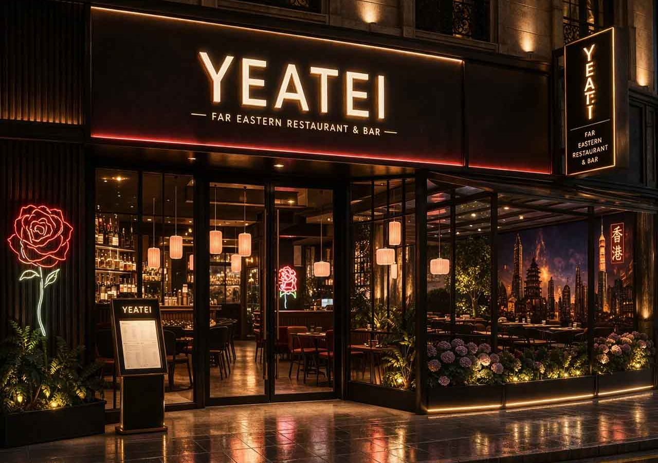
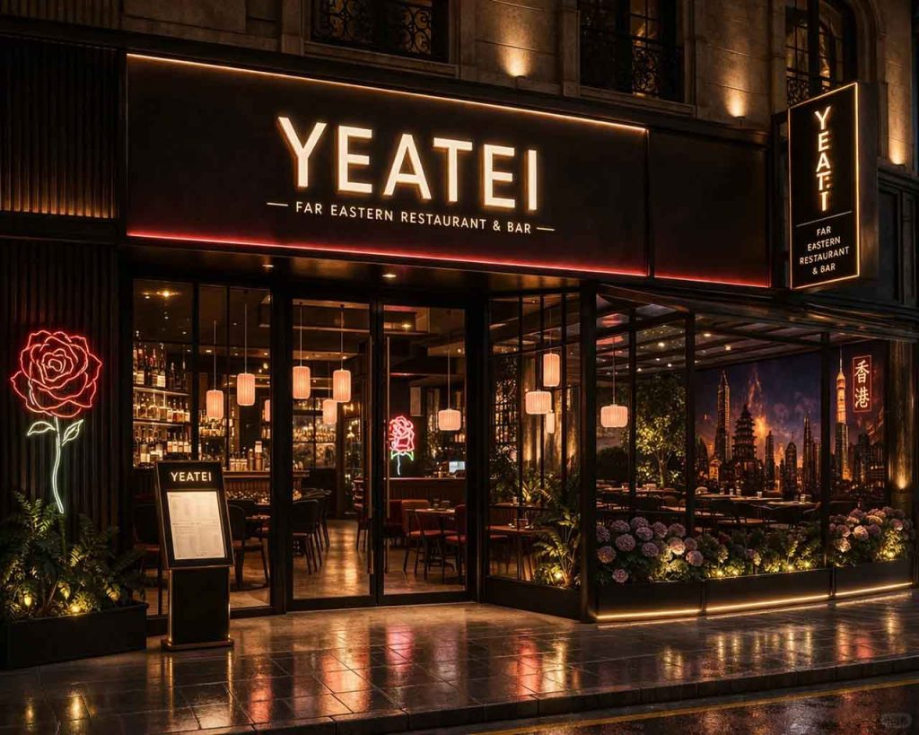
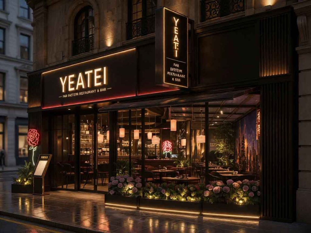
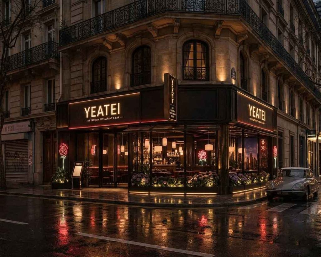
A well-regarded restaurant and wine bar in Milan’s Brera district needed a storefront sign that bridged contemporary minimalism with old-world charm. Known for modern Italian cuisine and a curated vintage wine list, the establishment required a façade that whispered elegance rather than shouted for attention—no oversized branding, no aggressive visuals.
Our team settled on a concept rooted in restraint and contrast. The palette would be restricted to black and gold, deployed with a light touch: matte, textured blacks to ground the composition and warm, softly illuminated gold to draw the eye. The mood evoked a vintage Milanese trattoria filtered through contemporary sensibility—clean lines, deliberate negative space, and drama that emerges only at night. The lettering would be fabricated from solid brass with a brushed gold finish, mounted on a deep matte-black anodized aluminium panel that absorbs light rather than reflecting it.
At the heart of the YEATEI solution is layered illumination. Many restaurant signs rely on a single overpowering light source that flattens the façade. Here, we approached lighting as a three-tier system.
The primary layer is the sign itself: individually illuminated gold lettering on a dark matte background. Each letter is backlit with warm-white LEDs (2700K), creating a subtle halo that makes the typography appear to float off the panel. The gold finish catches and scatters this light, producing a soft luminance legible across the street yet remarkably gentle up close—never harsh, never garish.
The second layer comprises the interior window lighting. Dimmable warm-grazing fixtures play across the textured plaster walls inside, so passersby see the soft glow of candlelit tables, the gleam of wine glasses, and the subtle movement of shadows—an invitation that feels almost theatrical. This interior warmth blends seamlessly with the sign’s gold illumination, creating a continuous visual field from the street to the dining table.
The third and most subtle layer is accent lighting aimed at architectural details: a brass handrail beside the entrance, exposed brickwork, and a ceramic planter. These carefully placed points of light add depth and texture, ensuring the sign becomes part of a larger, harmonious street-level composition.
When the palette is restricted to two colours, every surface finish must be intentional. The background panel is 12mm anodized aluminium with a deep black matte finish—chosen over powder coating for its stable, scratch-resistant surface that retains its velvety texture through years of sun, rain, and urban exposure. The aluminium substrate keeps the panel lightweight and thermally stable, preventing warping in direct sunlight.
The lettering was waterjet-cut from 6mm solid brass, hand-polished, and finished with a brushed gold patination. Each letter was individually wired for LED backlighting through precisely drilled channels in the aluminium panel, allowing individual removal for maintenance without dismantling the entire sign.
We specified low-iron, anti-reflective glass for the main window panels, reducing the greenish tint of standard float glass and ensuring faithful colour transmission. At night, the glass doubles the visual impact of the interior lighting, creating depth and reflecting the warm glow of the gold lettering back onto the street. Metal window frames were finished in a custom dark bronze powder coat that bridges the black panel and gold lettering—a subtle middle note preventing an abrupt contrast.
Installation was completed over two evenings. The sign panel was mounted on a custom stainless-steel subframe 45mm off the wall, allowing air circulation to dissipate heat from the LED drivers and prevent moisture entrapment. The power supply was concealed in a weatherproof enclosure inside the entrance vestibule.
The transformation was immediate. Where the previous façade was cluttered with promotional decals and a generic backlit box sign, the new storefront presented a quietly commanding presence. By day, the matte black panel and brushed gold letters read as elegant architectural detailing—minimal enough to blend with the historic street, distinctive enough to mark the entrance. At night, the three illumination layers activate in sequence as daylight fades, gradually revealing the full depth and warmth of the composition.
Since installation, the restaurant has reported a measurable increase in walk-in dinner reservations, with several new patrons citing the façade as what drew them in. The sign has become a local landmark: a favourite backdrop for evening photographs and a quiet signal of the quality that awaits inside. The project reaffirms that in hospitality signage, true sophistication is not about being seen—it is about creating an atmosphere people want to step into.
Interested in a custom storefront sign design? Contact Y Design Guide for a free consultation.