From $19.9

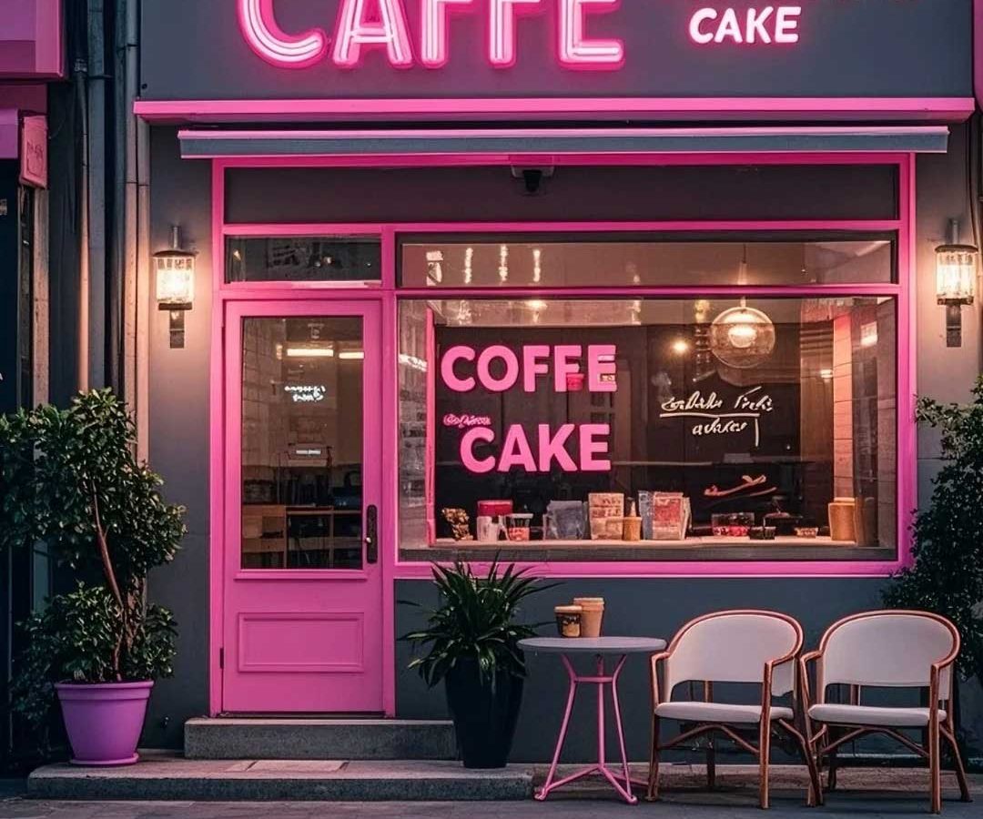
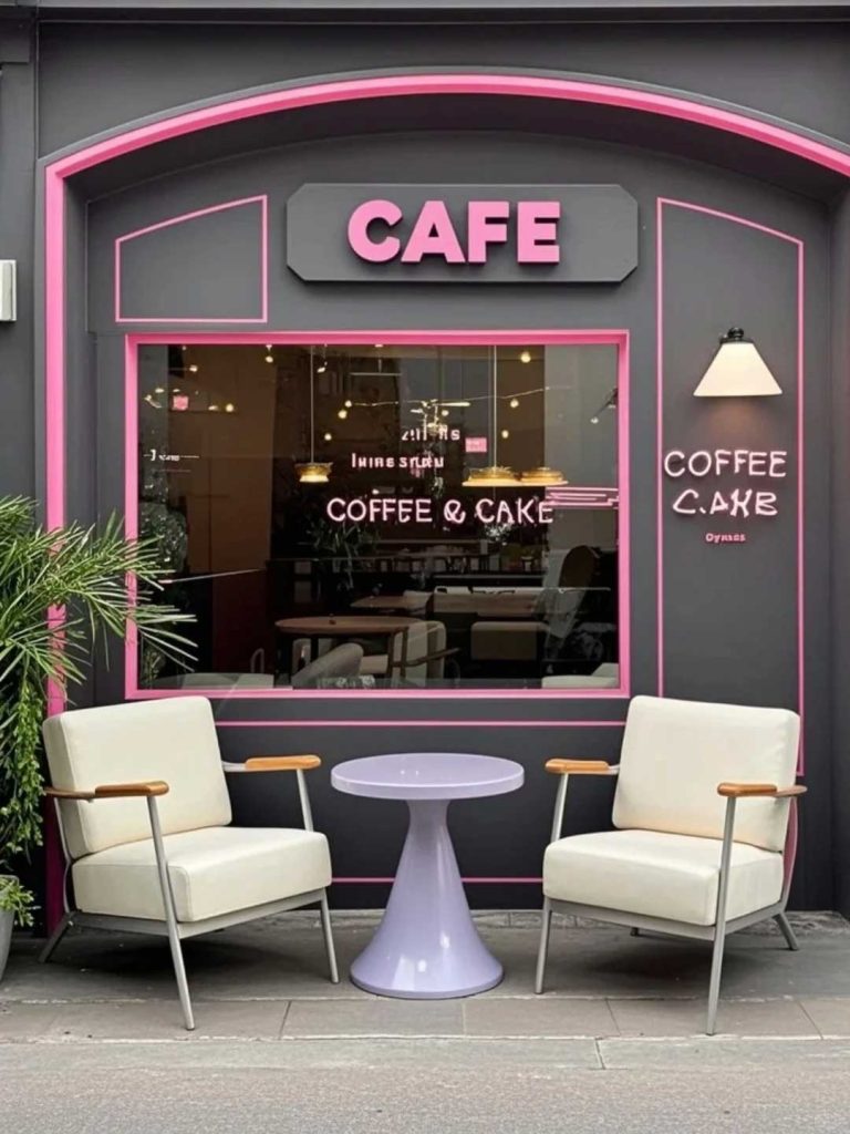
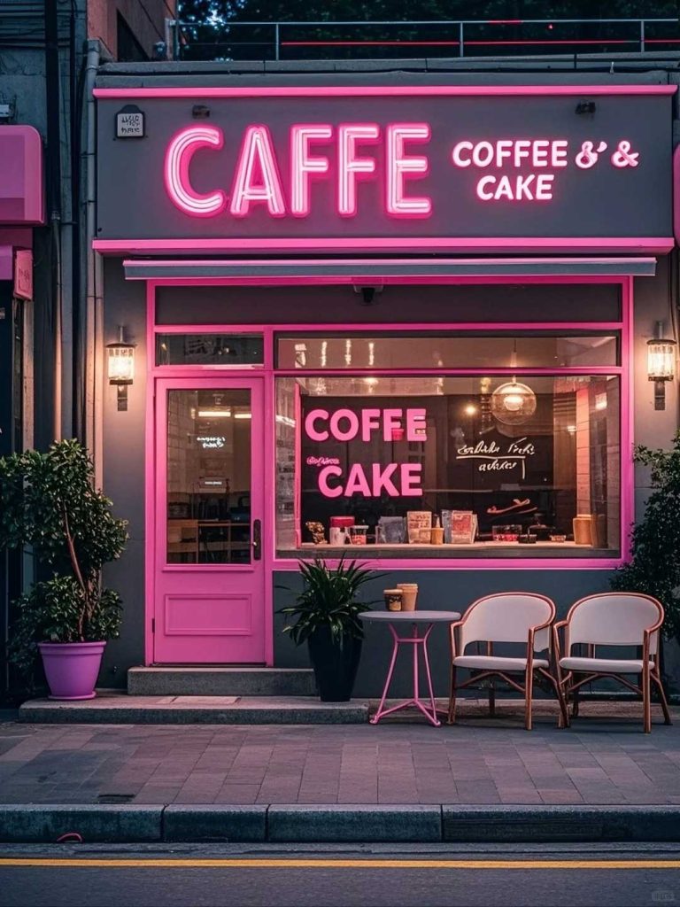
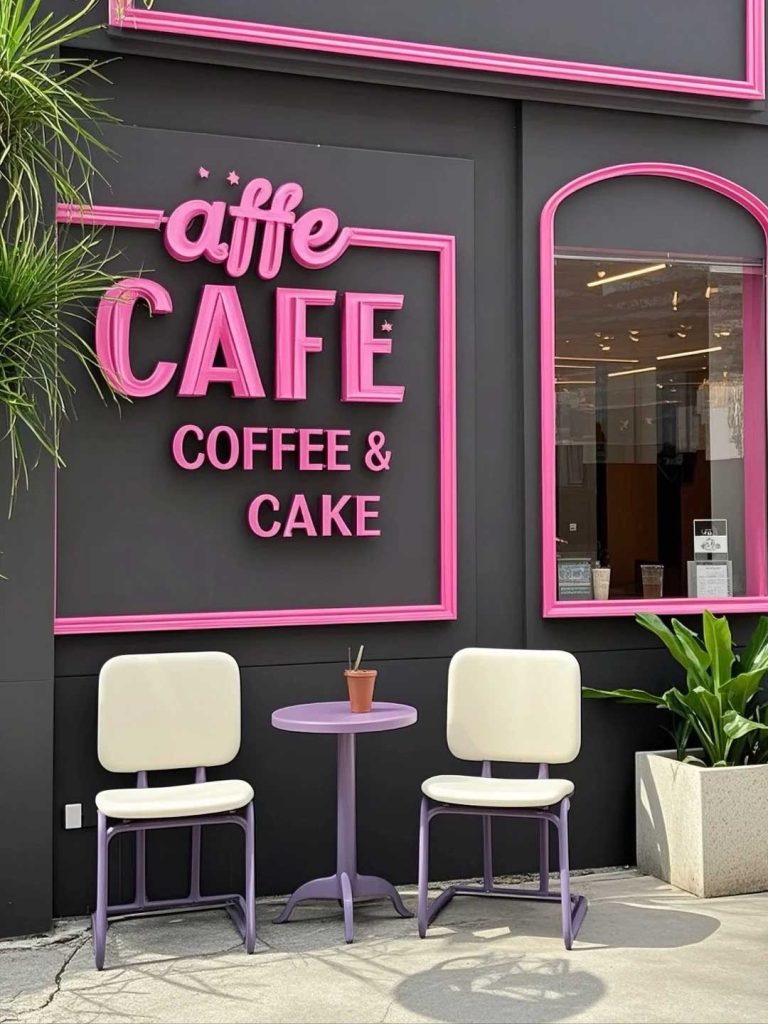
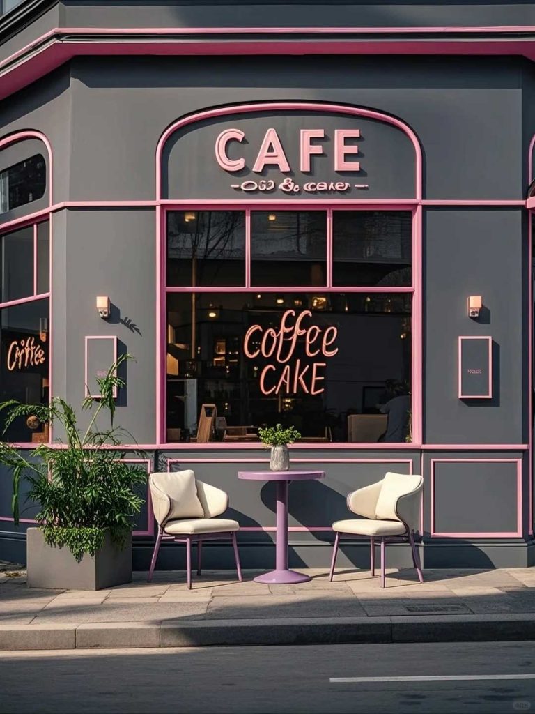
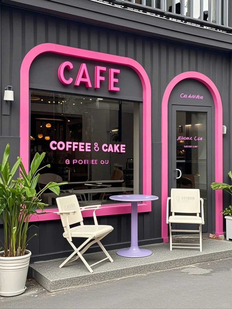
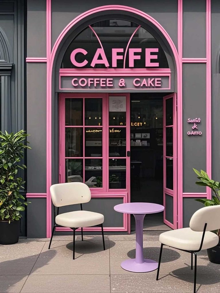
This case study celebrates a coffee shop signage design that puts color at the center of the brand experience. Rather than the muted earth tones typical of coffee shop design, this project embraces bold, unexpected color combinations that create an energetic and memorable storefront. The design demonstrates that coffee shop signage doesn’t have to follow conventions—sometimes the boldest choice is the right one.
The concept is built around fearless color blocking and artistic expression. The primary signage uses a custom display typeface in a vivid coral pink, applied as dimensional letters against a deep teal background panel. The unexpected color combination creates immediate visual impact and sets the coffee shop apart from neighboring establishments that default to brown, green, or black signage. A secondary accent panel in mustard yellow adds a third color element, creating a complete color story that feels curated rather than chaotic.
The layout is deliberately asymmetrical, with the brand name positioned off-center and supplemented by a small abstract graphic element—a coffee bean rendered as a colorful geometric shape rather than a realistic illustration. This artistic approach signals to customers that this is not a conventional coffee shop.
The primary letters are fabricated from CNC-routed HDU with a high-gloss painted finish in coral pink. The paint is automotive-grade for maximum color retention and UV resistance. The backing panel uses aluminum composite with a deep teal matte finish, providing a smooth surface that maximizes the color contrast. The mustard yellow accent panel uses a separate routed and painted piece mounted with standoffs, creating depth and shadow.
The window graphics use a combination of translucent colored vinyl and clear glass, creating colorful light patterns inside the shop while maintaining outward visibility. All materials are selected for maximum color saturation and long-term stability.
The colorful coffee shop signage has become a local landmark, instantly recognizable and frequently photographed. The bold color choices generate strong social media engagement and word-of-mouth marketing. Customers specifically mention the distinctive storefront as a reason for initial visits, and the interior color scheme maintains the energetic brand experience established at the entrance. The installation demonstrates that thoughtful, bold color choices in signage can create powerful competitive differentiation in a crowded market.
Browse more related signage design projects from our portfolio:
Need custom design for your business? Contact our design team for a personalized consultation.