From $19.9

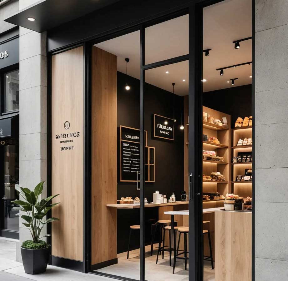
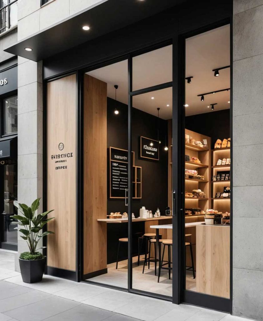
This case study presents a minimalist storefront signage design that embodies understated luxury. The project demonstrates that true premium branding doesn’t require loud colors or oversized graphics—instead, it relies on impeccable material selection, precise typography, and confident restraint. The resulting storefront speaks to discerning customers who recognize quality without needing it announced.
The minimalist luxury concept operates on the principle that “less is more”—every element must earn its place through purpose and quality. The primary signage uses a refined custom serif typeface with subtle spacing adjustments, appearing as a single elegant line across the facade. There is no logo mark, no tagline, no decorative element—just the brand name in perfectly executed lettering. The absence of visual noise is itself a statement of confidence.
The color palette is monochromatic: matte black, warm off-white, and natural brass. The facade itself serves as a neutral canvas, with the signage appearing as an integrated architectural element rather than an applied afterthought. The overall effect is quiet, assured, and unmistakably premium.
The primary lettering uses solid brass with a satin brushed finish, individually mounted with precision alignment on the facade. The brass is left untreated to develop a natural patina over time, a deliberate design choice that adds depth and character as the signage ages. The letters are side-illuminated with warm LED light strips recessed into the facade, creating a subtle glow that outlines the letterforms without direct light exposure.
The facade surface uses a matte lime-based plaster finish in warm off-white, providing a natural texture that complements the brass warmth. The overall material selection prioritizes natural materials and honest finishes—brass that ages, plaster with visible hand-trowel marks—embracing the Japanese wabi-sabi appreciation of imperfection and natural processes.
The minimalist luxury storefront has successfully attracted the target clientele—customers who appreciate and can afford premium products. The restrained design stands out precisely because it doesn’t try to stand out, creating a quiet confidence that resonates with discerning shoppers. The brass letters have begun developing their natural patina, adding depth and character that reinforces the brand’s commitment to quality and authenticity. The installation proves that in luxury signage, restraint is the ultimate sophistication.
Browse more related signage design projects from our portfolio:
Need custom design for your business? Contact our design team for a personalized consultation.