From $19.9

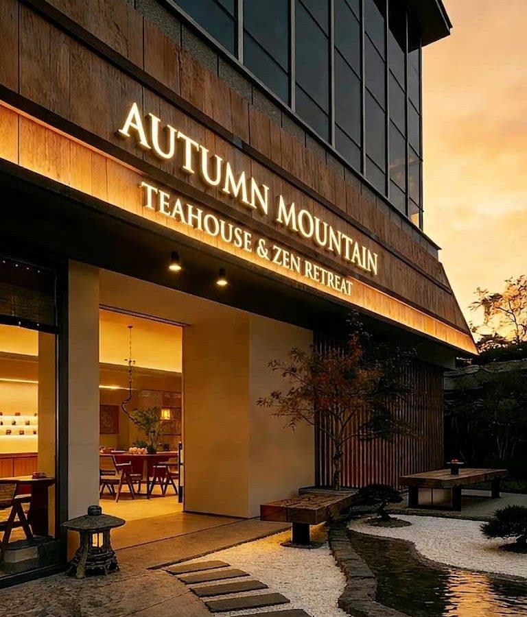
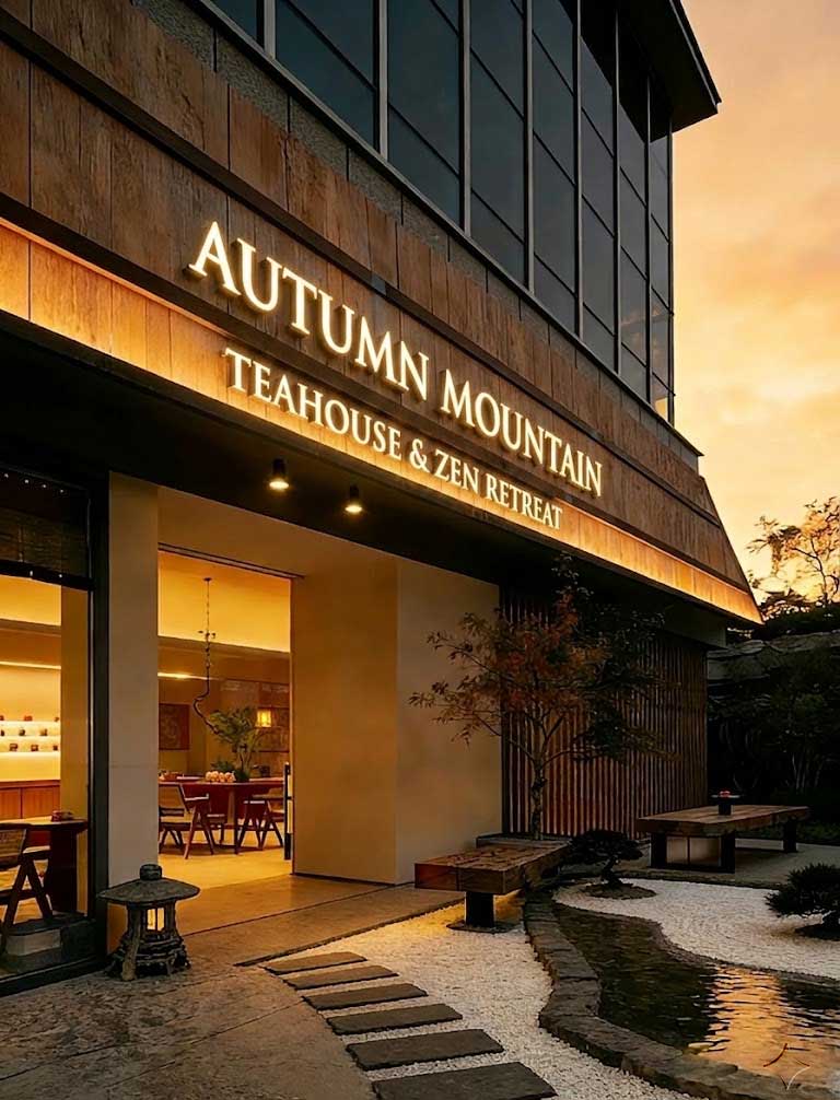
Chinese Zen aesthetics represent one of the most refined and emotionally resonant design traditions in the world, and this cafe storefront proves that these principles translate beautifully into contemporary commercial architecture. Far more than a stylistic choice, the Zen approach to design is rooted in a philosophy of balance, tranquility, and mindful observation. Every element is placed with intention, creating a space that feels both effortlessly natural and deeply considered. This cafe storefront signage design project showcases how illuminated signs and custom signage transform a commercial space.
The project, named Autumn Mountain, centers on the belief that great commercial storefront design is more than just a sign — it is the first emotional impression of a space. The goal was to wrap every guest in an embrace of Zen and tenderness even before they step through the door, establishing a mood of calm welcome that sets the tone for the entire cafe experience. This philosophy guided every decision, from the material palette to the landscaping to the typographic treatment of the signage.
The design avoids the trap of literal cultural reproduction. Instead of simply decorating with Chinese motifs, it distills the essence of Zen — asymmetry, simplicity, naturalness — into a architectural language that feels both authentic and contemporary. The result is a storefront that could belong to the present while carrying the quiet wisdom of centuries of aesthetic tradition.
The material palette is anchored by warm-toned wood cladding that follows the architectural contours of the building, creating soft, layered warmth against pale beige walls. The wood is not uniform — it shows its grain, its knots, its natural variation — reinforcing the Zen principle of wabi-sabi, the beauty of imperfection. This natural warmth is the visual and emotional foundation of the storefront, inviting guests to approach and linger.
Pale beige stucco or lime-washed walls provide a neutral counterpoint to the wood, their subtle texture catching the light differently throughout the day. The combination of these two materials — warm wood and soft mineral — creates a layered depth that changes with the sun’s angle, ensuring the facade feels alive and ever-changing. Glass doors and windows are transparent yet understated, offering a soft glimpse of the warm light and curated interiors within, while maintaining a sense of mystery that invites exploration.
The intentional restraint in the material palette leaves room for imagination, adding a quiet poetic depth to the space. There is no busy pattern, no competing color — just a calm composition of natural elements that speak directly to the senses. This is a storefront that trusts its materials to do the work, and they respond with quiet elegance.
The small courtyard in front of the entrance is the finishing touch that elevates this storefront from beautiful to transcendent. Designed as a dry landscape (karesansui), the courtyard features white gravel raked in gentle, concentric patterns that evoke ripples of water. This is a deliberate Zen reference — the gravel represents the sea, creating a microcosm of nature within the urban environment.
Sculptural greenery with bold, rugged forms punctuates the gravel, selected for their architectural silhouette rather than floral color. Pines, bamboo, or carefully shaped bonsai specimens rise from the white field, their deep green providing a striking contrast that is both serene and dynamic. Vintage stone lanterns, their surfaces weathered by time, add historical depth and create a subtle narrative of age and tradition. One step into this courtyard, and you are transported from the bustling city into a quiet mountain grove.
The courtyard serves a crucial transitional function. It is neither street nor interior — it is a liminal space that slows the visitor’s pace, clears the mind, and prepares the senses for the experience within. In commercial design, this breathing room is invaluable, transforming a simple entry sequence into a ritual of arrival that guests will remember and return for.
The illuminated signage for Autumn Mountain is rendered in a mellow, rounded typeface — a gentle calligraphic form that echoes traditional Chinese brushwork without being unreadable or overly decorative. The characters (秋山, Autumn Mountain) are backlit with a soft, warm LED glow that seeps out from behind the letters, creating a halo effect that feels almost painterly. At dusk, this light blends seamlessly into the evening glow, dialing the atmosphere all the way up.
The sign itself is mounted on a slim, dark metal bracket that keeps it visually separate from the wood cladding, allowing it to read as a floating element against the facade. The warm color temperature of the backlighting matches the interior illumination, creating a visual bridge between outside and inside. As the evening deepens, the glow from the sign combines with the warm light spilling from the windows and the lantern-lit courtyard to create a composition of light that is both inviting and profoundly peaceful.
This is lighting designed not to compete with the urban landscape, but to carve out a pocket of tranquility within it. The gentle, restrained illumination ensures that the cafe stands out — not through brightness, but through the quality and warmth of its light. It is a design that proves, once again, that the most powerful commercial storefronts are those that speak to the heart before they speak to the wallet.
design for your business? Contact our design team for a personalized consultation.
Browse more related signage design projects from our portfolio:
Need custom signage design for your business? Contact our design team for a personalized consultation.