From $19.9

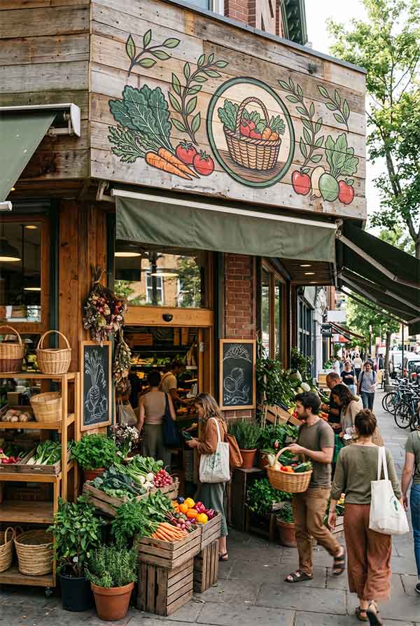
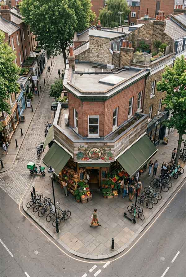
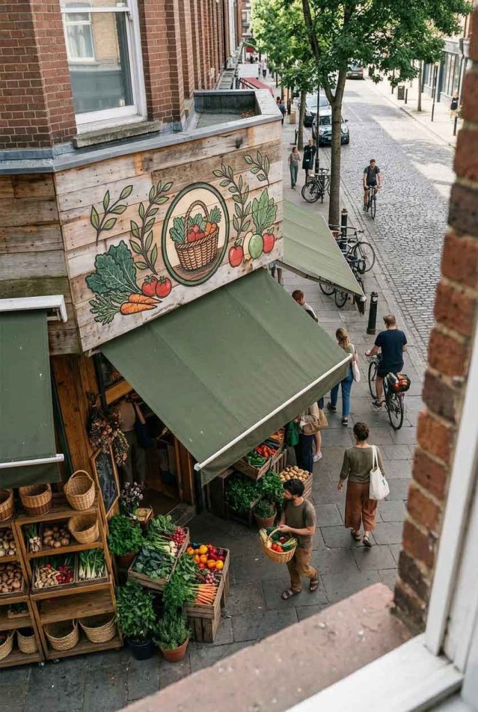
Green Harvest Grocers is an organic and locally sourced food market in a sustainability-minded urban neighborhood. The brand’s core values — farm-to-table, eco-consciousness, community connection — needed to be expressed through the storefront sign. The owners specifically requested a design that uses natural motifs and avoids the cold, corporate feel of conventional grocery signage.
The sign combines two distinct elements: a green leaf-and-vine motif rendered in dual-tone LED neon (sage green and warm amber), and hand-carved wooden lettering for “GREEN HARVEST” mounted on a reclaimed barn-wood backer panel. The leaf forms a semicircular arch over the lettering, evoking the feeling of walking through a garden trellis. The twin color tones — sage green representing fresh produce and amber representing harvest season — create a natural, harmonious palette.
| Sign Type | Dual-tone LED neon leaf motif + hand-carved wood lettering |
| Dimensions | 66″ × 38″ (1676 × 965 mm) |
| Primary Material | Reclaimed barn wood, LED neon flex, carved hardwood letters |
| Lighting | LED neon: sage green (5500K) + warm amber (2700K) |
| Installation Year | 2025 |
| Location | Eco District — Austin, TX |
| Client | Green Harvest Cooperative |
Every material was chosen to align with the store’s sustainability ethos. The backer panel is salvaged from a 1920s Texas barn, kiln-dried and treated with food-grade mineral oil. The “GREEN HARVEST” letters are carved from FSC-certified black walnut by a local woodworker. The LED neon uses 70% less energy than traditional glass neon and is fully recyclable at end of life. Even the mounting hardware is made from recycled stainless steel.
The leaf-vine motif started as a hand-drawn sketch by the store owner, then digitized and refined into a continuous neon path. The dual-tone effect required two separate runs of neon tubing — sage green for the main leaf body and warm amber for the vine tendrils — running in parallel channels. A custom bracket system allows the neon to float 2 inches in front of the wood backer, casting a soft colored glow onto the reclaimed surface that changes with the daily light cycle.
The sign aligns perfectly with the eco-conscious neighborhood’s values, generating positive local press coverage and social media mentions. Local design blogs featured the storefront as an example of “green retail design.” The store reports that the handcrafted, warm aesthetic of the sign helps build trust with customers who value authenticity — a key differentiator from the large supermarket chains in the area.
design for your business? Contact our design team for a personalized consultation.
Browse more related signage design projects from our portfolio:
Need custom signage design for your business? Contact our design team for a personalized consultation.