From $19.9

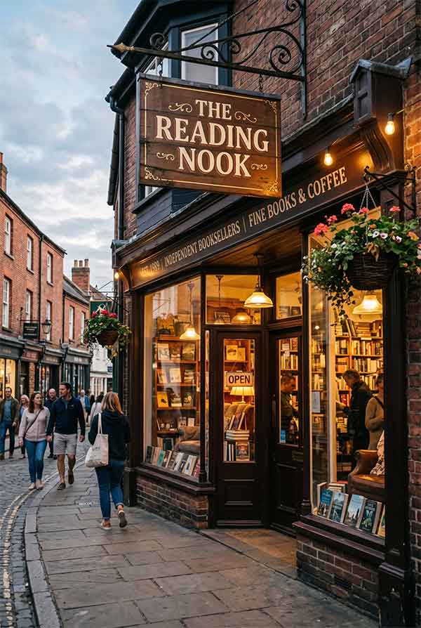
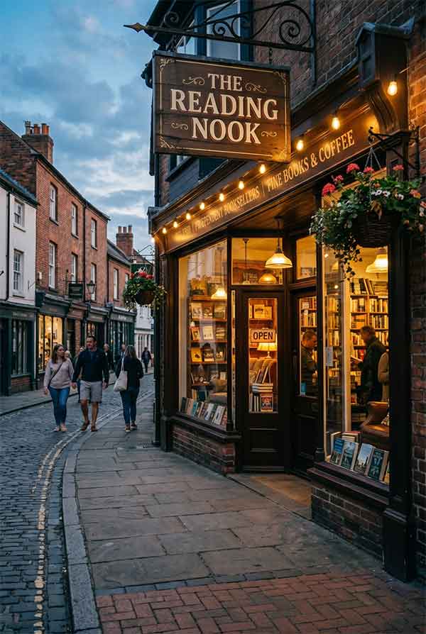
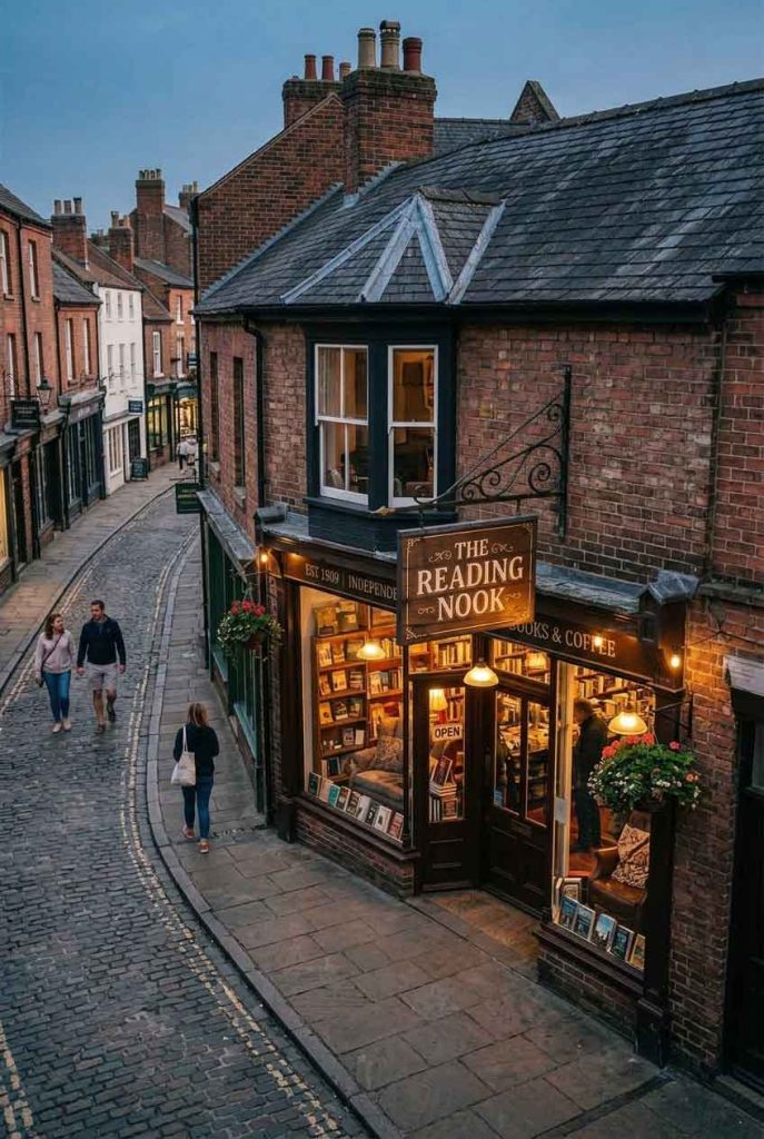
The Reading Nook is an independent bookstore combined with a small café, located in a quiet residential neighborhood. The owners wanted a sign that evokes the warmth and intimacy of a personal library — a place where customers feel invited to linger, browse, and read. The design needed to be visible from the street but not aggressive, matching the calm, unhurried atmosphere of the store itself.
The sign takes a minimalist approach: the store name is set in a refined serif typeface, executed as open-face channel letters with a warm golden interior illumination. Above the lettering, a simple neon icon of an open book with a steaming coffee cup resting on its pages — rendered in a single continuous line of warm amber LED neon. The entire sign is mounted on a dark navy blue panel, creating a rich background that makes the warm golden light glow with depth.
| Sign Type | Open-face channel letters + continuous-line neon icon |
| Dimensions | 52″ × 28″ (1321 × 711 mm) |
| Primary Material | Navy powder-coated aluminum, brass-finished letter returns |
| Lighting | Warm golden LED (2700K interior), amber LED neon flex |
| Installation Year | 2025 |
| Location | West Village — New York, NY |
| Client | The Reading Nook LLC |
The lighting was carefully calibrated to match the store’s interior atmosphere. The open-face channel letters — where the letter interior is visible rather than covered — use 2700K LEDs that produce the same color temperature as a table lamp. This creates a visual bridge between the exterior sign and the warm, wood-toned interior visible through the store windows. The amber neon book-and-coffee icon operates at reduced brightness (60% of maximum), ensuring it adds warmth without dominating the facade.
The residential neighborhood has strict signage guidelines to preserve the historic streetscape. The sign was designed to comply with all local regulations while still making a distinctive statement. Key design decisions — the modest 52″ width, the non-animated lighting, the subdued color palette — were all shaped by these requirements. Rather than seeing the restrictions as limitations, the design team used them to reinforce the store’s understated, refined character.
Regular customers describe the sign as “warm and welcoming” — the top adjective pair used in online reviews mentioning the storefront. The book-and-coffee icon has been adopted as the store’s secondary logo, appearing on tote bags, bookmarks, and the café’s coffee cups. Several customers have commented that the sign’s warm glow is what first drew their attention while walking past in the evening.
design for your business? Contact our design team for a personalized consultation.
Browse more related signage design projects from our portfolio:
Need custom signage design for your business? Contact our design team for a personalized consultation.