Why Channel Letter Height Matters More Than Any Other Spec
Letter height is the single variable that determines whether a passerby can read your name in the two seconds they have to do it. A perfectly designed halo-lit face with 8-inch letters on a highway-facing parcel will lose every potential customer to the competitor next door with plain 14-inch letters.
Sizing decisions also ripple through cost and code compliance. Most municipal ordinances cap letter height in inches per linear foot of lot frontage. Oversized letters trigger permit rework; undersized letters cost you conversion.
The Core Sizing Formula: Viewing Distance
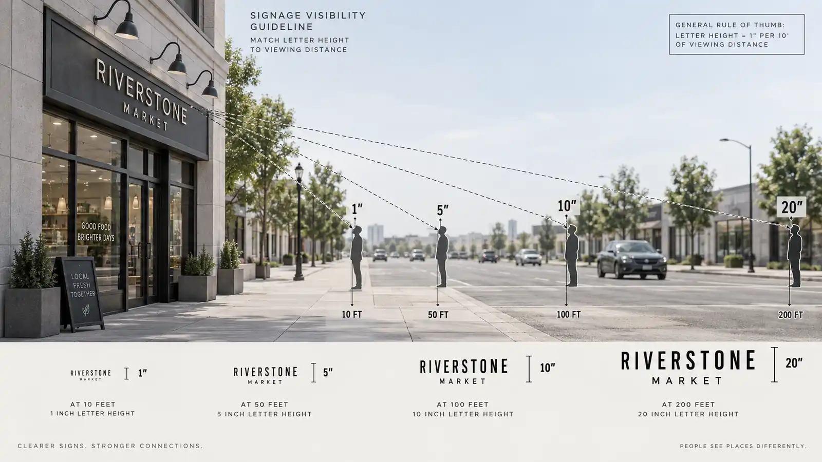
The most reliable rule of thumb in the sign industry is a ratio: one inch of letter height for every 10 to 15 feet of viewing distance. The “10” figure is used when the viewer is stationary or slow-moving and needs to read the full name. The “15” figure applies to drivers who are passing at speed and only need to register a name.
How to Derive the Right Viewing Distance for Your Sign
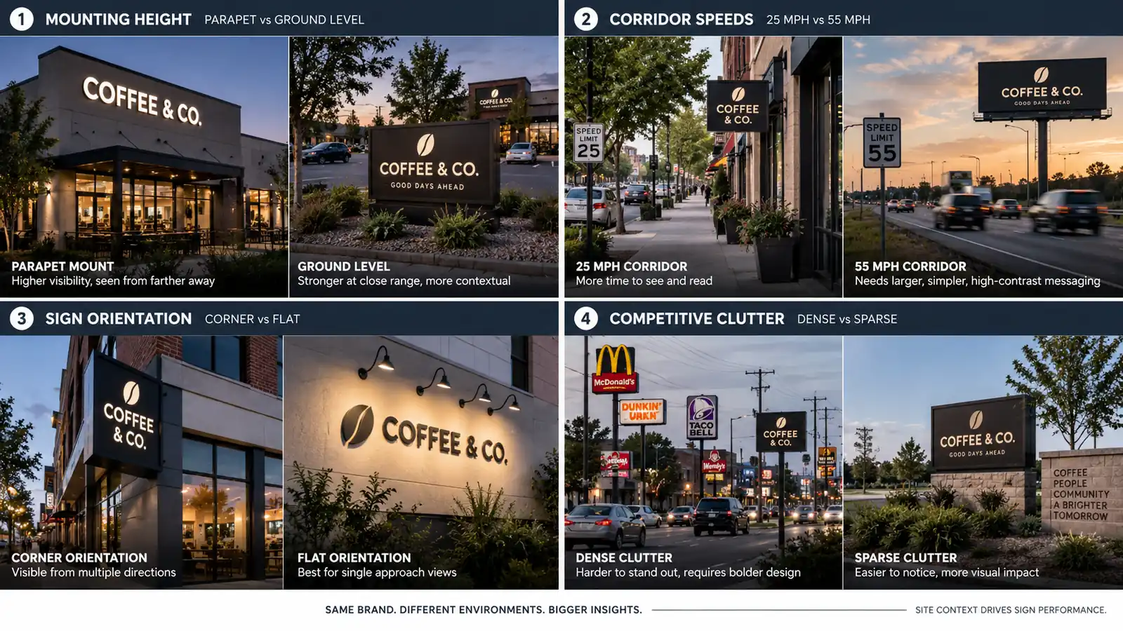
There is no universal answer, because viewing distance depends on the parcel, the corridor and the sign plane. Four factors drive the calculation:
- Sign mounting height. A sign on a 12-foot parapet is read at roughly eye-level from 60 to 120 feet away. A sign flush against a ground-floor stucco wall is read from the sidewalk 15 to 25 feet away.
- Corridor speed. Residential streets where drivers move at 25 mph give letters roughly two seconds of read time. Arterials where drivers move at 55 mph compress that window to under a second.
- Sign plane orientation. A corner sign that faces two streets is read at an angle, which shortens the readable width and forces you to increase letter height to compensate.
- Competitive clutter. A parcel in a dense retail strip competes with a dozen other signs. Bigger letters cut through the visual noise; smaller letters blend into it.
Sizing the Letters to Match the Viewing Distance
Once you have the effective viewing distance, apply the ratio. A storefront sign viewed from 100 feet away calls for letters between 7 and 10 inches, rounded up to 8 or 10. A highway bill sign viewed from 300 feet calls for letters between 20 and 30 inches. Use the smaller end of the ratio only when the entire sign is short and easy to read in one glance. Push toward the larger end whenever the sign contains a tagline, a category descriptor or a long multi-line wordmark.
Height Ranges by Storefront Type
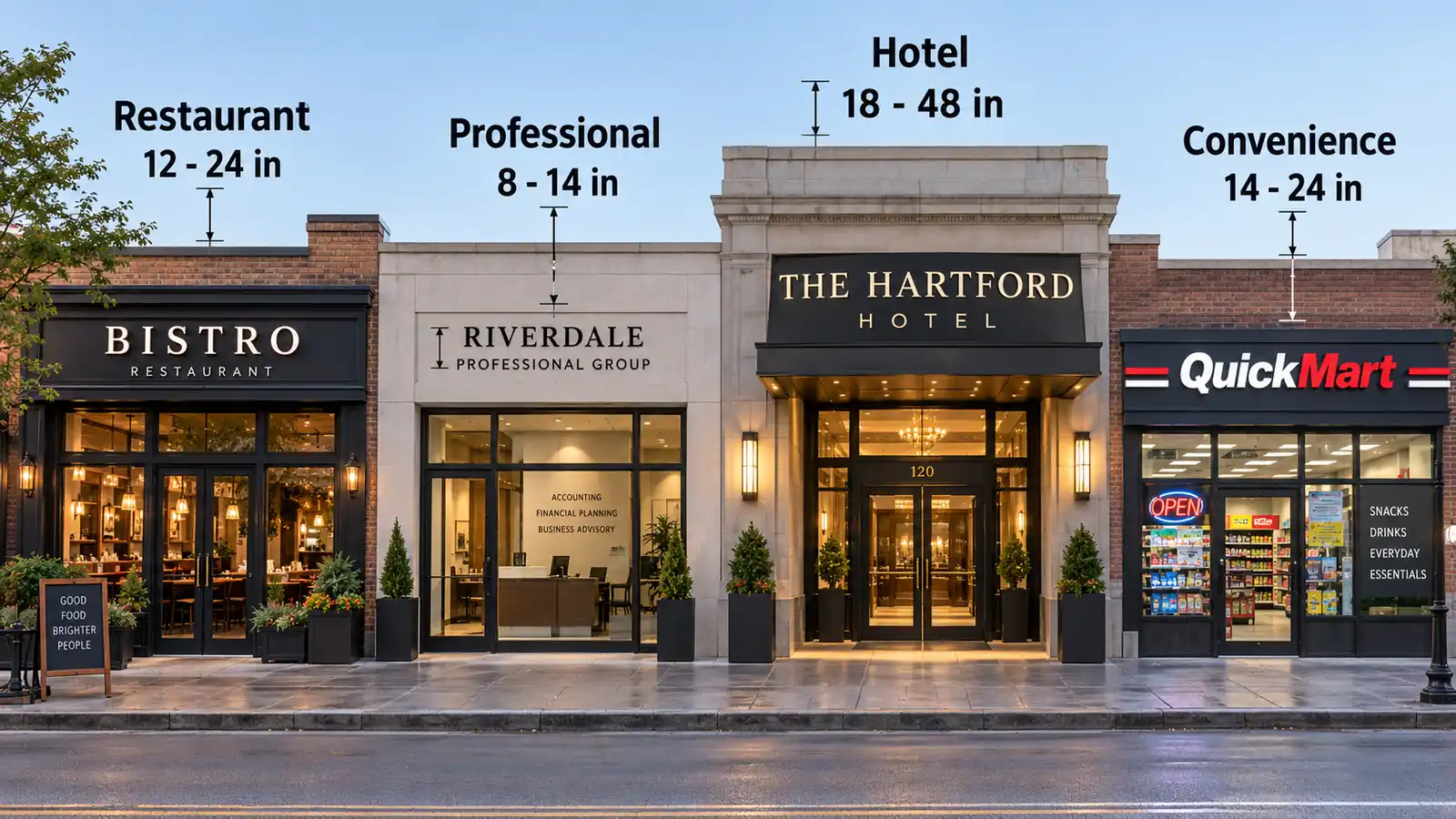
The viewing-distance formula gets you in the neighborhood. Industry benchmarks then tell you what your neighbors already accept as normal. These are the working height ranges sign fabricators quote for new build-outs:
Restaurants, Bars and Convenience Retail
12 to 24 inches. These venues compete on visibility from the road and from the parking lot, and the sign needs to pull cars in. Most full-service restaurants with a 25-foot façade land at 14 to 18 inches. Bars and lounges that rely on evening traffic run a touch larger, around 16 to 22 inches.
Professional Services and Corporate Offices
8 to 14 inches. Law firms, accounting practices, medical suites and insurance offices do not need to pull cars over. They need to be readable from the sidewalk or from a client arriving on foot. Over-sized letters read as cheap in this context.
Hotels, Resorts and Large Retail
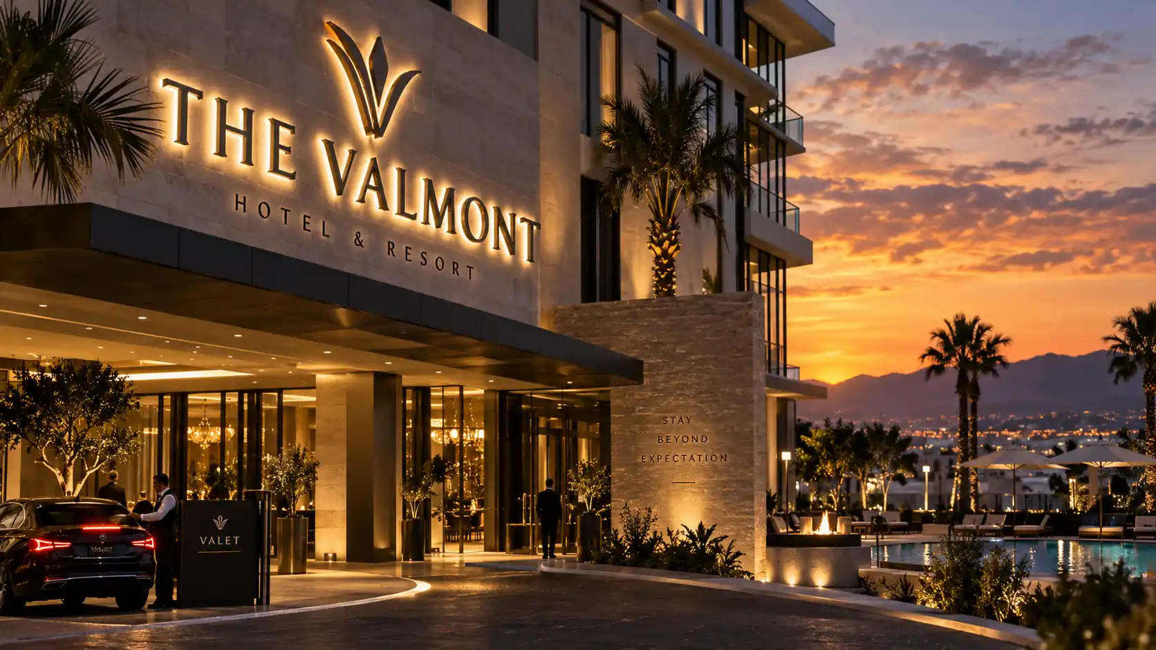
18 to 48 inches, occasionally up to 120 inches. Hotels typically install a low storefront sign around 18 to 24 inches for lobby entry, then add a second large-format sign on a distant pylon that runs 40 to 120 inches for arrival roads. Department stores at arterial intersections fall in the 24 to 48 inch range.
Multi-Line Sign Proportions
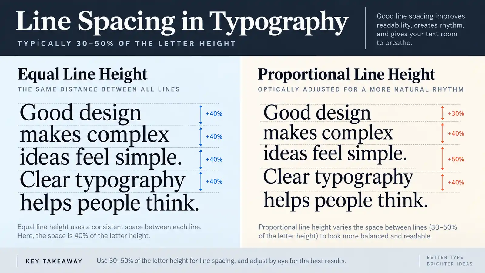
Most real storefront signs have more than one line: a name on top, a category below, a slogan underneath. Each additional line doubles the complexity of the sizing decision.
Line Spacing: The Golden Ratio
The gap between stacked lines should be 30 to 50 percent of the letter height. A 10-inch two-line sign needs a gap of 3 to 5 inches. Push it below 25 percent and the two lines visually merge into one blob. Push it above 60 percent and the sign reads as two separate signs.
Proportional Lines vs Equal Lines
Equal-height lines use the same letter height on every line. Proportional lines use a larger letter height for the primary name and a smaller one for the descriptor, typically 60 to 75 percent of the primary. Proportional sizing is the default for retail and hospitality signs, where the brand name must dominate.
Legibility and View Distance for Passersby
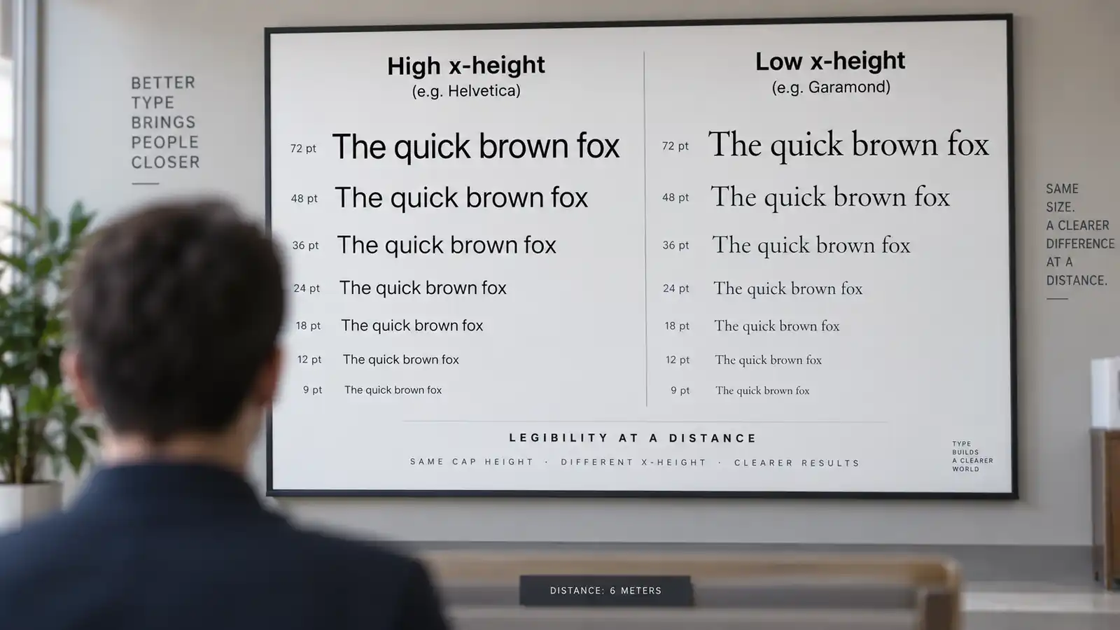
Letter height is only one half of legibility. The other half is x-height, the height of the lowercase letters in a word. Most typefaces have lowercase letters that run 45 to 65 percent of the uppercase cap height. A sign with 12-inch capitals using a typeface with 50 percent x-height has effective lowercase of only 6 inches, which cuts the readable viewing distance in half.
Two practical rules follow. First, avoid typefaces with low x-height for highway and arterial installations. Serifs with delicate strokes and tall-ascender display faces look elegant at 20 inches and disappear at 14 inches. Second, if your wordmark contains lowercase letters, apply the viewing-distance formula to the x-height, not the cap height. A wordmark like “coffee & co” needs cap letters about 1.8 times larger than “COFFEE” to be readable at the same distance.
Material Thickness and LED Spacing
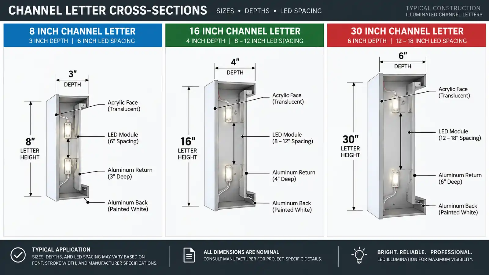
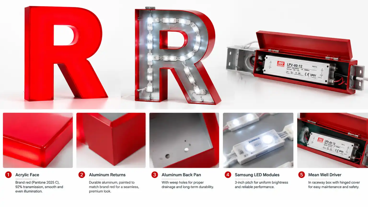
Letter height is not independent of fabrication. When letters are too small, installers cram a 4-inch channel depth into a 6-inch letter face and crush the light output. When letters are too large, LED strips spaced for smaller letters leave visible shadow lines across the face.
- Letters under 10 inches usually use a 3-inch channel depth and LED strips spaced every 6 inches.
- Letters between 10 and 24 inches use a 4-inch channel depth and LED strips spaced every 8 to 12 inches.
- Letters above 24 inches move to 6-inch channel depth and LED strips spaced every 12 to 18 inches.
If you are specifying either a halo-lit or a front-lit face-lit execution, ask the fabricator to confirm the LED spacing against the final letter height. See also our guides on backlit vs face-lit channel letters and halo-lit letter materials.
Installation and Mounting Constraints
Sizing decisions are bounded by the physical parcel, not just the design brief. Four constraints show up in nearly every installation:
- Parapet height. Most masonry parapets are 30 to 48 inches tall. A 14-inch two-line sign with 30 percent line spacing takes roughly 37 inches, leaving no room for a mounting plate.
- Wall setback. Signs are typically required to sit 3 to 6 inches off the wall surface for ventilation and to allow LED heat to escape.
- Building code height. Most municipalities cap the total sign height at 1 inch per linear foot of lot frontage. A 30-foot façade caps the sign at 30 inches total.
- Fire code and egress. Signs that hang from the parapet can obstruct egress routes. Signs that project forward from the wall face can obstruct pedestrian walkways.
For wall-mount considerations on specific substrates, see our article on backlit letters on brick, stucco and glass.
A Decision Framework for Choosing Letter Size
When you sit down to spec a sign, work through these five questions in order. Skip a step and the whole decision becomes guesswork.
- Step 1 — Measure the effective viewing distance. Walk the sidewalk, drive the corner, stand at the parking lot entrance. Note the farthest point from which the sign is still readable at full word-mark clarity.
- Step 2 — Apply the 1:10 to 1:15 ratio. Divide the distance by 10 for a stationary viewer, by 15 for a driver. Round up to the next whole inch.
- Step 3 — Check the industry benchmark. Compare your calculation to the ranges above. If you are 30 percent above or below the benchmark, ask why before committing.
- Step 4 — Layer multi-line proportions. Pick equal vs proportional, set the line spacing, then re-check total height against parapet height and building code limits.
- Step 5 — Confirm with the fabricator. Send the spec to two or three fabricators and ask for their LED spacing recommendation at that letter height. If a fabricator cannot execute cleanly, the height is wrong.
Sizing Matrix by Storefront Type
| Storefront Type | Recommended Letter Height | Typical Viewing Distance | Lines |
|---|---|---|---|
| Restaurants / Bars | 12 – 24 in | 60 – 150 ft | 1 – 2 |
| Convenience Retail | 14 – 24 in | 80 – 200 ft | 1 – 2 |
| Professional Services | 8 – 14 in | 25 – 60 ft | 2 – 3 |
| Corporate Offices | 10 – 18 in | 40 – 100 ft | 2 – 3 |
| Hotels (storefront) | 18 – 28 in | 80 – 180 ft | 1 – 2 |
| Hotels (pylon) | 40 – 120 in | 300 – 800 ft | 1 – 2 |
| Department Stores | 24 – 48 in | 200 – 500 ft | 1 – 2 |
FAQ: Channel Letter Sizing
How tall should channel letters be for a street-facing storefront?
Most street-facing storefront signs use letters between 8 and 24 inches. Apply the 1:10 to 1:15 ratio to your effective viewing distance: divide the farthest readable point by 10 for pedestrians, by 15 for drivers, then round up.
Does letter size affect the cost of the sign?
Yes, and linearly. Letter height drives the material face area, the channel depth and the LED strip length. Doubling the letter height roughly doubles the cost per letter. Our backlit channel letters cost article breaks down the pricing per inch so you can model the impact before committing.
Can smaller letters still be readable from across the street?
Yes, if the typeface has a strong x-height and the illumination is bright. A condensed sans-serif with 60 percent x-height at 10 inches reads as clearly as an extended serif at 14 inches.
Is there a maximum letter height I should not exceed?
In most jurisdictions, sign ordinances cap total sign height at 1 inch per linear foot of lot frontage, so a 30-foot façade caps at 30 inches total. Exceeding that triggers permit rework. Beyond code, letters larger than roughly 40 inches on a storefront read as cheap, which damages brand perception.
Where can I see how sizing pairs with a specific illumination style?
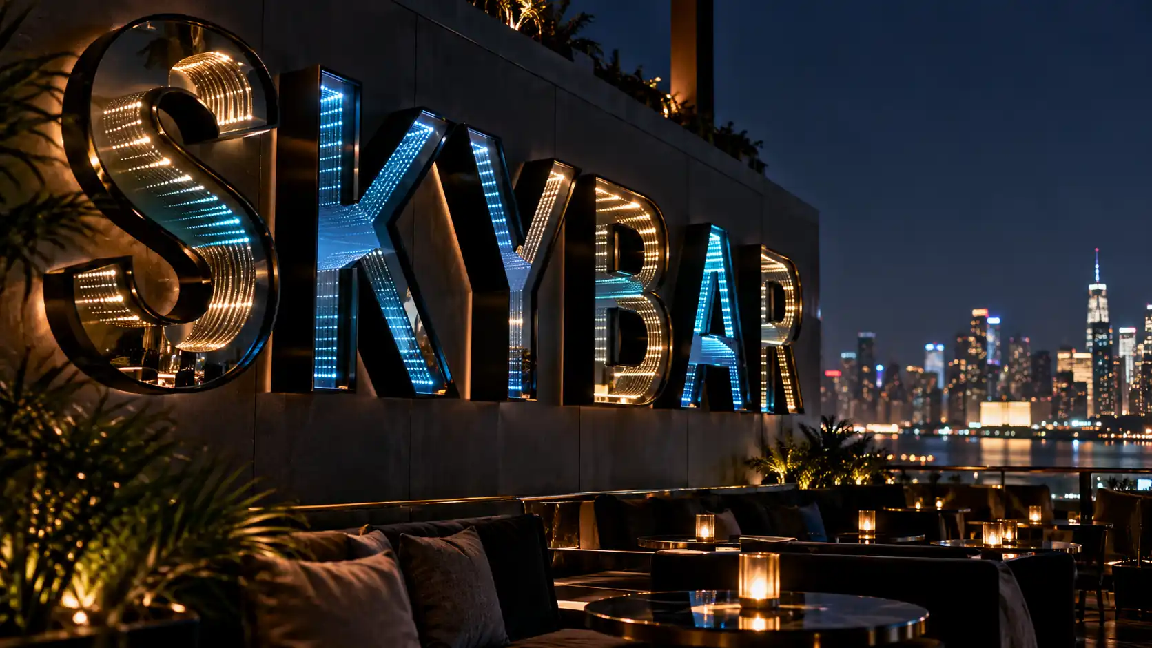
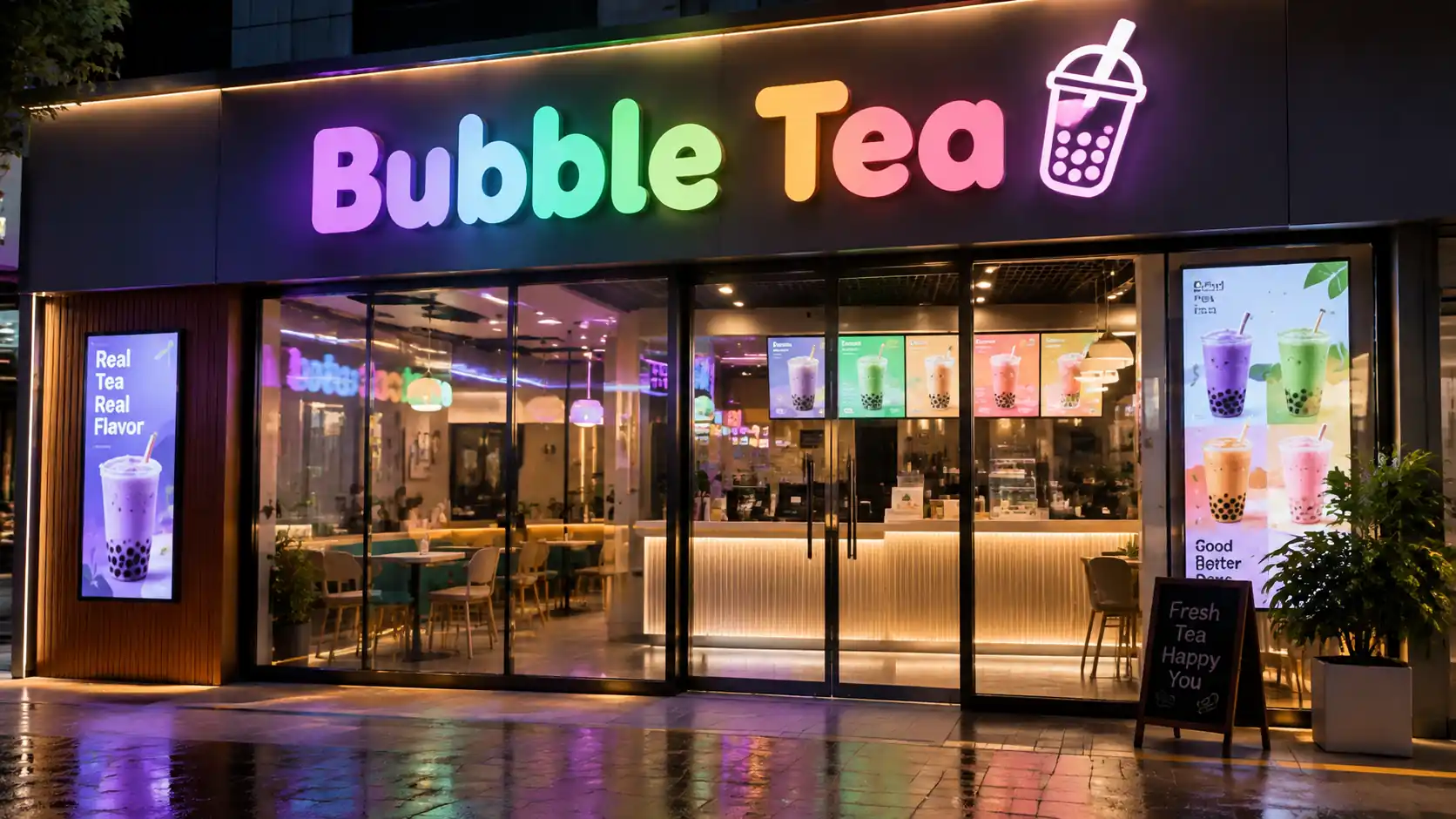
Each of our product pages shows examples at the recommended height range for that illumination type. Browse the Spectrum Glow, Infinity Mirror and front-and-back lit product pages, then check the industry gallery.