From $19.9

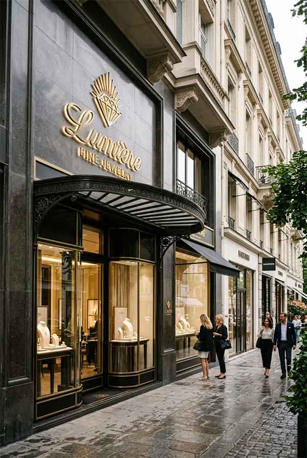
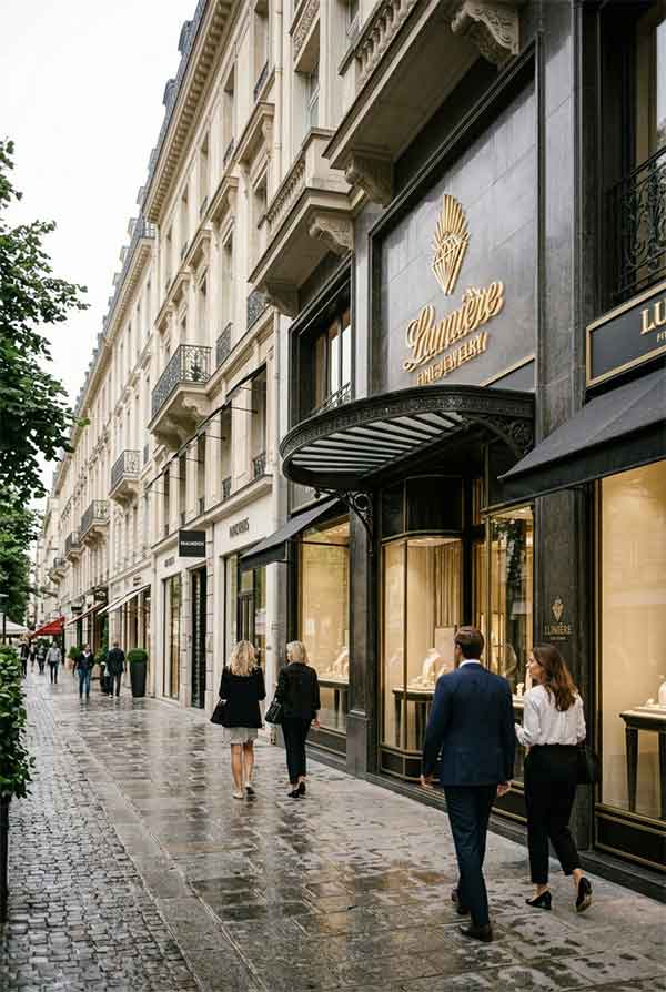
Lumière is a high-end fine jewelry boutique in a luxury shopping district. The brand name means “light” in French — a concept that became the central theme for the storefront signage. The client requested a sign that embodies understated luxury: nothing loud or flashy, but unmistakably premium. The target audience is discerning clientele who appreciate refined aesthetics.
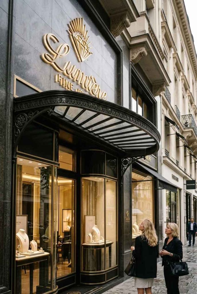
The design eschews traditional illuminated channel letters in favor of a minimalist approach: a single continuous line of ultra-slim (6mm) warm white LED neon forms the word “Lumière” in an elegant custom script. The letters are mounted on a matte brass backplate with a hand-brushed finish. Below the wordmark, a small diamond-shaped neon accent — just 3 inches across — serves as a subtle visual anchor. The entire sign emits a soft, warm glow reminiscent of candlelight, reinforcing the jewelry store’s atmosphere of intimacy and luxury.
| Sign Type | Continuous-line LED neon script + brass backplate |
| Dimensions | 40″ × 14″ (1016 × 356 mm) |
| Primary Material | Hand-brushed brass, 6mm LED neon flex |
| Lighting | Warm white LED neon (2700K) |
| Installation Year | 2026 |
| Location | Magnificent Mile — Chicago, IL |
| Client | Lumière Fine Jewelry Inc. |
The brass backplate is hand-brushed in a single direction to create a subtle linear grain that catches ambient light. The plate is mounted on 10mm stainless steel standoffs, creating a 5mm shadow gap between the plate and the stone facade — a detail that suggests precision engineering. The LED neon tubing is the thinnest commercially available gauge at 6mm, chosen specifically to read as a delicate “line of light” rather than a bulky tube. The power supply and wiring are hidden inside a custom-milled cavity behind the backplate.
By day, the brass backplate is the dominant visual element — its warm metallic sheen catches sunlight and reads as architectural jewelry. By night, the warm white neon takes over, casting a soft 2700K glow that illuminates the entrance area without spilling harsh light onto the street. The diamond accent is barely visible during the day but becomes a subtle beacon at night. The design intentionally avoids bright illumination, creating a sense of exclusivity — you have to approach to appreciate it fully.
design for your business? Contact our design team for a personalized consultation.
Browse more related signage design projects from our portfolio:
Need custom signage design for your business? Contact our design team for a personalized consultation.