Understanding Neon Design Styles
Choosing the right design style for your neon sign is the most important decision you will make. The wrong typography can make a luxury brand look cheap; the right illustration style can turn a simple sign into a viral social media moment. This guide breaks down the three most popular neon design styles — vintage, minimal, and bold display — and explains when to use each.
This article builds on our broader overview in 2025 Neon Sign Design Trends.
Vintage Neon: Timeless Appeal
Vintage-style neon draws inspiration from the golden age of glass neon signage (1920s-1960s). Characterized by warm color palettes (amber, red, soft white) and script or serif typography, vintage neon creates an immediate sense of nostalgia and authenticity.
Excellent examples include the gradient lightbox bar and the women wm bar entrance, both of which use vintage-inspired neon to signal a classic, high-quality experience. Vintage works best for:
- Pubs, breweries, and traditional restaurants
- Barbershops and traditional service businesses
- Wedding signage with a romantic, timeless feel
- Any brand that wants to communicate heritage and craftsmanship
Minimal Neon: Less Is More
Minimalist neon focuses on clean lines, generous negative space, and restrained color palettes. Often executed in white, warm white, or a single accent color, minimal neon works well in modern interiors where the sign should complement rather than dominate.
The LECHAO Nightclub uses minimal neon to create sophisticated zone transitions. The minimal storefront sign proves that simple typography, perfectly executed, can be more striking than complex illustrations.
Pro tip: Minimal neon pairs exceptionally well with script-cursive typography. A single sweeping cursive word in warm white on a dark wall creates an elegant focal point that works in both commercial and residential settings.
Bold Display Neon: Maximum Impact
Bold display neon uses heavy typography, striking colors, and large scale to command attention. This style is purpose-built for high-visibility storefronts, event backdrops, and any application where the sign needs to be seen from a distance.
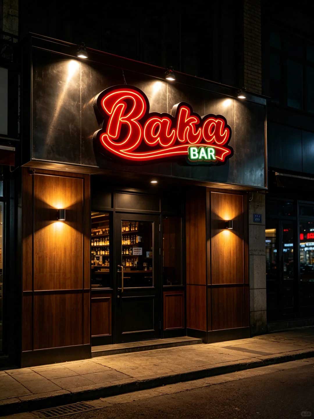
Outstanding examples include the BAKA BAR bold retro sign, American-style pub signage, and the barbershop icon-symbol sign. Bold display works best for:
- Storefronts on busy streets or in shopping districts
- Event photo walls and festival installations
- Bars and clubs where visibility is critical
- Brand names and logos that need instant recognition
Geometric and Dual-Tone: The Modern Frontier
Beyond the three core styles, geometric and dual-tone neon deserve special attention. Geometric installations — like the burger joint geometric design — use abstract shapes and patterns rather than text, creating art pieces that happen to be signs. Dual-tone neon, as seen in the dark cool bar display, combines two colors in a single design for depth and visual interest.
Explore how these styles translate into real projects in our Gallery.