
Why Sign Size Matters More Than You Think
Choosing the right size for your storefront sign is one of the most consequential decisions you will make for your business. It is not just about aesthetics — sign size directly affects how many people see your business, how they perceive it, and whether they can actually find you. A sign that is too small becomes invisible from the street. A sign that is too large overwhelms your storefront and can violate local codes. Getting it right requires understanding three factors: readability distance, building proportion, and regulatory limits.
Studies in retail signage consistently show that businesses with properly sized signs see 15-30% higher foot traffic than those with undersized signs, all else being equal. Your sign is often the first impression a potential customer has of your business. Make sure it is legible, proportionate, and visible from the distance people will actually be approaching.
The Letter Height Rule: How Far Away Can People Read Your Sign?
There is a well-established rule of thumb in sign design: for every 10 feet (3 meters) of viewing distance, you need approximately 1 inch (2.5 cm) of letter height for minimum readability. For comfortable readability (the distance at which people can read your sign without squinting or slowing down), double that height.
The table below gives you the minimum and recommended letter heights for common viewing distances. When in doubt, always go with the recommended height — your sign will be competing with visual clutter, lighting conditions, and drivers moving at speed.
| Viewing Distance | Min Letter Height | Recommended Height |
|---|---|---|
| 50 ft (15 m) | 4 inches | 6 inches |
| 100 ft (30 m) | 6 inches | 8-10 inches |
| 200 ft (60 m) | 10 inches | 12-15 inches |
| 400 ft (120 m) | 18 inches | 24 inches |
Note that these heights apply to the x-height of lowercase letters or the cap height of uppercase letters. Thin, condensed fonts require larger heights than bold, wide fonts at the same viewing distance. If you are using a script or custom typeface, add 20-30% to these minimums.
Sign Width to Storefront Width: The Golden Ratio
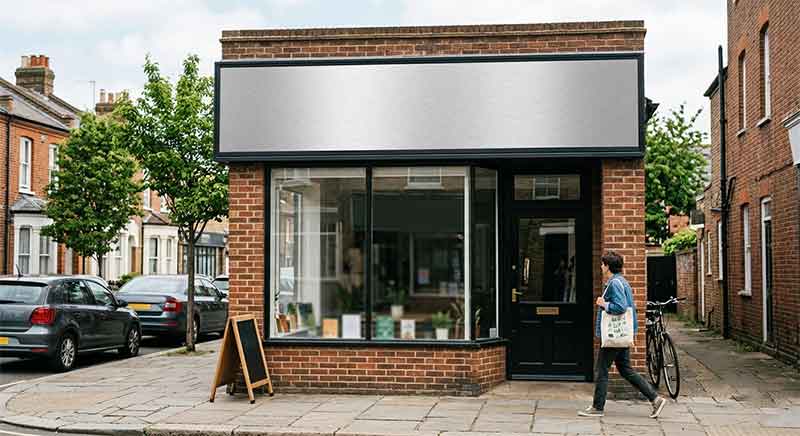
Once you know the letter height you need, the next question is how wide the sign should be relative to your storefront. The industry standard is a ratio of 1:5 to 1:3 — that is, your sign should occupy between one-fifth and one-third of your storefront width.
Here is why this range works. A sign smaller than one-fifth of your storefront width looks undersized and gets visually lost against the building facade. Your branding becomes secondary to the architecture, and from a distance the sign blends into the overall building rather than standing out as a distinct landmark. A sign larger than one-third of your storefront width starts to dominate the facade in a way that can feel aggressive and unbalanced. The building becomes a background for the sign rather than a cohesive storefront.
Within the 1:5 to 1:3 range, the exact ratio depends on the character of your building. For classic, historic storefronts with architectural details (cornices, columns, transom windows), aim for the smaller end of the range (1:4 to 1:5) so the sign complements the architecture rather than competing with it. For modern minimalist storefronts with clean lines and no facade detailing, the larger end of the range (1:3 to 1:4) works well and creates a strong visual anchor.
Sign Size by Storefront Type (With Examples)
Different business types have different signage needs based on typical storefront dimensions, customer approach patterns, and brand perception goals. Here is a breakdown by common storefront categories.
Boutique (12-20 ft storefront). A 3-5 ft wide sign is appropriate. Boutiques benefit from signs that feel curated and intentional — oversized signs can cheapen the perceived brand. A well-lit 4 ft sign with 6-8 inch lettering reads clearly from across the street and maintains the intimate character of a boutique shopping experience.
Restaurant (20-30 ft storefront). Aim for a 4-8 ft wide sign. Restaurants need strong visual presence to attract walk-in traffic, especially during evening hours. A 6 ft sign with 8-10 inch letters works well for most restaurant frontages. Consider adding a secondary sign (an A-frame or window decal) for daily specials or operating hours.
Strip mall unit (15-25 ft storefront). A 3-6 ft wide sign is the sweet spot. Strip mall units face the challenge of multiple signs competing for attention in a shared facade. Your sign needs to be large enough to differentiate from neighboring units but not so large that it breaks the uniformity of the strip. Coordinate with the landlord’s sign program — many strip malls have size restrictions to maintain consistent visual standards.
Building tenant (30+ ft storefront). Signs from 6-12 ft wide are appropriate. For larger storefronts, you have room to incorporate your logo, tagline, and possibly a secondary message. Monument signs or projecting signs may also be options. At this scale, professional sign design and engineering consultation are strongly recommended — the structural and permitting requirements are significantly more complex.
5 Common Sign Sizing Mistakes
- Designing for the sidewalk, not the street. Most business owners design their sign based on how it looks when they stand directly in front of it. But your primary audience is across the street or driving past. A sign that looks perfectly scaled from 10 feet away may be illegible from 100 feet. Always check your letter height against the distance your customers will actually be viewing from.
- Ignoring the competition factor. If your sign is significantly smaller than neighboring signs, it will visually disappear. You need to match or slightly exceed the visual presence of adjacent businesses, even if that means pushing to the larger end of the recommended size range.
- Forgetting about secondary signage. Many businesses try to cram everything onto one sign — business name, tagline, hours, phone number, website. This results in a cluttered, hard-to-read sign where nothing stands out. Use primary signage for your business name only. Secondary information belongs on separate signs (window graphics, A-frames, blade signs).
- Choosing beautiful but unreadable fonts. Elaborate scripts and ultra-thin typefaces that look elegant in a mockup are often unreadable at distance. Test your font at the actual size and distance it will be viewed. If you cannot read it comfortably, choose a more legible font.
- Not accounting for elevation and setback. The higher your sign is mounted above eye level, and the farther it is set back from the street, the larger it needs to be. A sign mounted 15 feet up on a building needs to be 25-50% larger than the same sign mounted at 8 feet.
How Local Regulations Affect Sign Size
Sign regulations vary dramatically by jurisdiction, and they are often the limiting factor in sign size decisions. Before designing your sign, check with your local planning or zoning department for:
- Maximum sign area — typically expressed in square feet. Common limits range from 32 sq ft to 100 sq ft depending on zone and building type.
- Maximum letter height — some municipalities cap letter height directly.
- Setback requirements — how close the sign can be to the property line.
- Height limits — how high the sign can extend above grade or the roofline.
- Illumination restrictions — some areas limit brightness, hours of illumination, or colors.
- Permit requirements — most commercial sign installations require a permit with plan review.
We recommend obtaining preliminary sign approval before ordering your sign. Nothing is worse than designing the perfect sign only to discover it exceeds local limits. A sign professional who works in your area will know the local codes and can design within them.
Quick Reference: Minimum Sign Size by Business Type
| Business Type | Min Sign Width | Min Letter Height | Typical Viewing Distance |
|---|---|---|---|
| Coffee shop / Café | 3-4 ft | 4-6 in | 50-100 ft |
| Boutique / Retail | 3-5 ft | 6-8 in | 50-150 ft |
| Restaurant / Bar | 4-8 ft | 8-12 in | 100-200 ft |
| Salon / Spa | 3-5 ft | 5-7 in | 50-100 ft |
| Medical / Dental | 4-6 ft | 6-8 in | 50-150 ft |
| Auto / Service | 6-10 ft | 10-15 in | 200-400 ft |
| Gym / Fitness | 5-8 ft | 8-12 in | 100-200 ft |
| Corporate / Office | 4-6 ft | 6-10 in | 50-150 ft |
For more inspiration, browse our retail sign gallery and corporate sign gallery to see how businesses of different types and sizes have solved their storefront signage. And for pricing details, check out our storefront sign cost guide.