Two restaurants open on the same block with the same white acrylic channel letters, the same aluminum returns, the same mounting height. One reads as a place you would spend $90 a head in. The other reads like a counter you collect food from. The difference is almost never the font or the logo. It is the color temperature of the LEDs behind the face — a number most buyers never ask about and most quotes never print.
Color temperature is measured in kelvin (K) and describes how white a white light looks. Lower numbers read amber and warm; higher numbers read blue and clinical. It is the cheapest spec to change on an order and the one that most changes how a brand feels at night. This guide covers the three bands you will choose between, why a module shifts between noon and midnight, and how to write a spec a fabricator can prove.
Why Color Temperature Is the Most Overlooked Spec in Channel Letters
Buyers obsess over size, font, face color, and trim — the decisions you can sketch in a meeting. Color temperature is invisible in a daytime rendering and on a quote sheet, so it defaults to whatever the factory stocks in volume: usually a cool 6000–6500 K module that photographs badly and flatters almost nothing.
The Same Sign, Three Different Brands
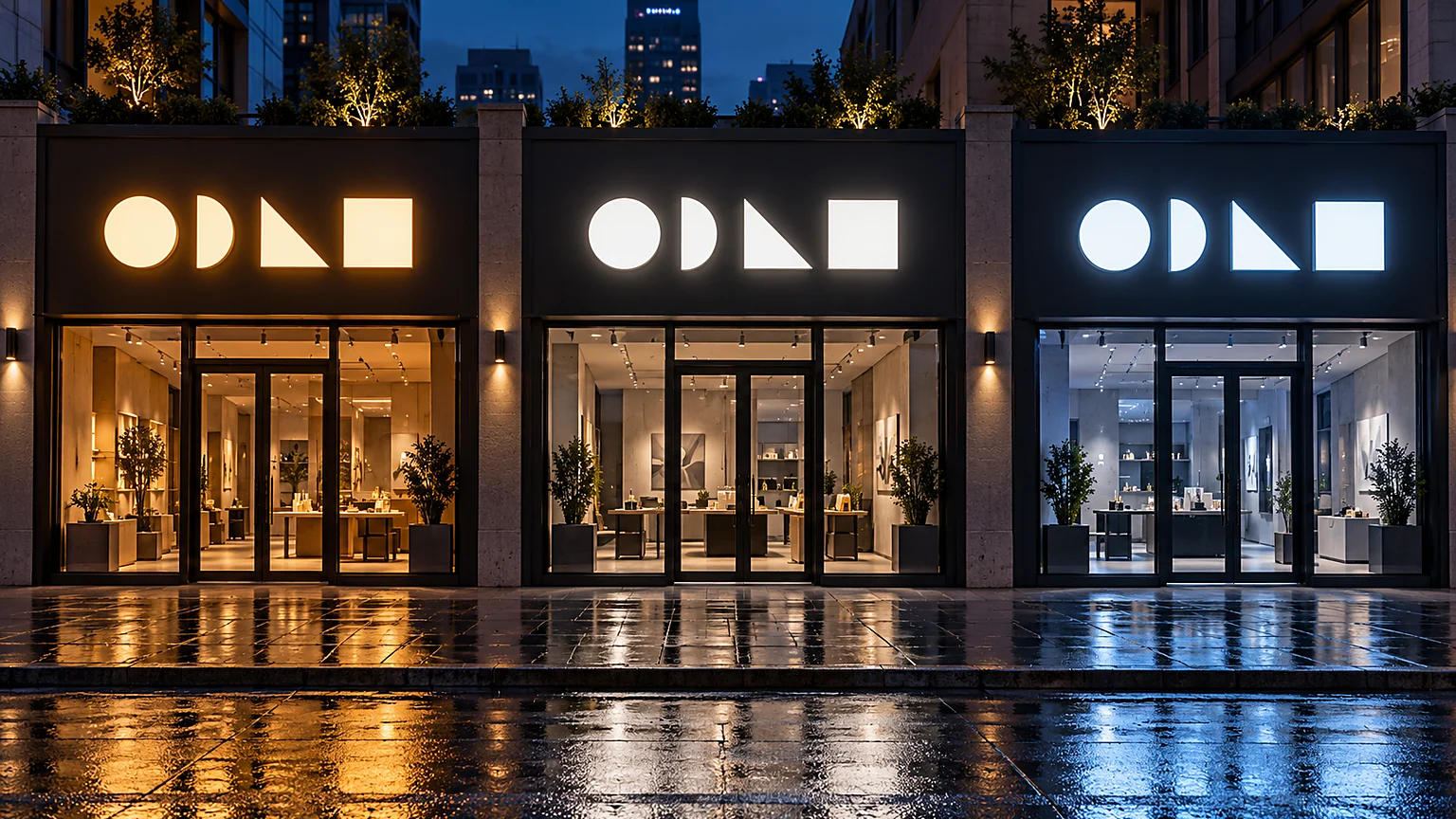
One storefront, one logo, one letter height — change only the CCT:
- 3000 K — amber-white letters. The facade feels inhabited. Passers-by read “small batch,” “family run,” “worth the detour,” even if the brand is a 40-location chain.
- 4000 K — clean neutral white. The brand reads competent, current, well-run: a bank branch that just remodeled, a dental group, a flagship apparel store.
- 6500 K — blue-white and slightly hard. The brand reads utility, throughput, open-at-2 a.m. Exactly right for a fuel forecourt, exactly wrong for a wine bar.
None of these is better. They are different promises, and customers decode them in under two seconds without knowing the word “kelvin” exists. Your customer feels the spec; you name it on the purchase order, or the factory names it for you.
A CCT is never just the module: it is the light source plus everything the light passes through or bounces off. “White LED” specifies none of that; “4000 K, CRI ≥90, ±2 SDCM, verified per batch” specifies most of it. For the geometry, see our front-lit buyer’s guide.
The Three Core Temperatures — What They Communicate
| CCT | Visual feel | Psychological effect | Best for |
|---|---|---|---|
| 2700–3000 K | Warm amber-white, like incandescent | Comfort, intimacy, appetite, trust — “stay awhile” | Restaurants, hotels, boutiques, jewelry, wellness, residential |
| 3500–4000 K | Neutral white, clean daylight | Clarity, professionalism, alertness — “we are on top of this” | Medical, dental, corporate, retail, select-service hotels, fitness |
| 5000–6500 K | Cool blue-white, like midday sun | Energy, visibility, utility — “open, fast, functional” | Gas stations, auto, warehouses, 24-hour retail, highway visibility |
2700–3000 K: The Hospitality Default
Warm white is the safest choice in food and lodging because it does two things at once: skin tones look healthy and food looks cooked rather than examined. It also lowers perceived brightness at the window, which raises dwell time — the space reads as a room rather than a light box. Every CCT recommendation in our coffee shop and cafe channel letter guide starts at 3000 K.
3500–4000 K: The Professional Middle
Neutral white is the temperature of competence — bright enough to read clean, warm enough not to feel like a freezer. Medical and dental practices cluster at 3500 K; retail flagships at 4000 K, the closest common CCT to daylight under which merchandise colors stay honest. Above 5000 K is a different tool: it scatters better in fog and reads louder at equal output, which is why forecourts use it and why it flattens faces and food.
3000K vs 4000K Channel Letters: Breaking the Tie
Three questions settle most warm-versus-neutral debates. What is sold? Food, skin, and wood want 3000 K; merchandise accuracy and professional services want 4000 K. When is it seen? A lunch-heavy cafe can carry 4000 K; a dinner trade at 8 p.m. should stay at 3000 K. What is next door? A warm sign between two cool ones reads premium; the reverse reads discount.
The Day/Night Shift Trap
The datasheet number is the module’s color, not your sign’s color. By the time light exits the face, passes through acrylic, bounces off a return, and competes with street lighting, the reading has moved — often 200–400 K off what was approved.
Why a 3000 K Module Can Read 3200 K at Noon
White acrylic transmits roughly 90–92% of visible light, but not evenly: it absorbs slightly more in the red end, pushing transmitted light cooler. A cream face such as 7328 does the opposite. Add a shallow return and a bright stucco wall, and the same module reads warm on one install and neutral on another — which is why the spec belongs at the face, not on the datasheet. If the brand white is 4000 K and the face adds 100 K, the module is binned near 3900 K.
The Drift Problem
Commodity modules with wide bins drift: phosphor degradation plus heat pushes a 4000 K module toward 4300–4500 K within 18–24 months at high drive current. One location, nobody notices; twelve locations built from three lots over three years gives a portfolio where no two signs match. On backlit letters the drift is worse because the glow is the entire visual; see halo-lit channel letters.
CRI — Why ≥90 Matters for Some Brands
Color rendering index (CRI) measures how faithfully a source shows color against a reference, on a 0–100 scale. Two modules can both be exactly 4000 K and render a tomato completely differently. CCT tells you the tint of the white; CRI tells you whether anything under it still looks like itself.
| CRI | What it means in practice | Where it is enough | Cost impact |
|---|---|---|---|
| 80 | Standard commercial. Colors read plausibly but slightly desaturated; deep reds suffer most. | Wayfinding, warehouses, parking, letters read from distance | Baseline |
| 90 | Colors read close to daylight. Skin, food, fabric, and wood keep their character. | Restaurants, hotels, apparel, cosmetics, jewelry, medical, signs above display windows | +10–20% module cost |
| 95 + R9 ≥ 60 | Deep reds hold up; meat, produce, wood tones, and cosmetics look correct. | Steakhouses, butchers, produce, high-end jewelry, furniture showrooms | +25–40% module cost |
CRI averages eight pastel test colors (R1–R8), which is why a module can score 90 and still render a tomato badly. Deep red, R9, is reported separately and is what matters for food and skin: a CRI 90 module at R9 12 makes a steak look grey; at R9 55 it does not. Ask for both on your batch.
Where CRI 90 Pays for Itself
It pays where the sign sits within a few meters of the product: a facade above a window of plated food, a jewelry storefront with visible cases, a cosmetics retailer whose proposition is color. There the sign does product photography with photons, so the module belongs in the merchandising budget. Our medical and dental clinic guide and front-lit letters page go deeper.
Binning & Multi-Site Consistency (±2 SDCM)
LEDs are made in lots, and no two are identical. Manufacturers sort modules into bins by color point, and the width of those bins decides whether a portfolio matches or merely almost matches. SDCM — standard deviation color matching, measured in MacAdam ellipses — expresses that width.
- ±3–5 SDCM — commodity bins. Fine for a one-off sign viewed alone, visibly mismatched across locations.
- ±2 SDCM — the professional standard, and our default for multi-site work. Two signs from the same bin look identical side by side.
- ±1 SDCM — reserved bins for brands whose white is a trademark element: luxury retail, automotive OEM programs.
Master Bin Reservation for Rollouts
For brands opening 10+ locations, color is a supply-chain problem: each store is built months apart, and the lot that built store one may be gone by store four. Reserve a master bin at the start of the program — sized to the rollout plus service allowance — and draw from it for every build. We offer five-year reservation and publish the bin’s chromaticity coordinates so a future fabricator can match it.
Color Temperature by Industry — Decision Matrix
Use this as a starting point, then adjust for the site: on a dark facade the sign needs less output and can carry a warmer CCT, and under warm sodium lighting a 3000 K sign can vanish, so one step up to 3500 K restores separation. The “why” column is the part worth arguing about. For property detail, see the hospitality signage guide and the fitness studio guide.
| Industry | Primary CCT | Why | Accent option |
|---|---|---|---|
| Fine dining / steakhouse | 2700 K | Intimacy; meat and skin read appetizing | — |
| Coffee / bakery | 3000 K | Warmth and comfort; supports dwell time | — |
| Hotel / resort | 3000 K face / 2700 K halo | Welcome at eye level plus halo depth | RGBW edge for event nights |
| Medical / dental | 3500 K | Clinically clean without the freezer effect of 5000 K | — |
| Select-service hotel | 3500 K | Consistent and professional; easy to reorder | — |
| Retail flagship | 4000 K | Closest common CCT to daylight; merchandise color stays honest | Dynamic accent for campaigns |
| Fitness / gym | 4000–5000 K | Alertness and energy; matches most gym interiors | Dynamic class-status colors |
| Gas station / auto | 5000–6500 K | Highway legibility, fog penetration, 24-hour trade | — |
| Nightclub / bar | 3000 K base + RGBW | Warm base keeps the room inviting; color becomes the entertainment | Beat-sync, zone control |
Face-Halo & Dual-Array CCT Strategy
Once a sign has two light sources — a lit face plus a halo, or a front array plus a rear array — color temperature becomes a relationship, not a single decision. Two arrays at the same CCT read as one flat glowing object; separated by 300–1300 K they read as depth, and depth is what makes a storefront look expensive at night.
| Configuration | Face CCT | Halo / rear CCT | Balance | When to use |
|---|---|---|---|---|
| Face-halo (dual-lit) | 4000 K brand white | 2700 K warm | Face dominant, halo for depth | Flagship retail, dealerships, corporate facades |
| Front-and-back balanced | 3000 K | 3000 K | Equal, or 60/40 face/halo | Hotels and restaurants where the wall is part of the look |
| Dynamic halo | Fixed 4000 K white | RGBW programmable | Halo at 30–40% of face output | Brands that change color seasonally |
| Infinity mirror | 3000 K core | RGBW edge ring | Core steady, edge animated | Interiors, entries, photo moments, nightlife |
Face-Halo: Two Temperatures, One Sign
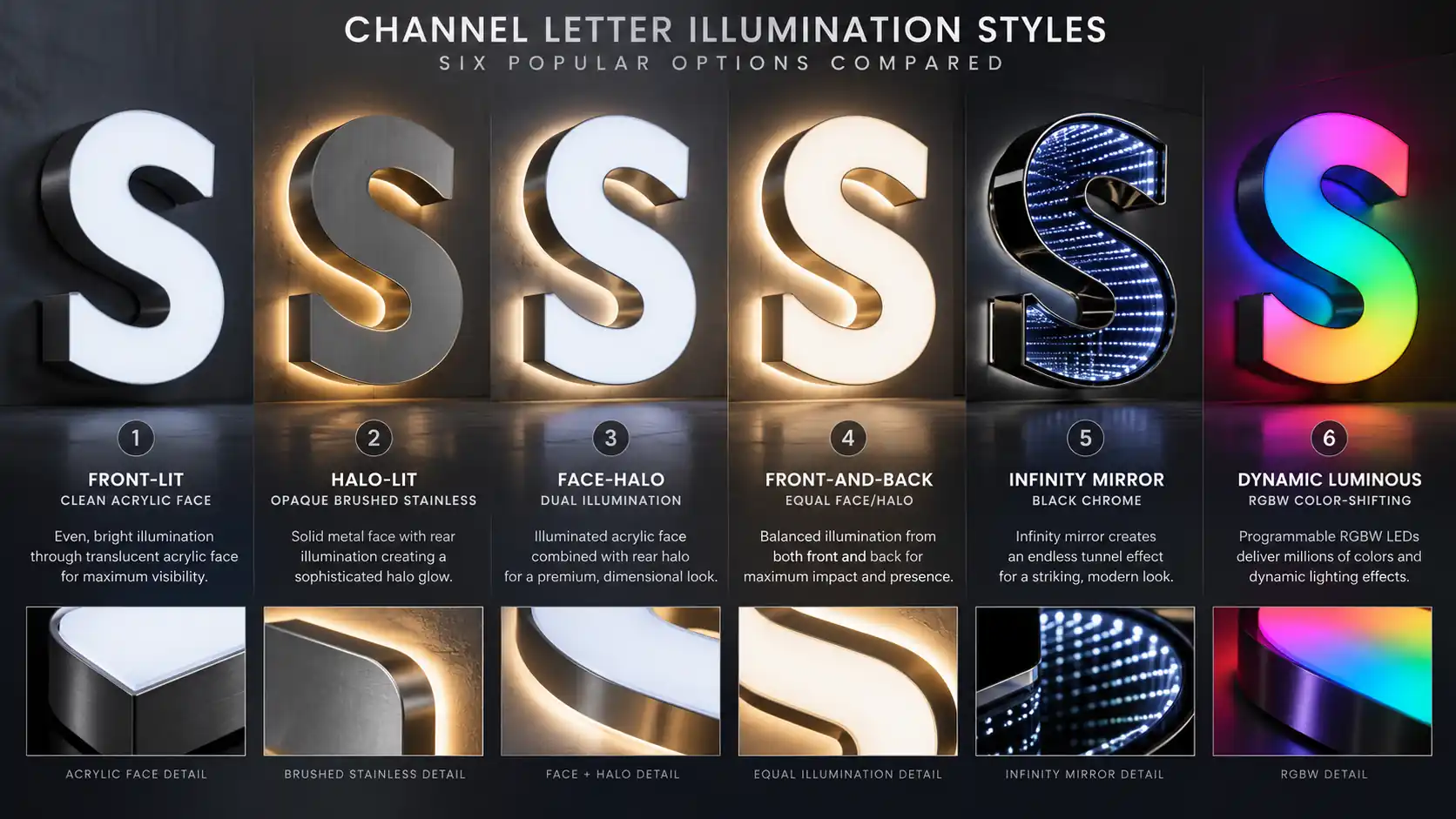
Face-halo letters light the face and the wall behind the letter at once. Set the face at the brand white and the halo 1000–1300 K warmer, and the letter sits in a pool of warm light while the logo stays crisp. That pairing — 4000 K face, 2700 K halo — is the most requested premium retail spec we build, because it reads as engineered rather than decorated. Array spacing and wall wash are in our face-halo explainer and on the front-and-back lit page.
Front-and-Back Balance, and Programmable Accents
When both sides are the same CCT, the risk is a glowing slab with no depth. Balancing output — face at 100%, halo at 55–65% — restores the silhouette; pale walls reflect, so they need less halo than dark ones. For color-changing signs, lock the brand white and let only the accent move: our dynamic luminous signs and the spectrum glow guide use a fixed white primary with a programmable accent layer, and the same rule governs infinity mirror letters — a 3000 K core holding the logo while the RGBW edge ring carries the effect in our infinity mirror ROI breakdown.
Common Mistakes & How to Avoid Them
“Just give me the brightest you have.” This produces 6500 K at maximum drive current — the cheapest module to buy, the most expensive to live with. Skin goes pale, food goes cold, and the modules shift color within two years because they run hot. Brightness is a distance problem; solve it with module count and letter depth.
Mixing CCTs on one facade. A warm logo beside a cool address plaque beside a neutral window sign produces noise, and noise reads as cheap. Pick one primary CCT per facade and allow one deliberate contrast.
No bin spec on the purchase order. “4000 K” without a bin width or SDCM tolerance means lot-to-lot variation of up to 500 K across a rollout — invisible until the second sign arrives.
No lit-sample approval. Datasheet numbers do not survive contact with a specific acrylic face and wall. Approve a lit sample at the real CCT, through the real face material, in a dark room. Specify CCT + CRI + SDCM in the brand book, require the sample, and require per-batch verification; everything else on this page follows from those three requirements.
Specifying in Your Brand Book
A color temperature spec belongs next to the Pantone numbers in the brand guidelines, not in a purchase order each contractor rewrites. The version that works fits on one page and is specific enough that two fabricators would build the same sign.
| Element | What to write | Example |
|---|---|---|
| Primary illumination | CCT + tolerance + CRI + SDCM | 4000 K ±150 K, CRI ≥90 (R9 ≥50), ±2 SDCM |
| Halo / accent | CCT + SDCM + output ratio | 2700 K ±100 K, ±2 SDCM, halo at 60% of face output |
| Dynamic accents | Locked primary + named palette | Primary locked 4000 K; accents #E4002B, #0057B8, #FFB81C |
| Face material | Acrylic grade and color reference | 3 mm cast acrylic, 7328 warm white, matte one side |
| Verification | Who measures, with what, at what tolerance | Spectrometer at face center, ±1 SDCM shipping tolerance, report per batch |
The One-Line Spec, and Auditing What You Own
If there is room for one sentence, use this: “All illuminated signage shall be 4000 K ±150 K at the letter face, CRI ≥90, ±2 SDCM from a reserved master bin; samples and each batch verified by spectrometer and reported.” That eliminates the four most common failures — wrong tint, poor rendering, lot drift, unverifiable claims.
Most brands then discover they are not starting from zero. The audit is mechanical: read each sign with a spectrometer at the face, record CCT, CRI, and illuminance, compare against the spec. Signs within tolerance get documented; the rest get a module swap inside the existing return, far cheaper than new letters.
From Spec to Sign
- Quote intake. You send the vector logo, Pantone numbers, and the CCT/CRI/SDCM spec. If it is missing we propose one from the matrix and explain why — the decision stays yours.
- Bin matching. We pick a bin that lands on your target CCT at the face after acrylic transmission and return bounce; on dual-lit signs, two bins are matched as a pair.
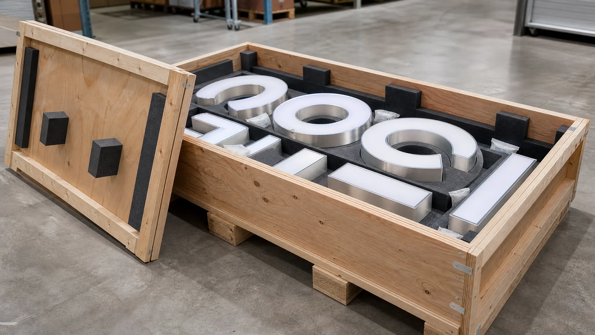
- Lit sample. We build three 12 in test letters at your CCT at ±1, ±2, and ±3 SDCM and ship them. You view them on your wall at night and approve one in writing, with the SDCM recorded.
- Production. The approved bin is pulled and reserved against the full order including service spares; letters are built, wired, and burned in.
- Verification. Each batch is read at the face against the approved sample at ±1 SDCM shipping tolerance, and the reading ships with the packing document.
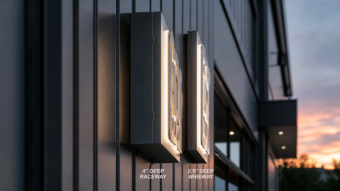
- Install and handover. Mounting affects the final read: a raceway stands the letters off the wall and changes the halo, a flush mount tightens it. If the method is open, compare raceway, flush mount and wireway, and confirm the electrical scope against UL and ETL requirements so the sign passes inspection first time.
If you are still deciding which style should carry the brand, start with the channel letter line selector — it narrows the geometry, then this guide sets the light. Send your logo, a photo of the wall, and the CCT you want; we will come back with a bin recommendation, a lit-sample plan, and a quote that names the specification instead of hiding it behind the word “white.”