From $19.9

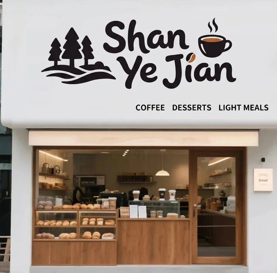
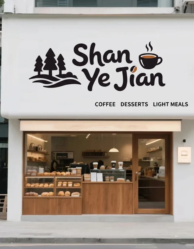
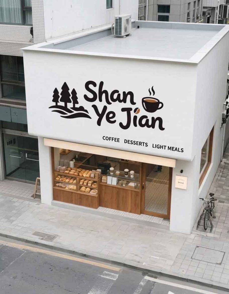
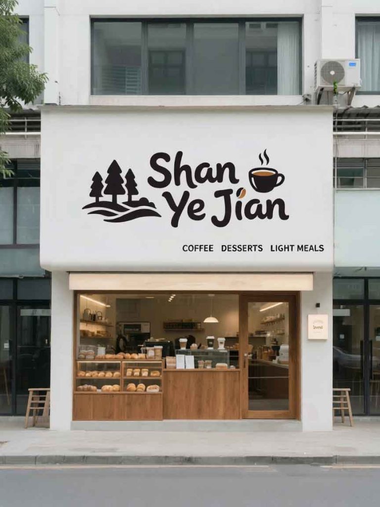
The subject of this redesign is a minimalist, modern lifestyle cafe and bakery located in an urban neighborhood. In the original storefront design (2.jpg), the shop features a stark, clean white stucco facade with a prominent, artistic Chinese signboard reading (Shan Ye Jian, meaning “Among Mountains and Wilderness”), accompanied by the subtitle (Coffee · Desserts · Light Meals). While the original branding holds immense artistic charm, its heavy reliance on stylized logography and Chinese characters limits its brand communication to a globalized or non-Chinese-speaking demographic. The primary objective of this project was to adapt the brand name and business offerings into English while strictly preserving the shop’s organic, artistic, and cozy minimalist design language.
The core challenge lay in translating the highly stylized Chinese logotype without losing its distinct graphic identity. The brand name was translated into “WILDERNESS” (or “SHAN YE JIAN” as a secondary option), reimagined through a custom-drawn English font that mirrors the original weight and playful posture of the Chinese strokes.
Typography & Style: The original Chinese font boasts heavy, rounded, ink-bleed aesthetics resembling bold calligraphy or stone-carving art. To maintain this, the new English lettering employs thick, organic, uneven contours rather than standardized digital geometric fonts.
Iconic Elements: The original design cleverly integrated a steaming coffee cup icon into the character “间”. In the English version, this whimsical graphic asset—featuring the abstract curved cup with two delicate lines of rising steam—is preserved and seamlessly integrated into the letter spacing or acting as a standalone emblem right next to the English text. The small coffee bean accent dot is likewise maintained to anchor the cafe theme.
The functional descriptive text was cleanly translated into “COFFEE · DESSERT · BISTRO”.
Layout & Alignment: To maintain the asymmetric balance of the facade, this subtitle is positioned in the lower-right quadrant beneath the main logo. It utilizes a slender, clean, widely-spaced sans-serif font that matches the understated elegance of the original layout, ensuring that the primary focus remains entirely on the artistic brand mark above.
The ultra-minimalist, pristine white background of the massive signboard structure was kept untouched. The stark contrast between the heavy black graphic text and the vast negative white space is central to the shop’s “wilderness in the city” concept, offering a visual breathing space on a busy street.
The English redesign successfully expands the cafe’s market accessibility while protecting its core visual soul. By translating the calligraphic weight and playful icon integration of the original Chinese characters into an organic English typographic format, the storefront retains its unique blend of rustic warmth and urban minimalism. The resulting storefront speaks fluously to an international audience without sacrificing its identity as an artistic, cozy neighborhood sanctuary.
design for your business? Contact our design team for a personalized consultation.
Browse more related signage design projects from our portfolio:
Need custom signage design for your business? Contact our design team for a personalized consultation.