From $19.9

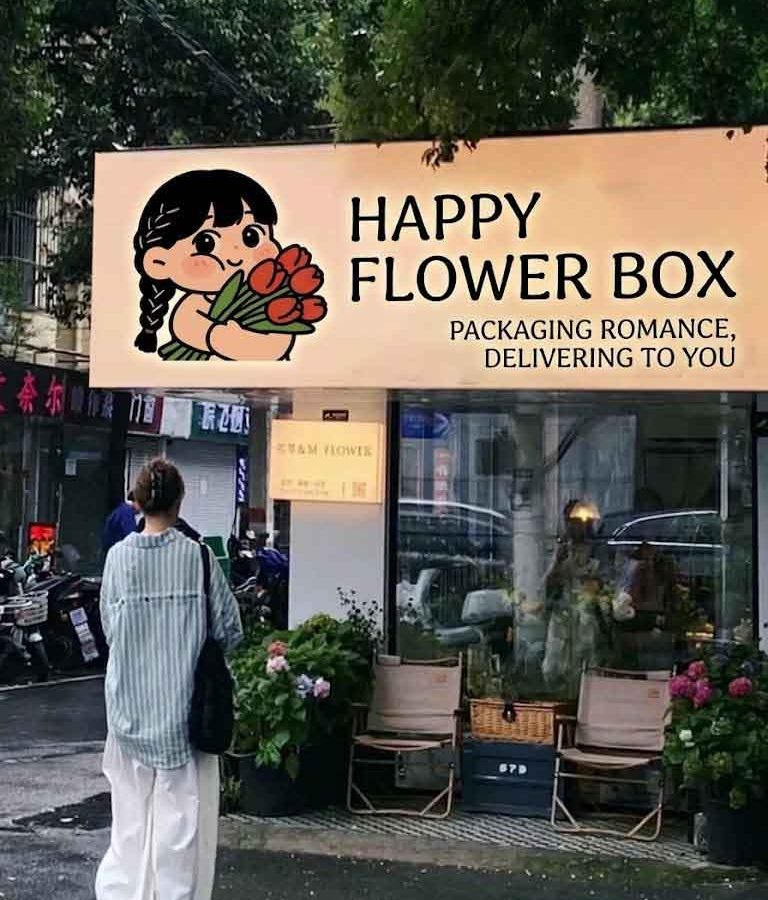
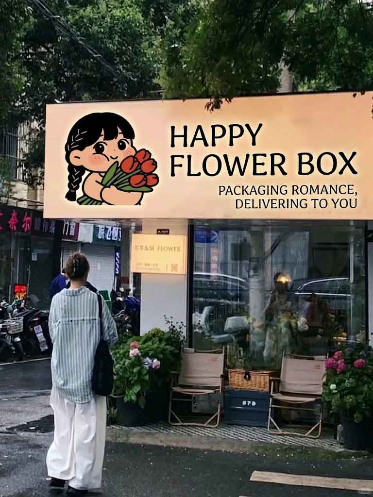
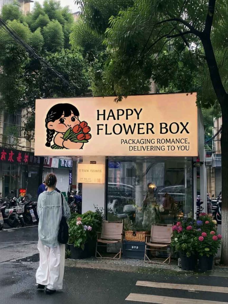
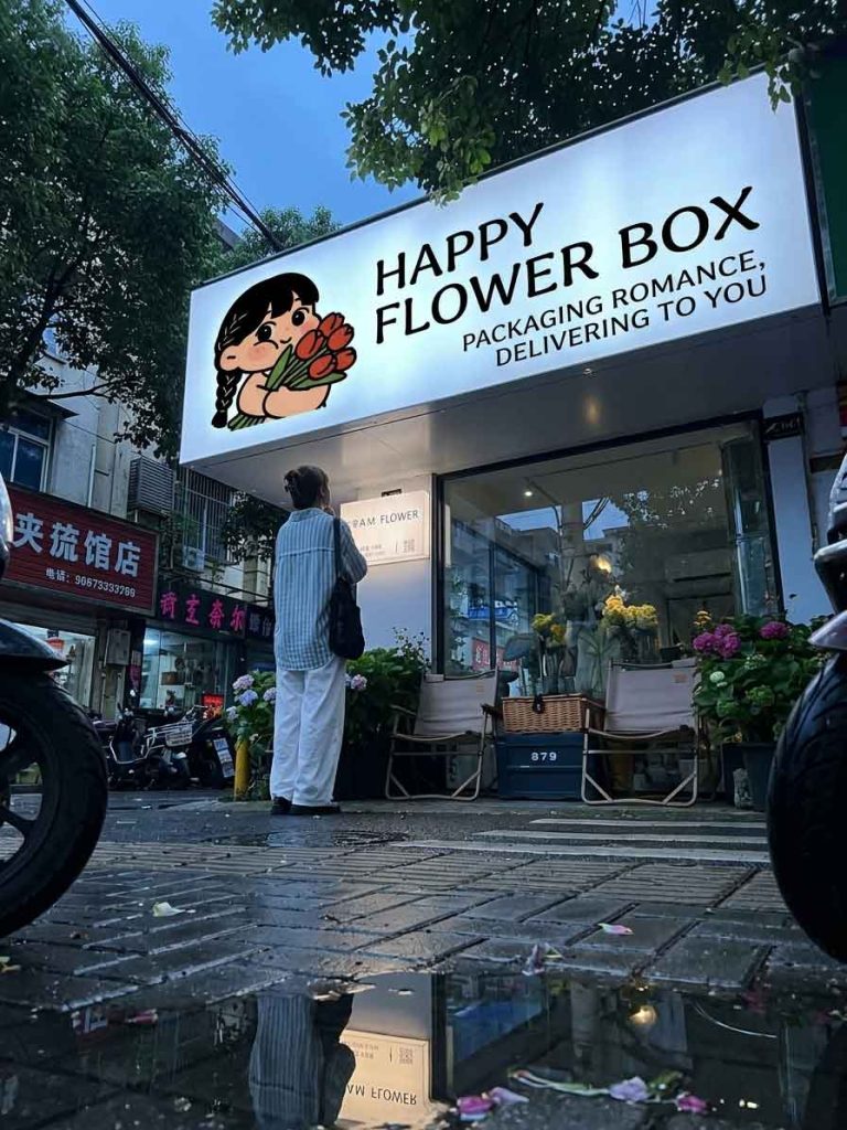
The subject of this redesign is a cozy, street-side boutique flower shop. In the original image (1.jpg), the storefront features a warm, inviting beige signboard with a charming illustration of a girl holding tulips. However, the text elements—consisting of the Chinese name (Kuai Le Hua Xia Zi), its Hanyu Pinyin, and the romantic tagline—restricted the brand’s appeal strictly to a local, Chinese-speaking audience. The primary objective of this project was to internationalize the shop’s branding by translating and redesigning the signboard text into English , thereby elevating its modern aesthetic while preserving its original emotional warmth.
The core challenge was translating the playful and imaginative Chinese name. was translated directly and effectively into “HAPPY FLOWER BOX”.
Typography: The original whimsical, brush-stroke Chinese font was replaced with a clean, elegant, and capitalized sans-serif typeface. This choice injects a contemporary, upscale feel into the storefront, balancing the playful nature of the illustration.
Layout: The English name is split into two balanced lines (“HAPPY” and “FLOWER BOX”) positioned to the right of the mascot. This structured layout maximizes readability from a distance.
The poetic Chinese tagline, (literally, “Package romance and deliver it to you”), carries a strong emotional hook. It was translated into a sophisticated, rhythmic English slogan: “PACKAGING ROMANCE, DELIVERING TO YOU”.
Placement & Hierarchy: To maintain a clear visual hierarchy, the slogan is placed in a smaller font size underneath the main brand name. It aligns beautifully with the right edge of the main text, creating a clean geometric block that does not compete with the primary brand name or the illustration.
To maintain brand continuity, the iconic illustration of the braided girl cradling a bunch of red tulips was kept completely intact. Her vibrant colors and joyful expression anchor the storefront, ensuring that despite the language shift, the shop retains its welcoming, neighborhood charm.
The final design successfully transitions the flower shop into a globally accessible brand. By replacing the localized text with clean English typography, the storefront achieves a minimalist yet deeply romantic aesthetic. The contrast between the structured text blocks and the organic, soft elements of the flowers on display below creates a sophisticated street presence that effortlessly draws the eyes of passersby.
design for your business? Contact our design team for a personalized consultation.
Browse more related signage design projects from our portfolio:
Need custom signage design for your business? Contact our design team for a personalized consultation.