From $19.9

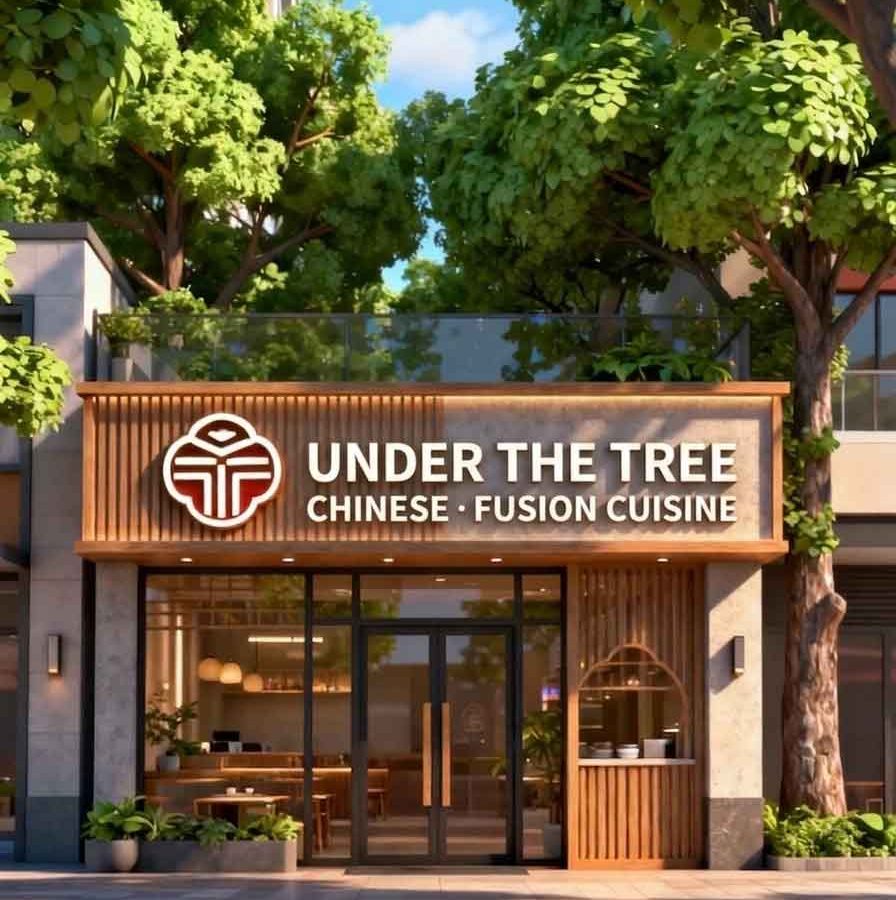
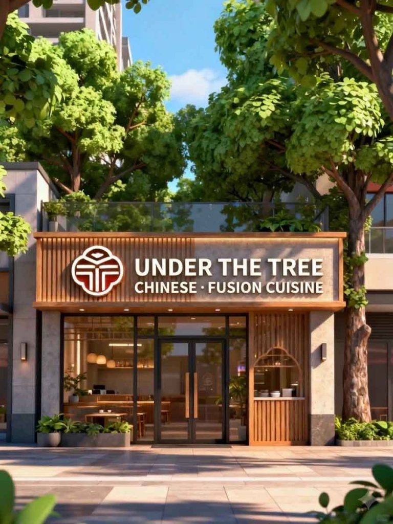
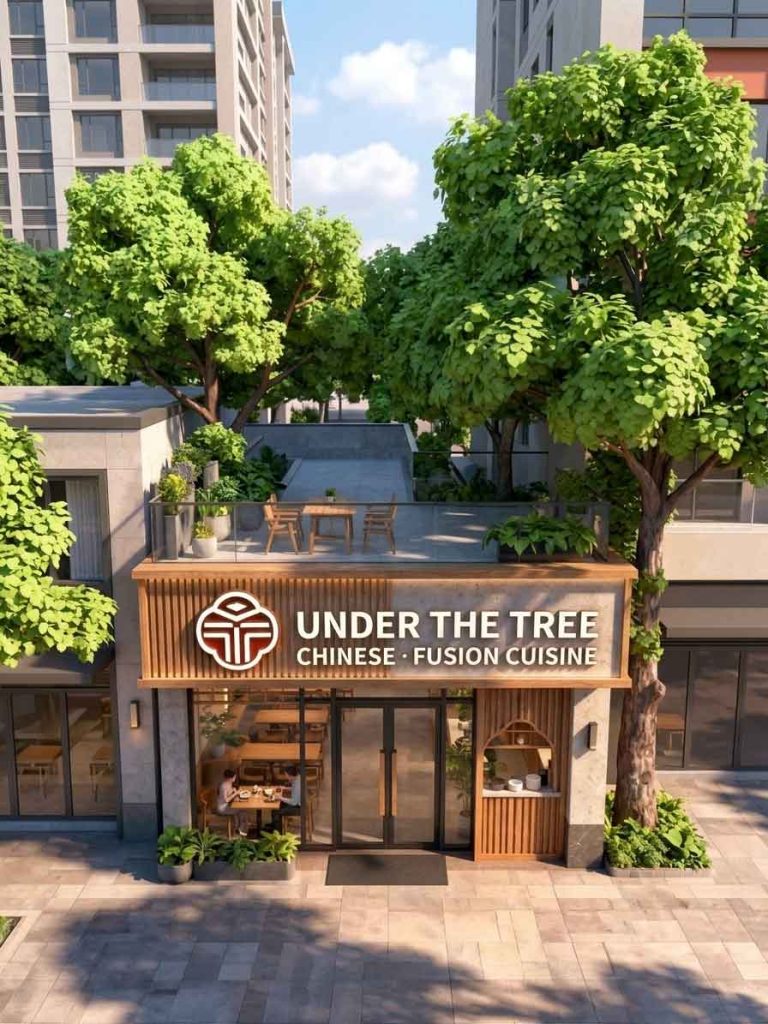
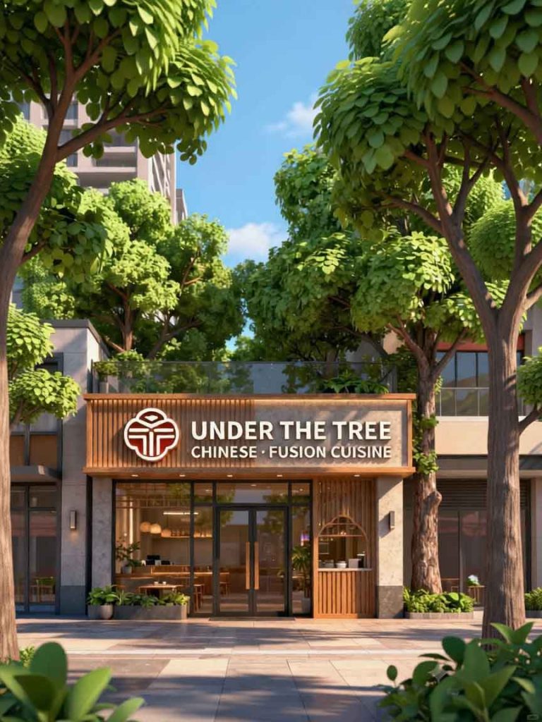
The project centers on the comprehensive signboard modernization of an upscale, nature-inspired restaurant nestled in a serene urban neighborhood. In the original design , the storefront gracefully honors its natural surroundings with a warm wood-slat and textured stone textured header, paired with a distinct circular geometric logo. However, its primary branding relied entirely on the Chinese characters (Shù Xià) and the descriptive subtitle .
The primary objective of this design iteration (watermarked_img_7061556612588520547.png) was to globalize the restaurant’s identity. By converting the Chinese typography into an elegant English layout, the venue successfully opens its doors to an international clientele while completely retaining its cozy, architectural harmony.
The poetic Chinese name was directly and naturally translated into “UNDER THE TREE”.
Typography & Weight: The bold, slightly soft sans-serif font chosen for the English text mimics the thick, clean visual weight of the original Chinese characters. Rendered in solid, matte white with warm, subtle backlighting, the 3D block lettering stands out flawlessly against the concrete textured fascia.
Layout Adjustment: Because “UNDER THE TREE” occupies more horizontal space than the original two Chinese characters, the text layout was transitioned into a structured, two-tier text block alongside the emblem to avoid cluttering the wood-slat feature on the left.
The functional culinary descriptor was accurately adapted to “CHINESE · FUSION CUISINE”.
Hierarchy & Placement: To maintain a clear reading hierarchy, the subtitle is positioned cleanly directly beneath the main brand title. It utilizes a slightly smaller font size and matching capitalization, creating a unified rectangular text block that balances beautifully with the circular logo on its left.
To preserve established brand equity, the iconic circular logo mark was left untouched. The logo—which artfully integrates a stylized tree motif inside a clean circular outline with a rich terracotta-brown backdrop—anchors the design. It provides an instant focal point that bridges the gap between the organic wood elements and the new modern English font.
The true brilliance of this signboard lies in how naturally it interacts with its physical environment. The warm vertical timber slats on the left side of the sign box find echoes in the arched window detailing on the lower right. Furthermore, the lush, overhanging green canopy of real trees framing the top of the building brings the name “Under the Tree” into immediate, literal reality, creating an immersive dining invitation.
The final design showcased in watermarked_img_7061556612588520547.png serves as an exceptional blueprint for cross-cultural commercial design. By transitioning to a balanced, clean, and backlit English typographic system, the restaurant elevates its presentation to a premium international level without sacrificing a single drop of its original, nature-loving warmth.
design for your business? Contact our design team for a personalized consultation.
Browse more related signage design projects from our portfolio:
Need custom signage design for your business? Contact our design team for a personalized consultation.