From $19.9

The objective of this design is to transition a traditional Chinese boutique bistro brand into a sophisticated, internationally accessible space named “LIUHE TAPROOM”. Operating as a dual-concept venue specializing in premium craft beer and fine wine, the facade design adopts a minimalist, architectural approach. It aims to project a sense of understated luxury, craftsmanship, and tranquility amidst an urban environment.
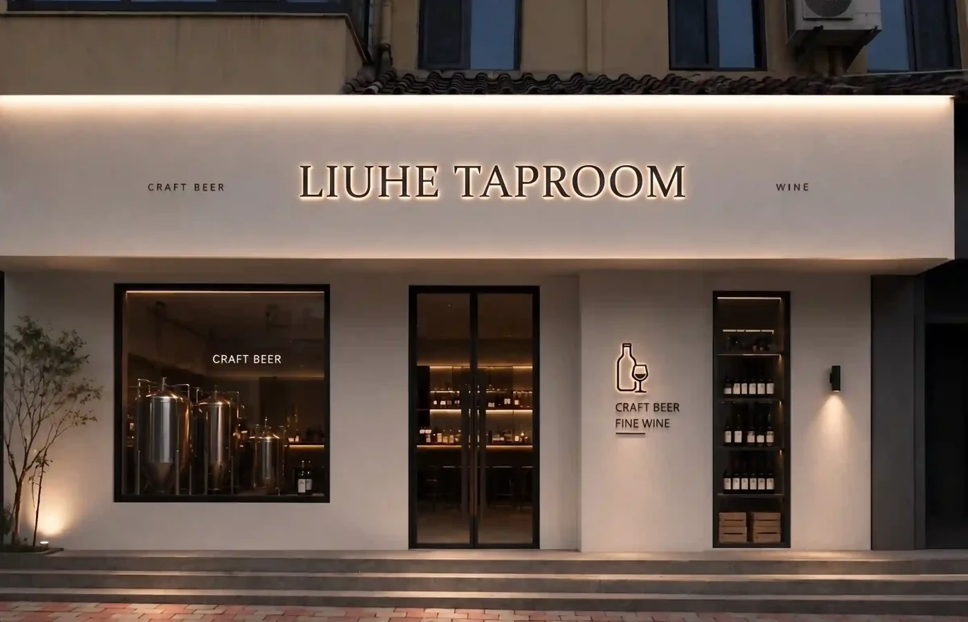
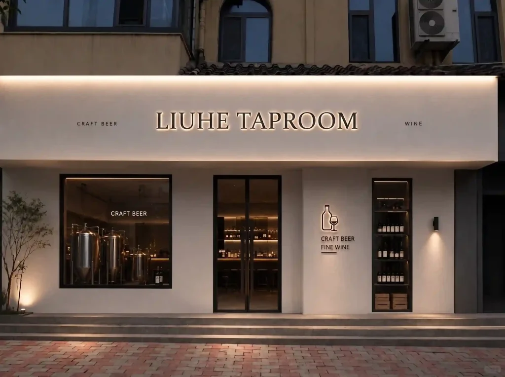
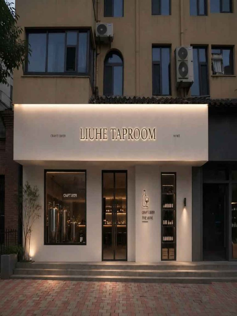
As seen in watermarked_img_9348464901351211825.png, the storefront rejects loud, flashing neon aesthetics in favor of a clean, matte off-white textured plaster facade. The design relies on dramatic geometry, high-contrast black framing, and a curated lighting scheme to tell the brand’s story. The signage is integrated directly into the architecture, acting as a natural extension of the building itself.
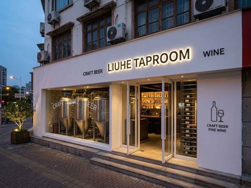
The centerpiece of the facade is the primary brand name, replacing the original Chinese characters while maintaining the exact spatial elegance and design weight.
Typography: The text is rendered in an elegant, clean serif typeface with classical proportions. The sharp serifs impart a sense of heritage and premium quality, aligning with the “fine wine” identity.
Material & Lighting: The lettering consists of solid, dark metallic block characters. They are engineered with advanced backlit LED halo lighting ($3000text{K}$ warm white). This creates a crisp, floating silhouette against the illuminated plaster band, ensuring perfect legibility and a high-end texture at night.
Sub-headers: Flanking the far left and right ends of the main fascia are the minimalist descriptors “CRAFT BEER” and “WINE” in a small, light sans-serif font, establishing clear brand offerings without cluttering the entry.
To the right of the main glass entryway, a secondary signage cluster is positioned on the main structural pillar to engage pedestrians at eye level.
Visual Icon: A minimalist, continuous-line metal icon combining a beer/wine bottle and a stemmed wine glass. It is backlit to mirror the main header’s premium halo effect.
Content: Below the icon, the bilingual text is streamlined into clean, stacked English typography reading “CRAFT BEER / FINE WINE”. This acts as a secondary functional anchor for passersby.
The brilliance of the signage lies in how it interacts with the facade’s open elements:
The Brewing Window: On the left, a large square glass viewing window showcases shining stainless steel fermentation tanks under warm spotlighting, instantly communicating the “Taproom” authenticity.
The Wine Display: On the far right, a narrow, vertical recessed glass niche displays illuminated wine bottles, balancing the craft beer tanks on the left.
By utilizing a sophisticated serif typeface, premium backlit halo effects, and an uncluttered spatial layout, the new English signage for LIUHE TAPROOM successfully retains the calm, premium, and welcoming soul of the original design. It elevates the storefront into a landmark of contemporary urban lifestyle.
design for your business? Contact our design team for a personalized consultation.
Browse more related signage design projects from our portfolio:
Need custom signage design for your business? Contact our design team for a personalized consultation.