Running a medical or dental practice means your signage has to do more work than a typical commercial storefront sign. It has to satisfy municipal sign ordinances, meet ADA accessibility standards, pass electrical safety inspections, and comply with the signage clause in your lease — all before it is ever installed. A poorly planned sign can trigger a code violation, an insurance flag, or a patient complaint. A well-designed one builds trust before the patient has even walked through the door.
This guide walks through every compliance layer a healthcare provider needs to consider before ordering channel letters for a clinic, dental office, urgent care center, or medical spa. It covers what your city planner will ask, what the ADA actually requires, why UL or ETL certification is non-negotiable, and how to match your sign style to the kind of practice you run.
Why Healthcare Signage Is Different from Retail or Restaurant Signs
Regulatory Exposure Is Personal
For a retail store, a sign violation is a cost problem — a fine, a rework, a delay. For a healthcare provider, it is a trust problem. Patients form their first professional impression of your practice from the outside. A sign that is too dim, that flickers, or that was installed without the required electrical certification signals a lack of attention to detail — and in healthcare, that detail is exactly what patients are trusting you with.
Municipal sign enforcement in healthcare-dense districts (medical office parks, suburban commercial corridors, and mixed-use zones) tends to be stricter than in purely retail districts. Healthcare facilities are subject to additional accessibility and patient-safety overlays that push sign inspections further than a typical store will ever face.
The Trust Signal You Cannot Afford to Get Wrong
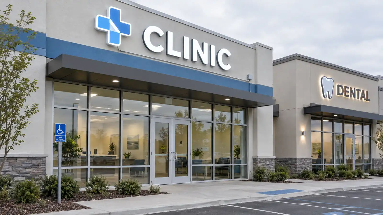
A channel letter sign is the first professional assessment most new patients make of your practice. Healthcare marketing research consistently shows that exterior design cues — sign clarity, mounting quality, lighting consistency — directly influence whether a prospective patient schedules an appointment or walks past. A clean, well-lit sign in a consistent typeface tells the patient: this practice is organized, modern, and pays attention to the details that matter. A dim, inconsistent, or poorly mounted sign tells them the opposite. The sign is, in a sense, the first exam room the patient walks through.
Illuminated Sign Ordinances: What Your Municipality Actually Requires
Sign ordinances vary dramatically between a suburban county in Texas and a dense urban district in New York. Before specifying any lighting or letter size, you need to know what your municipality permits. The key variables are: maximum sign area (often expressed as a ratio of frontage, e.g. one square foot per linear foot), maximum letter height, illumination type restrictions (some older districts prohibit external projection lighting entirely), and setback distances from sidewalks and property lines.
The Municipality Checklist: Questions for Your City Planner
Bring this list to your first meeting with the planning department:
- What is the maximum sign area ratio for my property’s zoning classification?
- Is there a maximum letter height for illuminated signs in this district?
- Does the ordinance specify a maximum lumen output or brightness limit?
- Are internally illuminated (photo-luminous) letters permitted, or only external projection lighting?
- Is there a color temperature restriction — e.g. warm white only, no blue or green?
- What is the required setback from the sidewalk edge or property line?
- Must the sign be illuminated 24 hours, or can it be turned off at night?
- Is a sign permit required before installation, and what is the application fee?
- Are there height restrictions that conflict with a multi-story medical office building?
- Will the sign be reviewed by a design review board or just the planning department?
Getting these answers in writing before you order letters saves weeks of potential rework. For a broader overview of the US sign permit landscape, see our guide on whether you need a sign permit.
ADA Compliance for Clinic Signage: What You Must Meet
The Americans with Disabilities Act sets specific requirements for signage in public and quasi-public buildings, and healthcare facilities are among the most scrutinized under it. The 2010 ADA Standards for Accessible Design set the legal floor for character height, contrast, finish, and — in many cases — tactile characters.
Character Height and Contrast Requirements
For fixed signs that identify a room, service area, or function (e.g. “Dental Exam Room 3”, “Radiology”, “Reception”), the ADA requires a minimum character height of 5/8 inch with a 0.42-inch stroke thickness for sans-serif type. For larger directional and informational signs — the kind that carries your clinic name and an “Open 24 Hours” line — the character height should be at least one inch minimum. Contrast between characters and the background must meet a 70 percent contrast ratio minimum.
When specifying channel letters for your clinic name, make sure the letter color against the fascia or wall provides at least a 3:1 contrast ratio in daylight conditions. If you are uncertain about the minimum readable height for your property’s frontage and viewing distance, run the numbers through our channel letter size guide.
Tactile and Braille Considerations
Signs that identify rooms or services by name must include raised (tactile) characters and Grade 2 Braille. This requirement applies most often to interior signage. If your clinic has a standalone exterior sign that identifies the practice name and location — such as a pylon sign in a medical office park — tactile characters are generally not required. However, if the sign is mounted at the main entrance and functions as a room or function identifier, tactile characters may apply. When in doubt, add them: the incremental cost is minimal and it removes a potential compliance liability.
Electrical Certification: UL, ETL, and Why It Matters for Your Clinic
Any illuminated sign you install must use UL-listed or ETL-certified electrical components. This is not optional. It is required by most municipal electrical codes and by your practice’s liability insurance carrier. A sign that fails an electrical inspection can put the entire practice on a notice-to-correct timeline.
UL Listed vs ETL Certified: What Is the Difference?
UL (Underwriters Laboratories) and ETL (Intertek) are the two major North American third-party testing bodies. “UL Listed” means the component passed UL’s testing program and is included in the UL Directory. “ETL Certified” means it passed Intertek’s ETL program, which is a separate but equally recognized testing pathway. Both are accepted by the Authority Having Jurisdiction (AHJ) in most US municipalities.
When you are ordering channel letters, ask the manufacturer for the UL or ETL listing number for the LED driver and power supply. A clinic that installs a non-certified sign and later has an electrical inspection flagged will need to replace the driver — at a cost that far exceeds the premium for a certified one from the start. Our front-lit letters product page lists the certification options available for each build configuration.
Landlord and Lease Restrictions: The Unspoken Layer
Many medical office parks and commercial strip centers have lease clauses that restrict signage size, type, and mounting method — sometimes more strictly than the municipal ordinance does. A lease that allows “one single-tenant entrance sign not exceeding 24 inches in height” will cap your channel letter size regardless of what the city would otherwise permit.
Reading the Signage Clause Before You Sign
Before you sign a lease for a new clinic location, pull the signage exhibit from the lease and cross-reference it with the municipal ordinance. The lease restriction is the binding constraint, not the ordinance. A common trap: the lease specifies “one sign per tenant” and counts a pylon sign and a fascia sign as two separate signs. If your practice needs both a building-mounted sign and a parking lot pylon, confirm in writing with the landlord that both are permitted under the lease. Getting clarification before installation is far cheaper than a landlord dispute after the fact.
For examples of healthcare-specific sign configurations and their typical use cases, browse our industries page.
Designing for Patient Trust: Clean, Legible, Professional
Healthcare patients — particularly first-time patients and those arriving in a state of discomfort or anxiety — respond strongly to visual cues of competence and care. Your sign is the first of those cues, and it sets the tone for the entire visit.
Color Psychology in Healthcare
Blue and white remain the dominant palette for healthcare signage, and for good reason: blue signals calm and cleanliness, and white signals precision. Teal is increasingly used by dental practices to differentiate from the hospital-corporate blue. Avoid red as a primary sign color unless it is part of a logo — red signals urgency or alarm and can create a negative first impression for an anxious patient.
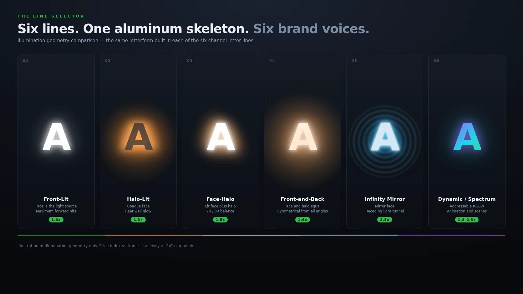
If your clinic name is long, consider a two-line stack with a smaller descriptor line (“Family Medicine” or “Cosmetic and General Dentistry”) beneath the primary name in a lighter weight. For a comparative look at which letter styles read as most clinical versus most welcoming, see our front-lit vs backlit channel letters guide — front-lit letters tend to read cleaner and more clinical, while halo-lit letters project a softer, warmer presence that works well for dental practices emphasizing a spa-like atmosphere.
24/7 Visibility for Urgent Care and ER: Always-On Signage
Urgent care centers, ER overflow clinics, and after-hours urgent dental practices need signage that is legible at 3 a.m. The sign design and driver configuration you choose will determine whether that is actually possible.
Always-On vs Daylight-Activated Signage
Most residential-zoned medical facilities operate 8 a.m. to 8 p.m. and can use a photocell that turns the sign off during daylight hours to save energy. An urgent care center that is open 24 hours — or a dental practice that handles after-hours emergencies — should keep the sign illuminated around the clock. A photocell with an “always-on” override switch lets you switch modes seasonally (always-on in winter, when darkness arrives early).
For the sign to be legible at 3 a.m., the LED driver output needs to be calibrated to a consistent lumen level. A sign that dims as ambient light drops below the photocell threshold will appear half-lit and unprofessional to a patient pulling into the lot in the dark. The spectrum glow letters product offers programmable color and brightness levels for facilities that want to shift from standard white to a warmer evening tone without replacing hardware.
Parking Lot Wayfinding: From Entrance to Patient Room
For multi-building medical office parks, the parking lot is the first wayfinding challenge patients face. A well-planned sign hierarchy — a pylon sign at the property entrance, directional signs at major lot intersections, and building-level identifiers at each entrance — reduces “where do I go?” calls to the front desk and improves the overall patient experience from the moment they pull in.
Pole-Mounted and Pylon Sign Integration
A pylon sign at the main parking lot entrance is the single highest-visibility element in a medical office park. It should carry the practice name in the largest letter height the ordinance allows, with a secondary line for the descriptor (“Urgent Care”, “Dental”, “Pediatrics”). Pole-mounted directional signs at internal lot intersections should use the same typeface and color as the pylon for visual consistency.
In multi-tenant parks where each tenant has its own sign allowance, coordinate with the property management company so that all pylon signs use a consistent base height and letter size. A park where every tenant’s sign is a different height and color looks chaotic and undermines the professional impression each individual practice is trying to make. The halo-lit letters product page shows the softer-glow option that works well for directional and pylon signs in mixed-use corridors.
Choosing the Right Style by Clinic Type
The table below maps common healthcare facility types to the sign style that best serves their patient-experience and compliance goals:
| Clinic Type | Recommended Style | Key Reason | Typical Color |
|---|---|---|---|
| Family Medicine / General Practice | Front-lit, clean sans-serif | Reads as organized and approachable | White or light blue |
| Dental Practice | Halo-lit, soft warm white | Soft glow reduces anxiety; spa-like feel | Warm white or teal |
| Urgent Care / ER Overflow | Front-lit, always-on, high lumen | 24/7 legibility is the priority | White or amber |
| Pediatric Clinic | Front-lit, rounded typeface | Soft shapes read as friendly; parents notice | Pastel blue or soft green |
| Medical Spa / Aesthetic Clinic | Halo-lit or infinity mirror, custom finish | Aspirational aesthetic; luxury signal | Brushed gold, rose gold, or soft pink |
| Diagnostic / Imaging Center | Front-lit, high-contrast, clean | Reads as precise and technical | White with blue accent |
| Multi-Specialty Medical Office Park | Coordinated pylon + fascia system | Consistent height/typeface across tenants | Per tenant, within a shared palette |
For any of these configurations, start with the signage glossary to make sure you are using the correct terminology when you brief your sign fabricator — it will speed up the quote process and reduce the chance of a miscommunication on finish or mounting type.
Frequently Asked Questions
Do medical clinics need a different sign permit than retail stores?
No — the permit application is the same municipal process. What differs is the level of scrutiny: healthcare facilities are more likely to be flagged during sign inspections for ADA and electrical code compliance. Build your permit application with those requirements documented from the start, not as an afterthought.
What letter height is the minimum for a dental practice name sign?
For a dental practice name sign visible from the street, aim for a minimum of 6 to 8 inches of letter height at a standard 25 to 50-foot viewing distance. For a pylon sign visible from across a parking lot, 12 to 18 inches is the practical minimum. Use our channel letter size guide to calculate the exact minimum for your specific frontage and viewing distance.
Can I use warm-white LEDs in a clinic sign?
Yes, and many dental and medical spa practices prefer warm-white LEDs (2700K to 3000K) because the softer glow reads as more welcoming than clinical cool-white. Confirm with your municipality’s sign ordinance whether a specific color temperature is restricted before you specify the driver — some districts limit sign color to white or amber only.
How long do LED channel letters last in a healthcare setting?
Quality LED channel letters with UL-listed drivers are rated for 50,000 hours or more, which is roughly 12 years of continuous 24/7 operation. In a healthcare setting where the sign runs 16 to 18 hours daily, expect to plan on a driver replacement at the 8 to 10-year mark. The letters themselves have no moving parts and no bulb replacement cycle.
Should I match my clinic sign to my interior design or to municipal code requirements?
Municipal code requirements are non-negotiable — they cap your letter size, color, and illumination type first. Within those constraints, your sign should reflect your interior design language: the same typeface, color palette, and material finish. A sign that looks like a retail brand while the interior looks like a clinical office creates a dissonance that patients notice even if they cannot articulate it.