Most channel letters are purchased from a daytime photo and judged at night. That is backwards. Face finish, face colour, edge treatment and return colour all change a letter’s character depending on whether the LED is on. This guide covers how channel letters look by day versus by night, and how to pick a finish that survives both shifts.
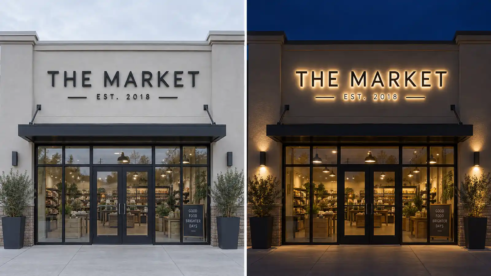
Day Appearance and Night Appearance Are Two Different Decisions
A channel letter is not one product; it is two. In daylight the LED is off and the letter behaves like architectural trim — the face finish, the face colour and the standoff on the wall do all the work. At night the face finish barely matters: viewers see the glow colour, the halo on the wall, and whether the face is still legible through the light.
Because the two conditions pull in different directions, most signage failures are finish decisions rather than fabrication errors — a daytime-pleasing choice that dies at night, a night-pleasing choice that disappears in daylight, or a safe middle that underperforms both.
How Much of the Day Is Really “Day” for a Sign
A commercial storefront runs roughly nine hours of usable daylight, three to four hours of dusk and dawn transition when the LED is dim or off, and twelve to thirteen hours of full LED-on darkness. Most US and EU retail traffic arrives between 17:00 and 22:00 — the transition and full-dark window — so the finish sets the ceiling for all three phases.
What Daylight Sees vs What Darkness Sees
| Condition | What the eye locks onto | What the finish controls |
|---|---|---|
| Full daylight (LED off) | Face colour, reflectivity, edge highlight, wall shadow | Whether the face reads as a brand material or as plastic trim |
| Dusk / dawn (partial output) | Balance between the face and the emerging halo | Whether the letter looks “on” or “half-off” to a driver |
| Full night (LED on) | Glow colour, halo shape, face legibility | Whether the face stays readable or becomes a flat white patch |
One finish rarely optimises all three. Buyers who regret a letter usually optimised night mode and then had to live with it through nine daytime hours a day.
By day the eye reads a channel letter the way it reads any architectural element — by reflection and contrast. A matte face returns a soft, even wash of the facade’s own colour; a semi-gloss face returns a subtle sheen that reads as quality; a gloss or mirror face returns a hard, high-contrast reflection that pulls the eye from far away.
Colour works the same way: a face matching the storefront’s brand colour reads as intentional, a bright accent face — white on brick, black on glass — reads as a graphic element, and a face the same colour as the wall disappears by day, legitimate only when the sign is a pure night-time marker.
Once the LED is on, the face’s job shifts from attracting attention to holding the letter’s shape. The eye follows the halo — the soft ring the letter casts onto the wall — and secondarily the light escaping around the face edge. If the face itself is bright, the eye is confused between face and halo. That trade-off is covered in our guide to backlit vs face-lit channel letters.
How Each Lighting Type Behaves by Day and by Night
Front-Lit Faces: The Daytime-First Option
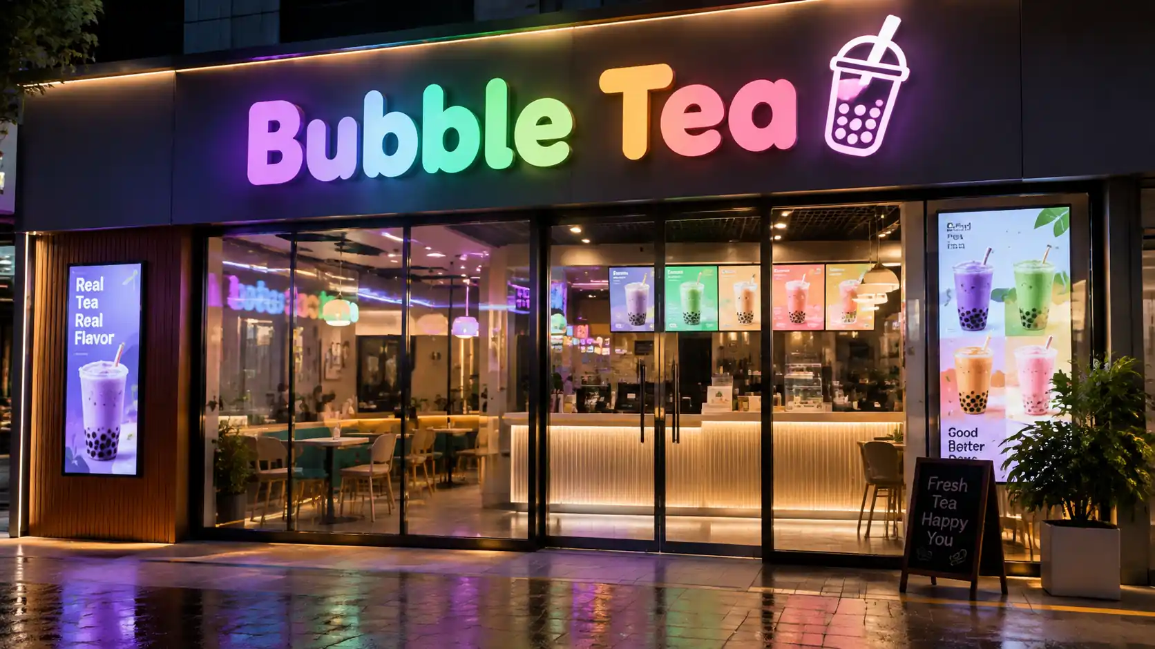
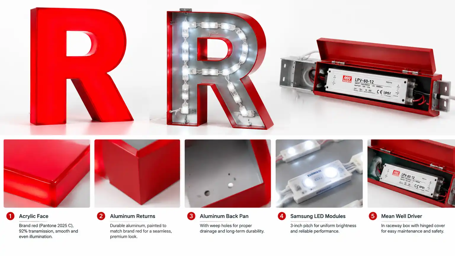
Front-lit channel letters are lit from the front: the LED sits behind a translucent face that glows evenly at night and reads as a solid opaque colour by day. By day the letter is a clean brand-colour face readable from forty feet; by night the face glows uniformly, though colours shift warmer under LED — bright blue may read teal, red may read orange. Best for restaurants, gyms and convenience stores, where the storefront is judged in both conditions equally.
Halo-Lit Faces: The Nighttime-First Option
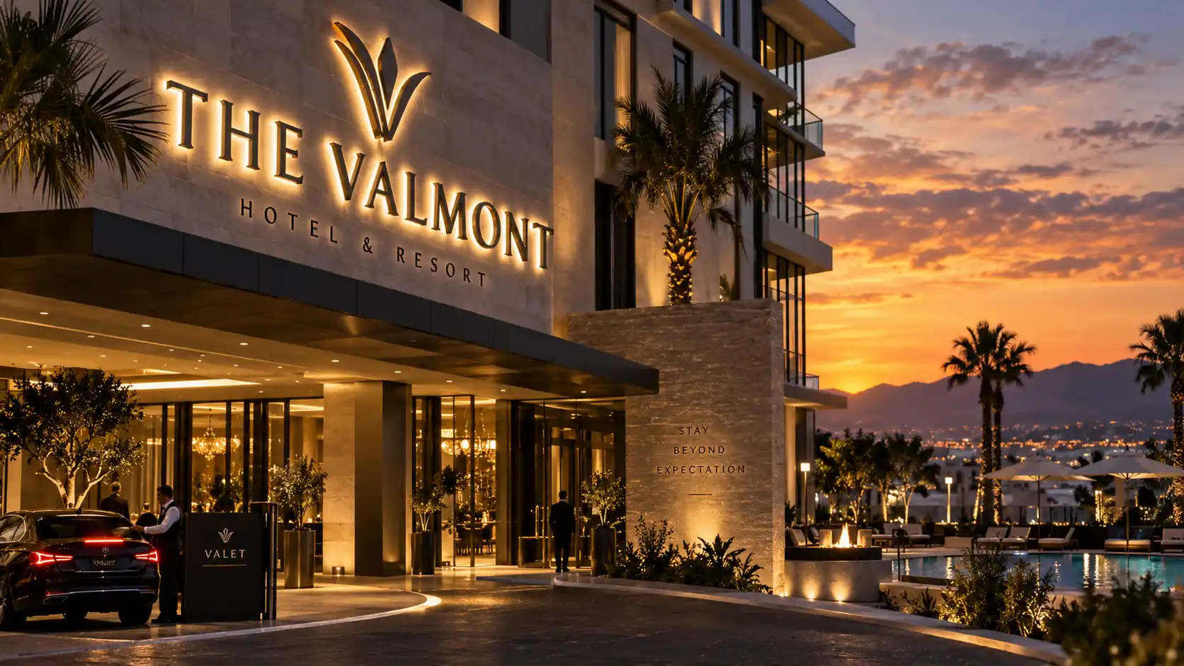
Halo-lit letters are lit from behind: the LED throws light into the gap between the letter and the wall, and the halo becomes the entire visual. The face is opaque and stays dark at night, so by day the face colour is 100% of the daytime character; by night the face disappears and any daytime colour is free. Best for hotels, boutiques, law offices and beauty salons. Because the halo does all the night work, the halo-lit face finish is a pure daytime decision — see the halo lit letters materials guide.
Dual-Lit: The Best of Both
Dual-lit letters are lit from the front and the behind at once. By day they behave like front-lit letters and carry the brand colour; by night the face glows while the halo adds depth. Best for flagship stores, dealerships, medical buildings and corporate facades, where the sign must stay visible from far distances in every weather condition. See the front and back-lit sign page for the full spec.
The Six Face Finishes Ranked by Day vs Night
| Face finish | Daytime read | Nighttime read | Best pairing |
|---|---|---|---|
| PVC painted matte | Soft, brand-colour, matte | Solid front-lit glow | Front-lit retail |
| Acrylic semi-gloss | Clean, modern, slight sheen | Even front-lit glow | Front-lit, dual-lit |
| Stainless brushed | Premium architectural trim | Dark face, strong halo | Halo-lit hotels, offices |
| Stainless mirror-polished | Reflective, sharp, high-contrast | Dark face, bright halo, glare risk | Halo-lit flagships |
| Aluminum powder-coat | Matte brand colour, weather-resistant | Solid front-lit or halo | Dual-lit storefronts |
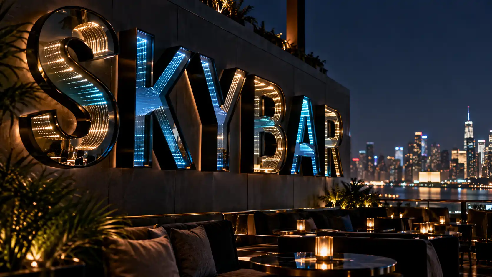
| Prismatic acrylic | Faint rainbow tint, glossy | Animated spectrum glow | Spectrum-glow nightlife |
Matching the Finish to Your Storefront Conditions
The Wall Colour Sets the Night Palette
At night the halo takes on the wall colour behind the letter. A red LED halo behind warm tan brick looks welcoming; behind white stucco it looks clinical; behind dark slate or dark-blue painted wall it disappears entirely. Before picking a face and an LED colour, walk the storefront at 22:00 with a flashlight against the wall where the letter will mount — that flash gives a rough read of what the halo will do.
Daytime Contrast Is the Brand Signal
If the face colour is close to the facade colour the letter disappears in daylight; if it is too far from the facade it reads as a sticker. Aim for enough contrast to see the letter from thirty feet, but enough harmony that the storefront still reads as one storefront. The industry-specific sign solutions page walks through these contrasts for retail, restaurant, hotel and medical storefronts.
Weathering Changes the Day Picture Over Time
Glossy acrylic yellows in direct sun within five to eight years. Painted PVC holds colour but flakes at the edge after ten-plus years in direct sun. Aluminum powder-coat is the most weather-resilient finish we ship; stainless — brushed or mirror — is maintenance-free but shows water streaks if the facade does not drain away from the letter. To weigh how much the finish affects lifetime cost, the backlit channel letters cost guide breaks down the tiers.
Common Day-vs-Night Finish Mistakes
- Choosing LED colour by default. White LED against a warm-toned face makes the letter look sickly at night. Match the LED colour temperature to the face finish, not the other way around.
- Paying for a premium face on a low-visibility mount. Mirror-polished stainless on a corner location at sixty feet is wasted premium — at night no viewer can resolve the finish.
- Ordering halo-lit on a wall that eats the halo. Deeply textured brick, dark-painted masonry and rough stucco all suppress the halo so much the letter looks unlit. If your wall is one of these, dual-lit is the safer choice.
- Ignoring the daytime transition. Between 18:00 and 20:00 the sky is still readable and the LED is at full output. A letter tuned only for full darkness reads as glaring in this window. A dimmable LED driver handles it; a fixed-output LED does not.
How to Verify Before You Commit to a Finish
A factory that controls quality will show the letter under all three conditions — daylight, dusk and full night. If the letter fails in one of them, the fix is a finish change before production, not a repaint after shipping. Ask for an unedited night clip of the exact finish against the actual wall, not a studio shot against a black void.
Once the face finish is chosen the LED colour temperature has to match. 3000K warm white, 4000K neutral white and 6500K cool white all look different behind the same face. Put the colour temperature in the order — 2700K–3000K for hotels and restaurants, 4000K for retail and medical, 5000K–6500K for corporate and automotive — and ask for the LED CRI in the same document.
FAQ
Does the face finish matter for halo-lit letters?
Yes, but only by day. At night the face is dark and only the halo is visible, so the face finish is a pure daytime decision. On a dark or textured wall the wall itself matters more than the face — see the backlit letters on brick vs stucco vs glass guide.
What is the safest finish for both day and night?
For most storefronts, aluminum powder-coat with a dual-lit configuration is the safest combination. Powder-coat is weather-resilient, holds its brand colour by day, and dual-lit gives both the face glow and the halo at night, so the letter stays legible under every lighting condition.
How do I know whether a supplier’s night photo is honest?
Ask for three things: an unedited night clip of the exact finish against the actual wall, the LED colour temperature in writing, and a spec sheet showing LED spacing per letter. A supplier who cannot provide all three is likely to deliver something different from their brochure — the same pre-order discipline as the how to avoid hotspots in backlit letters guide.
Want to see your logo under both conditions before you order? Get a free quote with your logo and storefront photo — Y SIGNS sends a daytime render and a night-lit render of the exact finish, so you approve both shifts before production starts.