Most channel letter quotes stall on artwork rather than price. A factory receives a PNG screenshot, guesses the typeface, estimates height from a phone photo, and returns either a rush-artwork charge or a proof request that pushes the order back two weeks. Getting the file right first lets the shop size, quote, and schedule the sign in one pass.
What “Artwork Ready” Means for Channel Letters
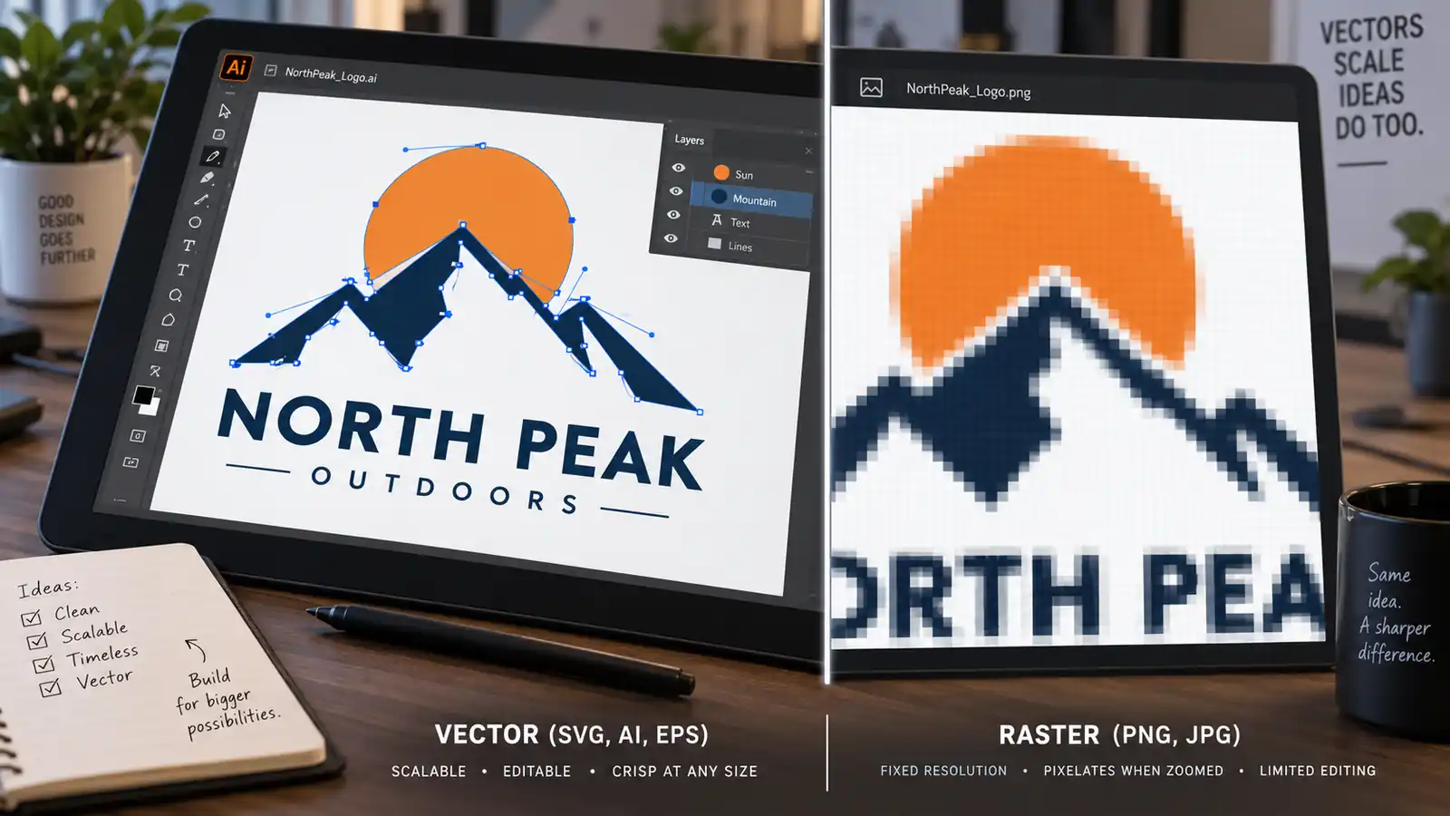
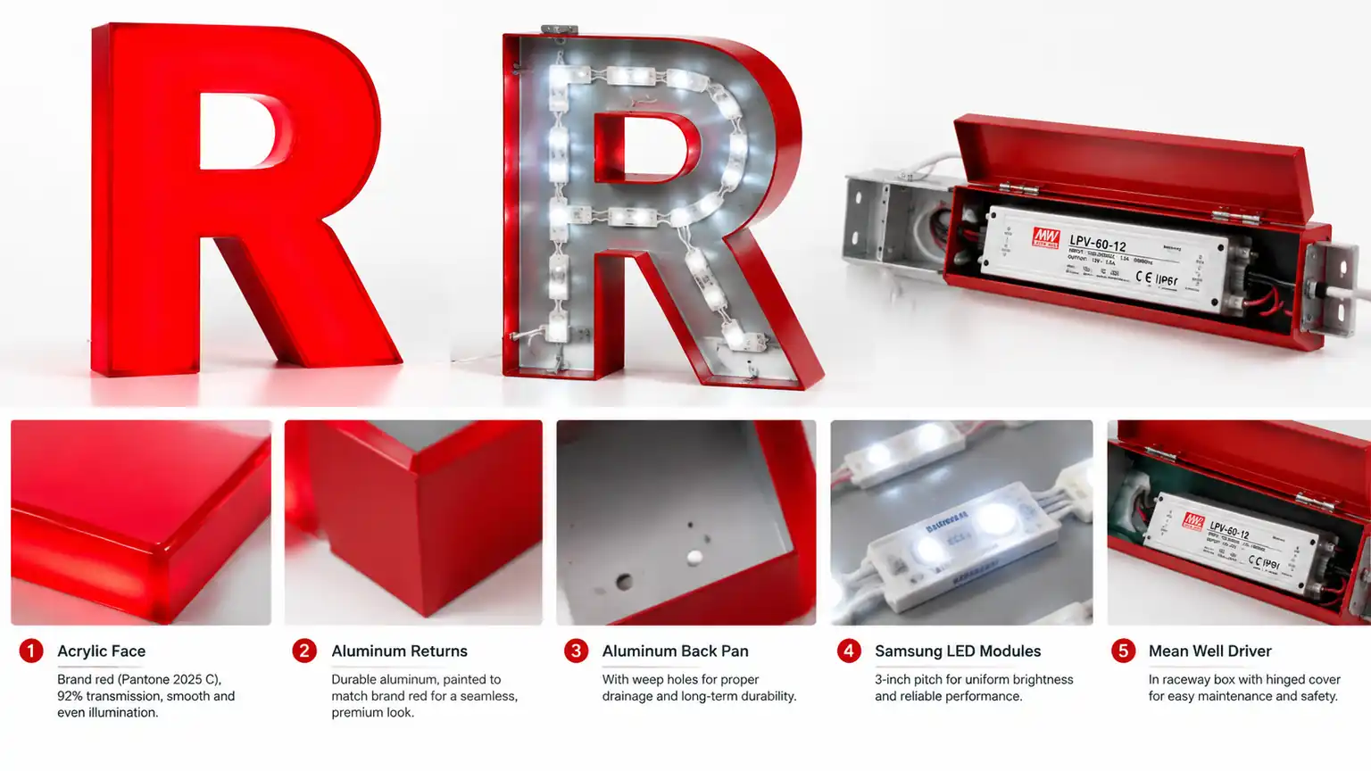
Channel letters are built from physical material: aluminum faces, acrylic inserts, and bent channel stock. Nothing is printed or projected, so the shop needs geometry it can turn directly into cutting files, not an image to trace by eye.
Resolution-Independent Geometry
A 1.2-meter letter can occupy only 300 pixels in a screenshot. Scaled to storefront size, edges turn jagged and curves become stair-step ladders. Vector artwork stores each curve as a mathematical equation and stays smooth at any scale, making it the single most important requirement here.
A Closed Letter Outline
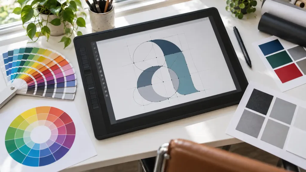
Every letterform must be a closed shape with defined inner and outer boundaries. The classic problem is the counter, the enclosed hole in letters like O, e, a, and R. If that inner shape is missing or not boolean-subtracted, the face becomes a solid disc with no hole, and the shop must decide depth and roundness on its own.
Color Separated by Element
Two-color and three-color lettering is common: a colored face with contrasting inserts, or a metal face with an acrylic inlay. Artwork with those zones layered correctly lets the shop pull each color directly. Color built from gradients, drop shadows, or blends does not survive fabrication and must be redrawn.
File Formats That Work, and Which Do Not
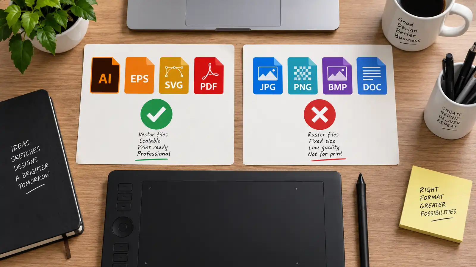
| Format | Status | What to Do |
|---|---|---|
| AI | Accepted | Best option. Keeps curves as true vectors. |
| EPS | Accepted | Standard exchange format. Send text outlined. |
| SVG | Accepted | Works if not raster-embedded; verify first. |
| Conditional | Only when paths and text are outlined. | |
| PNG, JPG | Rejected | Raster. Fine as a reference, useless for cutting. |
| Word, PowerPoint | Rejected | Resolves to screen fonts at low resolution. |
If you only have a PNG, do not send it as your working file. Note that you need the artwork re-created, or trace it yourself with the steps below. Be honest about it when you request a quote, because re-creation is billable and you want it priced upfront.
How to Convert a Low-Quality Logo Into Vector
Most small businesses hold their logo as a raster file: a social profile picture, a PNG from a free generator, or a photo of an existing decal. Conversion is straightforward for simple wordmarks and shapes, much harder for logos built from photographs or heavy texture.
Simple Wordmarks and Solid Shapes
Open the raster image in any vector editor with tracing capability and run automatic tracing. Then check the letterforms closely. Tracing engines handle bold geometric letters well but routinely round sharp corners, break thin serifs, and merge counters that are too tight. Fix the counter holes by hand, one letter at a time, before exporting.
Convert Text to Outlines
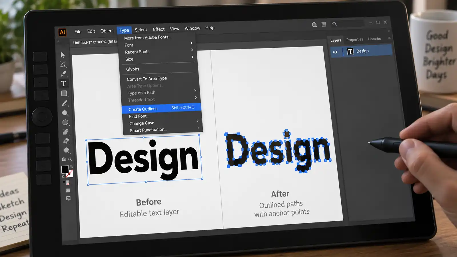
If you rebuild the wordmark in a design tool, find the typeface, set the text, then convert all type to outlines before export. This matters more than people expect: a linked font cannot be opened on a machine that does not have it installed, and the shop will substitute whatever its system offers, which almost never matches. Outlined text is geometry and renders identically everywhere. Check kerning after outlining, since at 1 meter of letter height a small spacing gap becomes a visible flaw, and confirm the result at 400 percent zoom.
When the Logo Is a Photo or Hand Drawing
A photographed logo carries perspective distortion, background, and possibly glare; a hand drawing has no reproducible line weight. Both can be traced, but the result is an interpretation, not your original mark. Get written approval before it goes to production.
Color, Pantone, and What Paint Actually Does
Screen color is a light output; sign paint is a pigment mixed and cured on a metal or acrylic face. Nothing maps between the two perfectly, and expecting an RGB screenshot to arrive as the same shade is the most common disappointment after installation.
Use a Pantone Match, Not a Screen Color
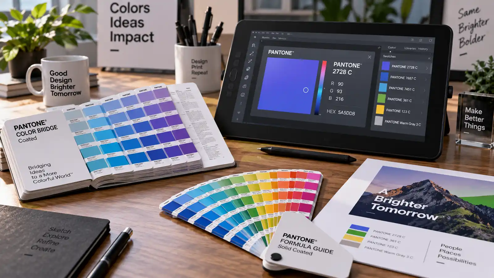
Specify color by Pantone number. A Pantone is a mixed paint formula the shop can match directly, and you can compare the finished sample against a printed Pantone card. RGB and CMYK describe light and ink, neither of which tells a paint shop what to mix. Without a Pantone, send CMYK and approve a sample first.
Light Changes Perceived Color
A warm-white halo behind a dark metal face shifts the face warmer than daylight does, and a face-lit acrylic insert reads more saturated than its pigment. View the artwork with the intended illumination on before finalizing color.
Letter Height and Dimensional Planning
Artwork does not stop at the file. Your quote depends on a target height that works with the logo.
Set One Cap Height in Millimeters
Give a single number: the height of the tallest capital letter, excluding descenders, in millimeters. “About 2 feet” forces the shop to assume. State the height, the unit, and whether you mean uppercase only or baseline-to-ascender, since capitals and ascenders differ in most typefaces.
Letter Height Versus Viewing Distance
A common rule of thumb is one inch of cap height per 100 feet of viewing distance, so a sidewalk viewer 150 feet back needs roughly 15 inches to read comfortably. A logo with fine detail, tight counters, or thin serifs loses legibility faster than a bold geometric wordmark, so detailed marks need more height.
Keep the Aspect Ratio Proportional
Do not stretch the logo to fill a wall. Scale it uniformly and let the width be whatever it is. Distortion is cheap at the design stage and obvious to every customer for the life of the sign. Check the total wordmark width against your wall or fascia band before quoting.
Why Factories Reject Artwork, and What Rework Costs
Re-creating a logo is billable, and each rework cycle adds calendar time to the invoice. The most frequent rejection reasons, in the order we see them, are raster-only files, font substitutions, counters that are not closed, gradients used as primary color, and artwork with no stated letter height. Each causes a re-cut or a re-typeset, and each delays the fabrication queue, which is where deadlines slip. The cheapest rework is the kind you prevent before emailing, and it costs thirty minutes of checking your own file.
Before You Send: A Logo Readiness Checklist
- Format: AI, EPS, or outlined SVG. Never send a PNG as the working file.
- Text: all type converted to outlines, no linked fonts remaining.
- Counters: every enclosed letter hole is a closed, separate path.
- Color: Pantone numbers per solid zone, no gradient as primary fill.
- Height: one cap-height figure in millimeters plus total wordmark width.
- Kerning: checked visually at 400 percent zoom.
- Reference: a PNG preview included, clearly marked as non-working.
Send a Working File and a Reference File
Include the vector file for fabrication and a PNG snapshot for the people reading your email. Many rejections come from a shop reading a screenshot as the artwork of record, so label the two files clearly.
What Happens After Artwork Approval
Once artwork is accepted, the factory produces a dimensional drawing at your target height, confirms spacing and mount pattern against your wall, then proceeds to fabrication and shipping. The light style stays open until this point: a halo build wraps glow around a metal or acrylic face (halo lit letters), while a lit insert fills the face itself (front lit letters). Our backlit vs. face-lit guide compares how each reads on a storefront, and our backlit letters on brick, stucco, and glass article covers how the wall changes the mounting plan. For the cost side, our channel letter pricing breakdown shows where artwork re-creation charges land.
FAQ
Can I use a PNG logo for a channel letter quote?
Send a PNG as a reference so the shop knows what you want, but it cannot serve as the fabrication source. A PNG is a fixed-resolution bitmap, so scaling to sign height produces jagged edges and lost detail. Have the logo recreated as vector, or pay for re-creation up front.
What is the difference between CMYK and Pantone for sign color?
CMYK describes a color as a mix of four inks for printing; Pantone is a premixed paint formula with a numbered specification. Sign faces are painted, not printed, so a Pantone tells the manufacturer exactly what to mix and gives you a card to compare against. CMYK converts to a close match, but it may differ visibly, so a painted sample approval is recommended.
How big should my letters be?
Plan around one inch of cap height per 100 feet of viewing distance, adding margin for fine detail or thin strokes. A storefront read from the street at 150 feet needs roughly 15 inches of cap height. Keep proportions intact and confirm the total wordmark width fits the mounting envelope.
Do I need to pay for logo re-creation?
Yes, if artwork arrives as a raster image, a font substitution, or an unresolvable screenshot. Tracing, re-typesetting, and re-cutting counters are manual design work billed separately from fabrication. The cost is small against the risk of a sign built from a file the shop misreads, so budget for it rather than hoping it is absorbed.