From $19.9

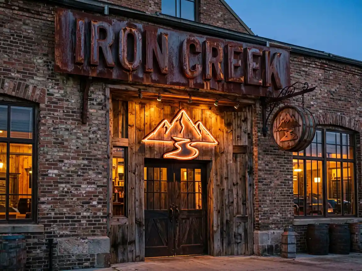
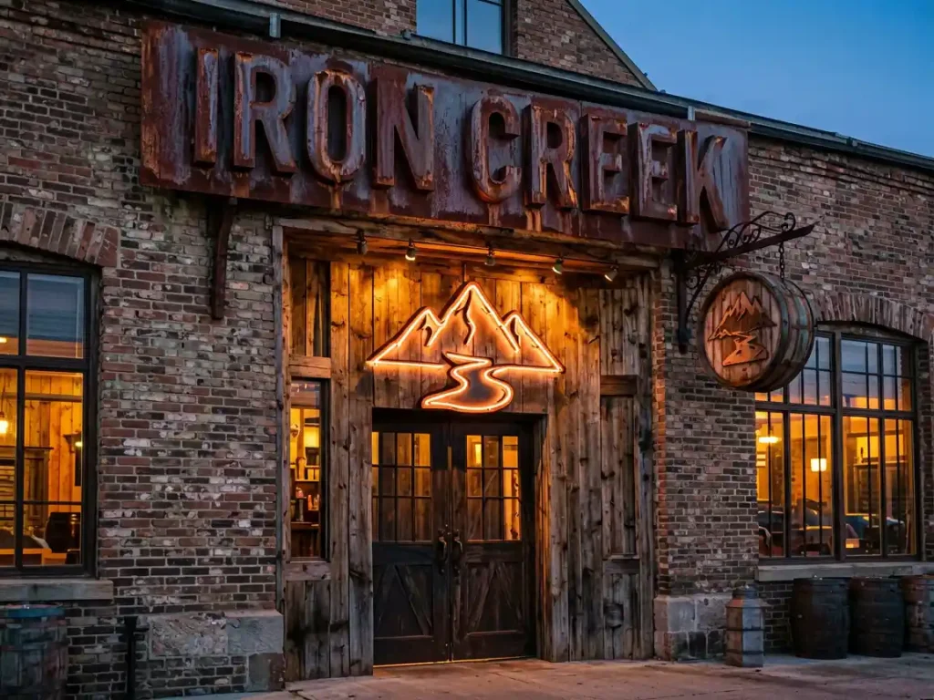
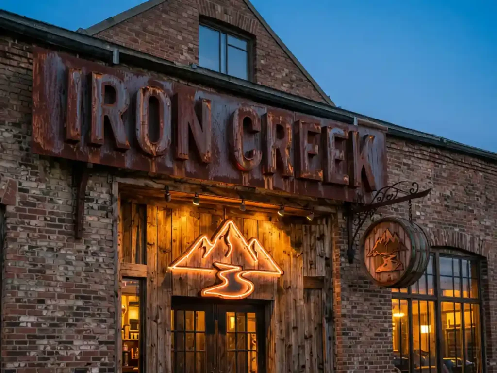
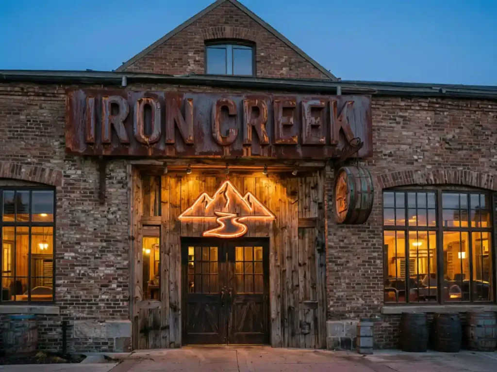
Iron Creek Brewing Co., a new craft microbrewery in Asheville’s River Arts District, needed signage that captured their brand identity: rugged, handcrafted, and rooted in Appalachian tradition. Their taproom occupies a restored 1920s warehouse with exposed brick and steel trusses — the sign needed to complement this industrial aesthetic while being visible from the popular walking trail along the French Broad River.
We designed a three-element signage system. The primary sign features corten steel channel letters spelling “IRON CREEK” mounted directly to the brick facade. Corten steel was chosen for its weathered, rust-like patina that will develop naturally over time — each year the sign will look slightly different as oxidation deepens the color.
A secondary accent sign uses warm copper LED neon tubing forming the brewery’s logo mark (a stylized creek cutting through mountain peaks), mounted on a reclaimed white oak barrel stave backing. The copper glow references both the brewing kettles inside and the historic copper mining heritage of Western North Carolina.
A third element is a circular barrel-end sign hanging from a wrought iron bracket, reading “EST. 2026 · ASHEVILLE” in laser-engraved lettering on reclaimed oak.
Challenge 1: Historic building restrictions. The warehouse is in a designated historic district. Solution: Used through-bolt mounting that doesn’t penetrate the brick mortar — brackets are clamped to steel lintels behind the facade. All installations are reversible per preservation guidelines.
Challenge 2: Corten steel runoff. Rainwater running off corten can stain the brick below. Solution: A hidden drip channel behind each letter channels water away from the facade.
Challenge 3: Vibration from the brewery’s fermentation tanks. The copper neon needed to be isolated from building vibrations. Solution: Silicone vibration dampers between the neon mounts and the oak backing.
| Client | Iron Creek Brewing Co. |
| Location | Asheville, NC |
| Sign Type | Corten Steel Channel Letters + Copper LED Neon + Barrel Sign |
| Dimensions | 72″ × 24″ (primary), 36″ diameter (barrel sign) |
| Material | Corten Steel, Copper LED Neon Flex, Reclaimed White Oak |
| Installation Year | 2026 |
| Budget | ,200 |
The brewery opened to lines around the block, and the sign was featured in four local media previews. The copper neon has become the most photographed element on the brewery’s Instagram — it appears in over 60% of location-tagged posts. “People walk by and stop to take pictures before they even taste the beer,” the owner noted.