
A salon owner on Reddit shared a hard lesson: “We tried the cute neon script thing. Looked great in photos but during the day it basically disappeared. We ended up adding bold 3D letters on top — and that’s what people mention now.”
Another user summed it up: “The biggest mistake people make is choosing style over readability. If people can’t read it instantly from distance, it’s useless. Go simple, bold, and visible — that’s what converts.”
These real-world experiences highlight a truth many business owners discover too late: a beautiful sign nobody can read is just expensive decoration. Here’s how to ensure your storefront sign is actually readable.
The 5-5-5 Rule of Sign Readability
Sign industry professionals use a simple guideline: for every 5 inches of letter height, your sign is readable from approximately 50 feet. Here’s the breakdown:
| Letter Height | Readable Distance | Best For |
|---|---|---|
| 3 inches | 30 ft (10m) | Pedestrian-only streets, indoor signs |
| 6 inches | 60 ft (18m) | Street-facing shops, narrow streets |
| 8 inches | 80 ft (24m) | Standard retail storefronts |
| 12 inches | 120 ft (37m) | Strip malls, set-back buildings |
| 18 inches | 180 ft (55m) | Roadside businesses, 35+ mph streets |
| 24 inches | 240 ft (73m) | High-speed roads, large properties |
| 36 inches | 360 ft (110m) | Freeway-adjacent, industrial zones |
Measure your building’s setback from the sidewalk or road, then check this table. If your letters need to be seen from 80 feet but you chose 4-inch lettering, your sign is invisible to most passersby.
Color Contrast: The #1 Readability Factor
Readability isn’t just about size — contrast is equally important.
The most readable color combinations (ranked by legibility studies):
- Black text on white background — highest legibility score
- Black text on yellow background — second best
- White text on dark blue/black background — good for nighttime, harder in daylight glare
- White text on red background — attention-grabbing but lower legibility at distance
- Light text on pastel/light background — AVOID — virtually invisible from even short distances
- Thin cursive on any background — AVOID for exterior — illegible from 15+ feet
If your brand colors include any low-contrast combination (light yellow on white, grey on beige, pastel pink on cream), reserve those for your interior or online branding. Your exterior sign needs a high-contrast treatment to be functional.
Day vs Night: Different Rules Apply
Daytime
- Foreground-background contrast is everything — dark letters on light panel, or vice versa
- Matte finishes reduce glare (glossy surfaces reflect sunlight, washing out the text)
- Channel letters create shadows that improve readability even in direct sun
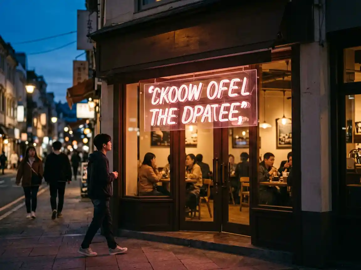
- LED neon is the worst performer in daytime — thin illuminated lines are overwhelmed by ambient daylight
Nighttime
- Internal illumination makes signs more visible at night than any daytime sign during daylight
- Channel letters with front-lit faces are clearly readable from 2-3x the daytime distance
- Backlit acrylic gives even illumination across the entire panel — excellent readability
- LED neon works well at night — the bright lines pop against a dark background
Placement Rules: Height and Angle Matter
| Sign Position | Recommended Height Above Ground | Readability Factor |
|---|---|---|
| Above door (primary) | 12-18 ft | Best — at natural eye line from street |
| On window glass | 5-6 ft (eye level) | Good for pedestrians, poor for vehicles |
| Awning / canopy | 8-12 ft | Good — visible from both sides of street |
| Roof-mounted | 25-40 ft | Must be 3x+ larger than wall signs |
| Parallel (blade sign) | 10-14 ft | Excellent for pedestrian-heavy areas |
Font Selection: Safe vs. Risky
Safe choices for exterior signs: Helvetica, Futura, Gotham, Univers, Montserrat — sans serif, clean, geometric. These fonts are legible at distance, read well in both upper and lower case, and work in both illuminated and non-illuminated formats.
Risky choices: Script fonts, hand-lettering effects, thin serif fonts, condensed typefaces. These look elegant in print but become unreadable blobs from across the street.
If you must use a script for brand consistency, pair it with a bold sans-serif subtext underneath that carries the readable message at distance.
Quick Visibility Checklist
- Can someone across the street (60-80 ft) read your sign in under 2 seconds?
- Is the letter height at least 6-8 inches for a typical storefront?
- Is the contrast ratio high (dark on light or light on very dark)?
- Is the sign illuminated for nighttime visibility?
- Will the sign be visible in all seasons (no tree coverage, no building shadow)?
- Is the font simple and bold, not cursive or condensed?
For help choosing the right sign type for your visibility needs, browse our storefront sign gallery or read our Size Guide and Where to Order guide.
Related Reading
See how different sign types compare on visibility with our Type Comparison Guide. Understand whether a sign upgrade gives real returns in our ROI Analysis, and learn why LED Neon needs supplement signage for daytime visibility.