From $19.9

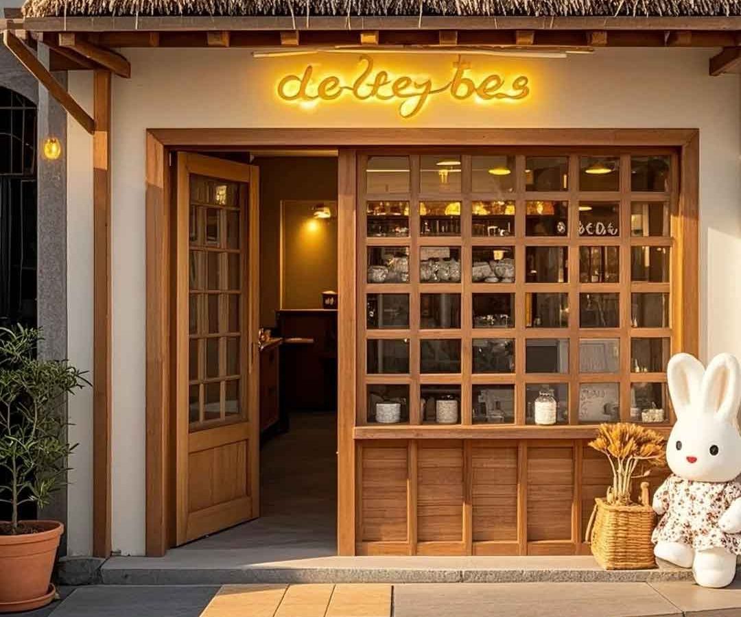
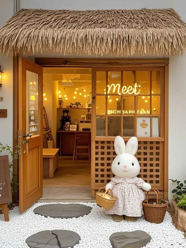
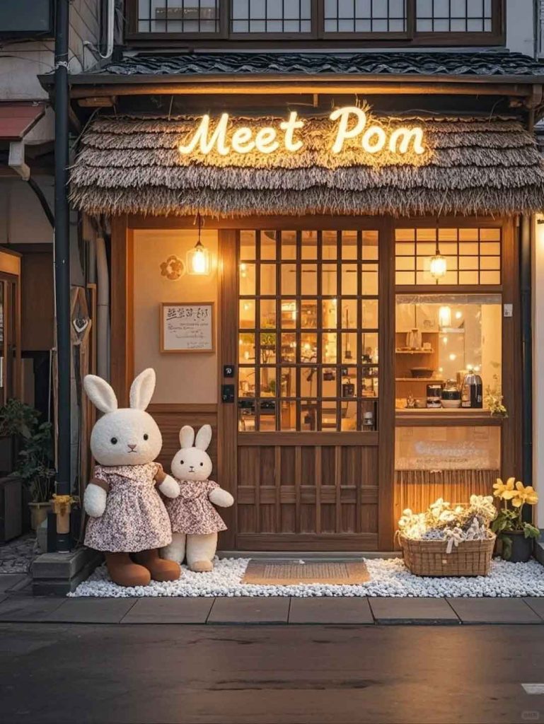
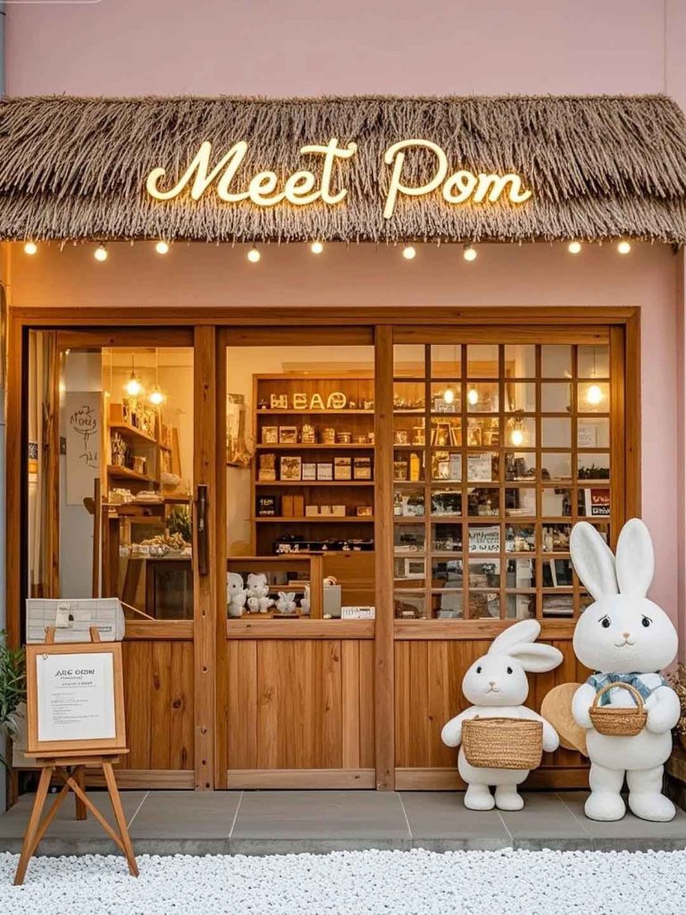
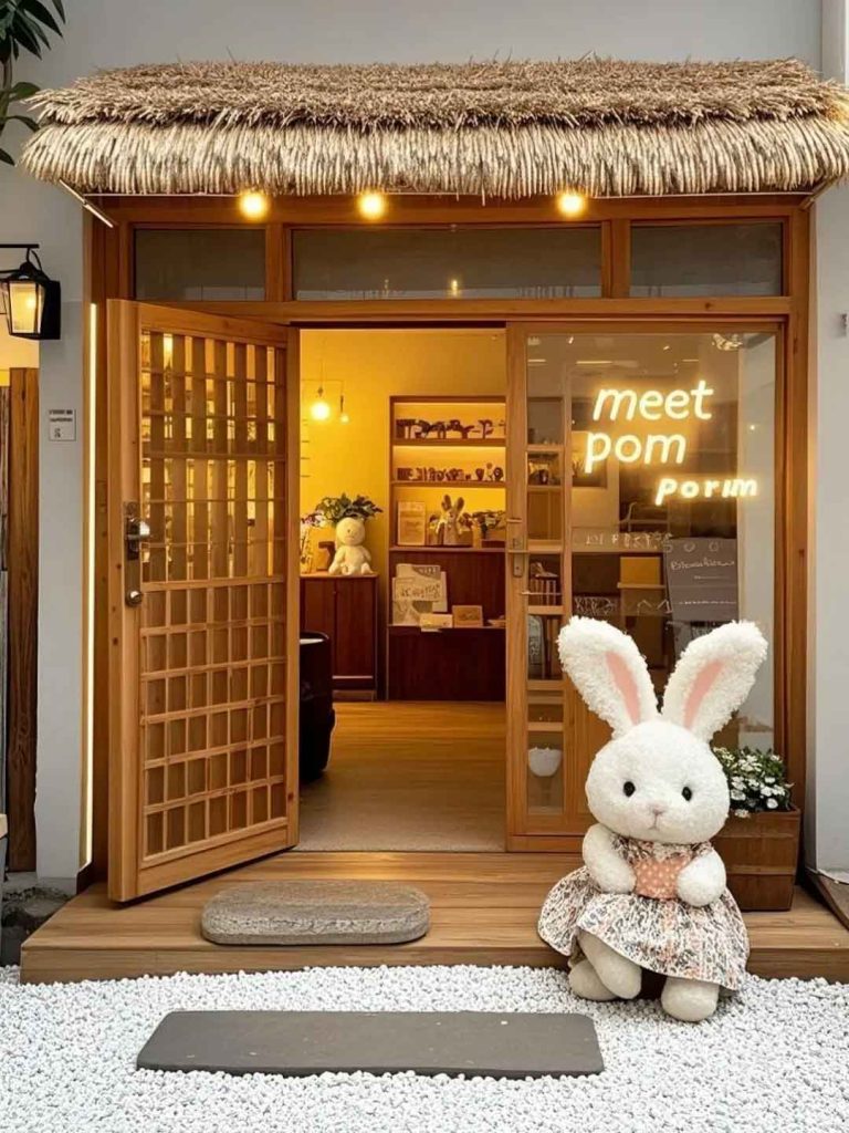
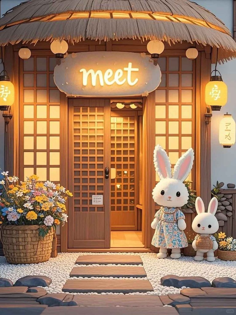
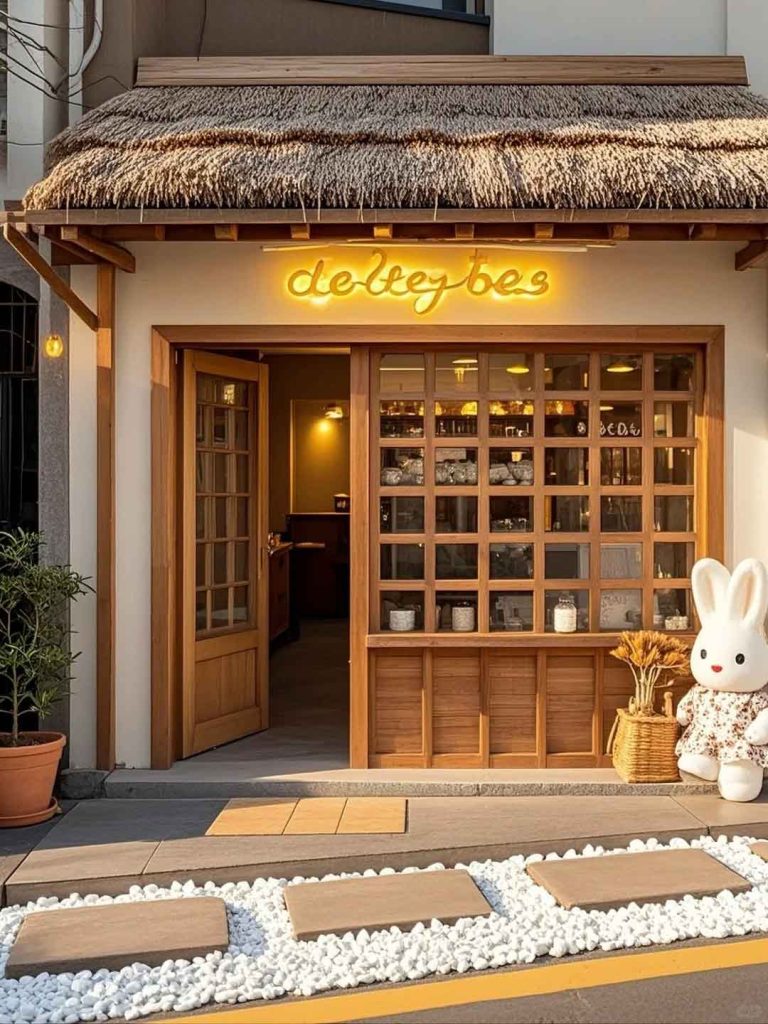
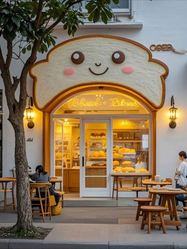
This case study presents the signage design for a Korean-style bakery that brings the beloved K-cafe aesthetic to a new market. The design captures the signature visual language of Korean bakeries—playful yet refined, cute without being childish, and meticulously curated in every detail. The storefront sign system creates an inviting presence that appeals to the bakery’s target demographic of young, style-conscious customers.
The Korean bakery concept embraces the “so-gyu” (trendy) aesthetic that defines successful K-cafes. The primary signage uses a custom rounded sans-serif typeface with soft edges and friendly proportions, often paired with a cute graphic element—a smiling baked good character or botanical accent. The color palette features soft pastels: powder pink, mint green, and creamy beige, creating a visually soft and welcoming appearance that photographs beautifully for social media.
The facade layout includes a primary sign above the entrance, a hanging blade sign for side visibility, and decorative window graphics that showcase the bakery’s most photogenic products. A small A-frame sign at the sidewalk level displays daily specials in a hand-lettered style.
The primary sign uses a powder-coated aluminum frame with a digitally printed acrylic face in soft pink, with dimensional acrylic letters in cream white mounted with standoffs. The blade sign matches the primary sign in material and finish, ensuring visual consistency from all viewing angles. Window graphics use high-quality cast vinyl in pastel colors with selective translucent areas that maintain interior visibility.
The A-frame sign uses a powder-coated aluminum frame with a chalkboard-look vinyl face panel, allowing daily handwritten updates that add authentic character. All outdoor materials are UV-stable and weather-resistant for long-term performance.
The Korean-style bakery signage has successfully established the brand’s trendy positioning in the local market. The pastel color scheme and cute graphics generate strong social media engagement, with customers frequently photographing the storefront. The bakery has developed a loyal following among young customers who appreciate the authentic K-cafe aesthetic. The installation demonstrates how culturally-specific design languages can be successfully translated into effective signage for new markets.
Browse more related signage design projects from our portfolio:
Need custom design for your business? Contact our design team for a personalized consultation.