From $19.9

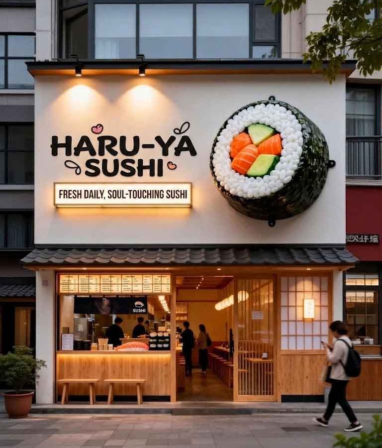
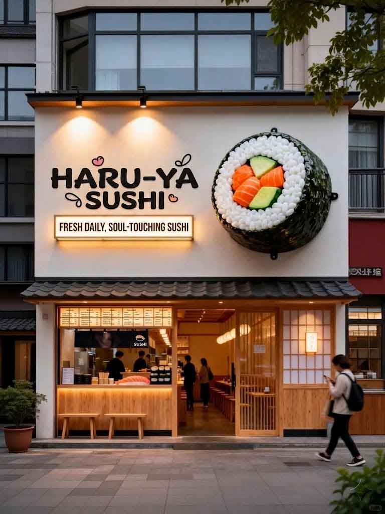
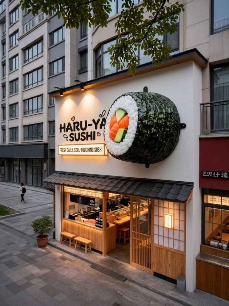
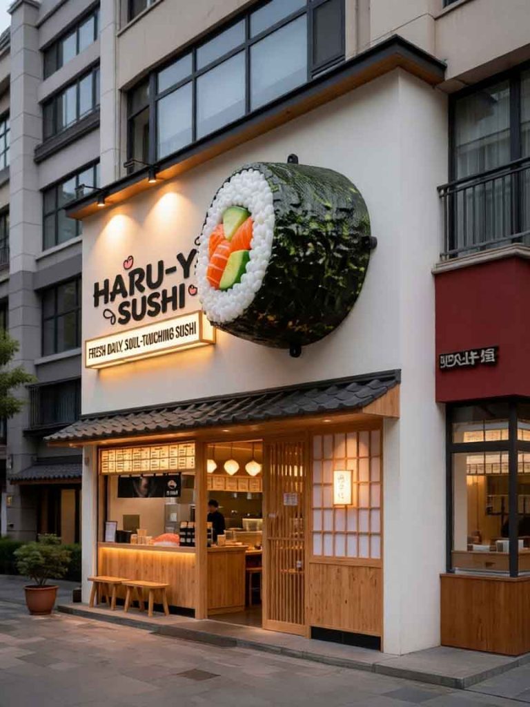
This case study presents a sushi storefront sign design engineered for maximum memorability. The challenge was to create a sign system that makes the entire street remember the establishment—a critical goal in a competitive dining district where multiple restaurants vie for customer attention. The solution draws from authentic Japanese design traditions while incorporating modern visibility strategies.
The concept honors Japanese aesthetic principles of simplicity, naturalness, and subtle elegance (wabi-sabi). The primary signage uses bold sumi-ink style calligraphy for the Japanese name, paired with a refined serif English translation below. The calligraphic characters are executed as dimensional forms, retaining the energy and flow of hand-brushed ink while gaining the visibility of three-dimensional signage. The color palette uses deep indigo, warm wasabi green, and rice paper white—colors drawn directly from Japanese cuisine and culture.
A traditional noren curtain at the entrance adds an authentic touch while functioning as a soft signage element that moves with the breeze, attracting attention through motion. A warm amber lantern-style blade sign extends perpendicular to the facade, referencing traditional Japanese izakaya signage.
The primary calligraphy signs use CNC-carved HDU with a multi-layer paint finish that simulates the depth and texture of sumi ink on washi paper. The characters are illuminated with warm LED backlighting that creates a subtle halo effect. The English text uses brushed brass letters with a clear protective coating, providing a warm metallic contrast to the dark indigo background.
The noren curtain is custom-fabricated from heavy cotton duck fabric with screen-printed brand graphics, treated for weather and UV resistance. The blade sign uses a powder-coated aluminum frame with an acrylic face printed with brand graphics, internally illuminated with warm LEDs. The lantern fixture uses aged copper finish with an LED flame-effect bulb.
The distinctive sushi storefront achieves its memorability goal—surveys indicate customers remember the location weeks after their first visit. The combination of calligraphic signage, noren curtain, and lantern creates a complete visual package that stands out from neighboring restaurants. The authentic Japanese design elements attract customers specifically seeking genuine dining experiences, supporting the restaurant’s positioning as an authentic sushi destination.
Browse more related signage design projects from our portfolio:
Need custom design for your business? Contact our design team for a personalized consultation.