From $19.9

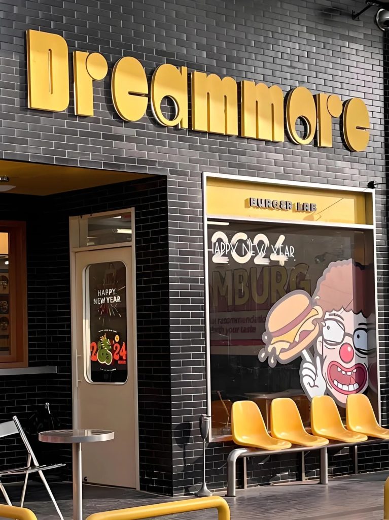
The objective of this design is to establish a high-impact, energetic, and visually unforgettable storefront identity for a trendy gourmet hamburger concept named “Dreammore” (sub-branded as “BURGER LAB”). Targeting an urban, youth-centric demographic, the brand identity fuses bold retro-pop graphics with a gritty, industrial architectural style. The goal is to maximize street-level visibility and project an atmosphere of playful indulgence, creativity, and culinary experimentation.
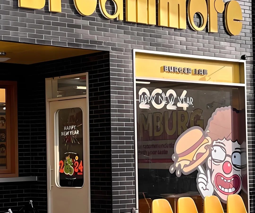
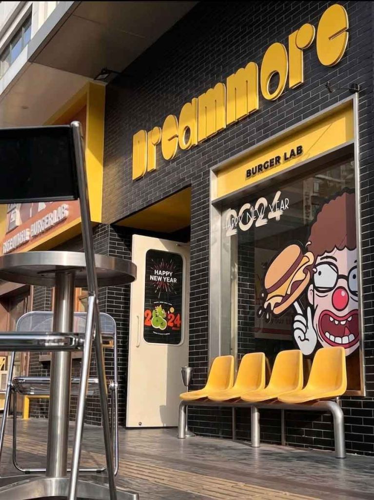
As illustrated in 2_2.jpg, the storefront embraces a high-contrast, texturally rich environment.
The Wall Canvas: The exterior facade is constructed from dark charcoal-black subway tiles arranged in a clean brick pattern. This matte, dark, and industrial background provides the ultimate high-contrast canvas for the bright branding elements.
The Streetscape Interaction: At the ground level, the storefront features a glass window display paired with a row of vibrant yellow, retro-molded plastic waiting chairs on a stainless steel bench. This creates an immediate, welcoming sidewalk zone for patrons waiting for takeout.
The main brand name dominates the upper fascia, stretching boldly across the dark tiled wall.
Typography & Form: The text is rendered in a custom, ultra-bold geometric sans-serif typeface. The letters feature extreme line weights and tightly curved counters (such as the circular cutouts in the “e”, “a”, and “o”), evoking a fun, chunky 1970s pop-art aesthetic.
Material & Finish: The dimensional block letters are crafted from premium sheets with a semi-gloss, mustard-yellow finish. The thick, dimensional sides of the 3D letters catch natural daylight, casting deep shadows against the black tile texture to ensure a powerful three-dimensional presence without requiring complex internal illumination during the day.
Positioned neatly above the large glass viewing window is the functional descriptor “BURGER LAB”.
Execution: These letters are encased in a recessed, horizontal yellow metallic frame. The typography shifts to a more structured, industrial stenciled block font, reinforcing the “lab” concept of culinary precision and experimentation.
The storefront layout effectively utilizes glass surfaces to tell a dynamic brand story:
The Character Illustration: The window features a massive, expressive cartoon character mural—a wide-eyed, joyful clown holding a dripping, melted-cheese double cheeseburger. This illustrative style adds a layer of street-art personality and directly showcases the product hero.
Seasonal Agility: As captured during a celebratory period in 2_2.jpg, the glass panels and door windows integrate festive vinyl decals reading “HAPPY NEW YEAR” and “2024”. These temporary, clean white and red elements show brand vitality and seasonal relevance without disturbing the permanent architectural signage.
By combining an ultra-chunky retro typeface, a high-contrast yellow-on-black color scheme, and playful pop-art illustrations, the signage system for Dreammore Burger Lab successfully transforms a stark, industrial tiled facade into a vibrant urban landmark. It creates an undeniable visual gravity that promises passing street traffic a fun, casual, and highly satisfying dining experience.
design for your business? Contact our design team for a personalized consultation.
Browse more related signage design projects from our portfolio:
Need custom signage design for your business? Contact our design team for a personalized consultation.