From $19.9

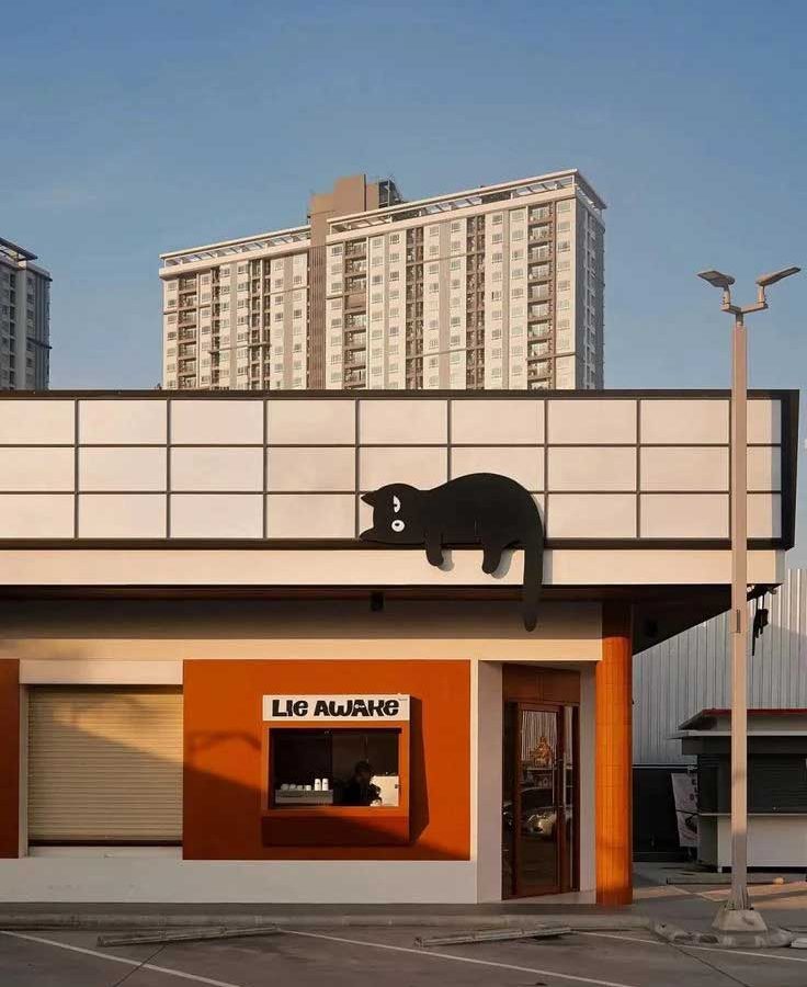
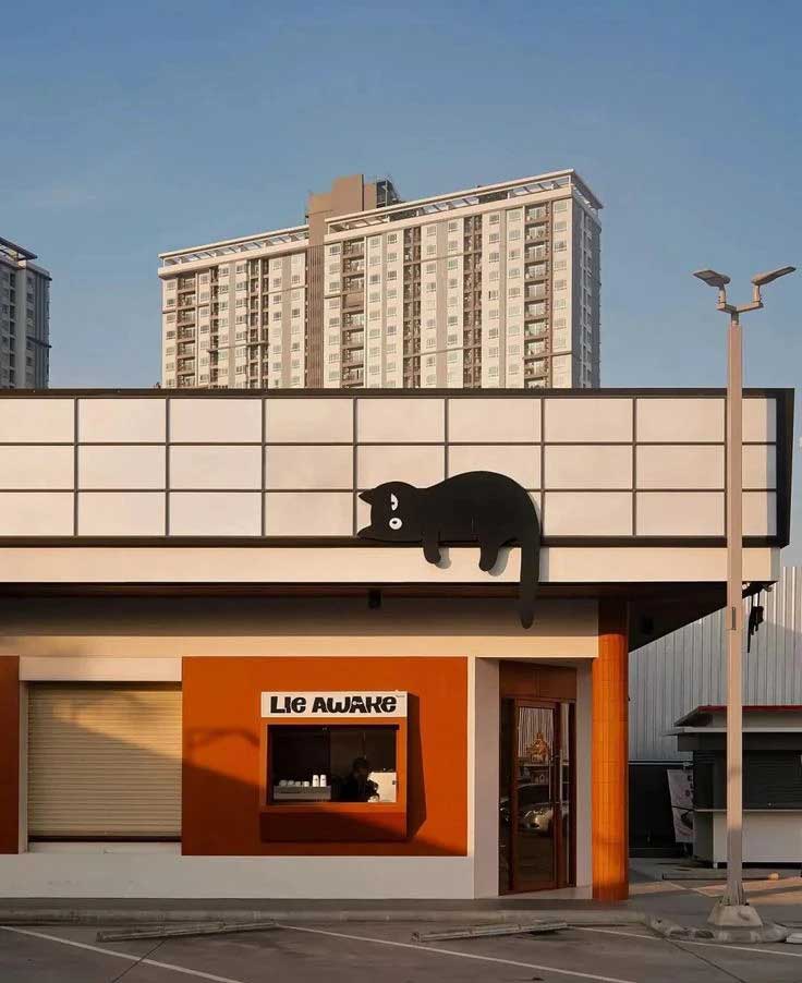
This case study presents the personal studio storefront and signage design for “LIE AWAKE”, a creative workspace that embraces nocturnal creativity. The design rejects conventional bright welcoming storefronts in favor of a moody, introspective, and deliberately understated facade. LIE AWAKE whispers rather than shouts, inviting only those attuned to its frequency to step closer—a powerful branding statement for a studio that values creative intimacy over mass appeal.
The design narrative flows from the studio manifesto—celebrating those who create while others sleep. The material palette is deliberately raw and unpolished: exposed concrete bearing subtle formwork marks, darkened steel with matte finishes that absorb rather than reflect light, and reclaimed wood adding warmth as a counterpoint to cooler surfaces. The palette as a whole channels a modern artist’s loft—honest materials, minimal intervention, maximum atmosphere.
The nameplate anchors the facade with unmistakable presence. Thick, confident sans-serif letterforms with intentionally tight spacing create a solid typographic block that reads as a graphic element rather than simple signage. The typography is custom-sourced with subtle idiosyncrasies that prevent it from feeling corporate or generic.
The primary signage uses darkened brass or brushed stainless steel with a finish that catches low light without glaring. The letters are surface-mounted with slight projection, casting soft shadows that add dimensionality to the facade. Backlit halo illumination outlines the typography with a subtle warm glow that never overwhelms. Recessed ground-level uplights graze the textured facade, drawing attention to material qualities of the concrete and timber.
Lighting throughout is treated as a mood instrument rather than a functional necessity. Warm pools of light spill from the studio onto the street like a quiet invitation, contrasting with cooler ambient urban lighting. The illumination is intentionally dim—never clinical or overbearing—suggesting a space that is occupied, alive, and at work even in late hours.
The LIE AWAKE studio storefront creates a distinctive street presence that stands apart from brighter commercial neighbors. The restrained design has proven highly effective at attracting the right clientele—those who appreciate the studio’s uncompromising creative vision. The raw materials have aged well, with the concrete and steel developing character over time. The installation demonstrates that for creative studios, the most effective signage is often the most personal—a direct expression of the work produced inside, rather than a generic commercial solution.
Browse more related signage design projects from our portfolio:
Need custom design for your business? Contact our design team for a personalized consultation.