Your restaurant sign is usually the first impression a customer forms before they even search for you online, and the most-viewed piece of marketing you own. Yet many owners treat it as an afterthought or inherit a sign never designed for their concept. This guide walks through the five channel letter styles, how to match the right one to your cuisine, what compliance requires, and how a new sign converts into revenue, written for restaurant and food business owners from a single site to a growing concept.
Why Your Sign Is the Highest-Return Marketing You Own
Most restaurant marketing stops working the moment the budget stops. A well-made channel letter sign does not: it runs around the clock, costs almost nothing per impression once installed, and tells passing traffic who you are, what you serve, and whether you are worth stopping for. Because diners choose restaurants on impulse far more than they plan, the sign builds brand recall by day, pulls people toward the entrance after dark, and lands in the customer photos that quietly extend your reach.
Impulse Decisions Favor Clear, Illuminated Signage
Food is a low-consideration purchase. Nobody plans to “grab Thai food on the 14th of the month.” They decide in the moment, and that moment is usually lit by what they can see from the road. A dark, hard-to-read, or missing sign surrenders that moment to the competitor next door. Illuminated channel letters remove that risk by keeping your name legible and your location obvious at every hour your kitchen is open.
The Five Channel Letter Styles Explained
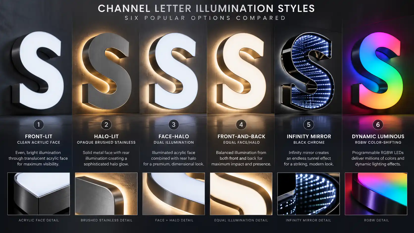
Every modern restaurant sign is built from channel letters, three-dimensional metal letters finished with one of several lighting approaches. The style choice is one of the most important decisions you make, because it shapes how your restaurant reads to different diners and at different hours. Here are the five styles.
Front-lit Channel Letters
Front-lit letters carry the LED inside the face, so the face itself glows. This is the brightest and most direct option, ideal when you want the name to read instantly even in bright daylight. It suits high-traffic corridors and bold, simple wordmarks. You can explore the options in our front-lit letters and signs catalog.
Halo-lit (Back-lit) Channel Letters
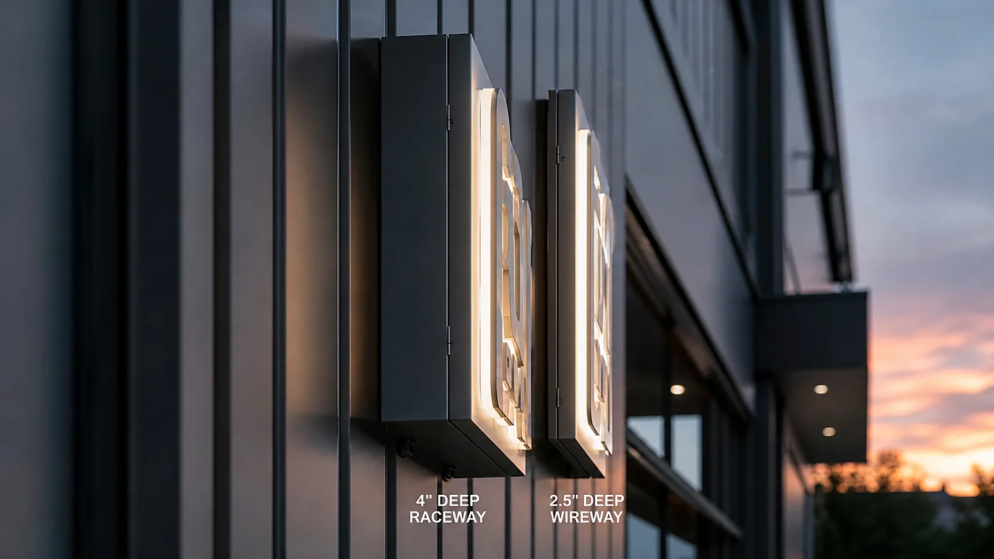
Halo-lit letters hide the LED behind the channel and let the light spill softly onto the wall, creating a refined, premium look with a gentle halo that frames the letter without making it shout. It has become the default for upscale concepts because it reads as quality rather than volume. For the material choices that affect how a halo looks on your facade, see our halo-lit letters materials guide, and the product line in our halo-lit letters collection.
Dual-lit (Front-and-Back-lit) Channel Letters
Dual-lit letters light the face and push a halo onto the wall at the same time, combining front-lighting brightness with halo refinement. It is the most expensive of the lit styles, so it is usually reserved for large or flagship locations where both impact and polish matter.
Neon and Flexible Neon
Traditional glass neon and its flexible-neon cousins give a warm, nostalgic glow no other style matches. Flexible neon is far more durable, safer, and easier to shape into script, which is why it has largely replaced glass in new builds. It suits coffee shops, bakeries, and late-night concepts, and works best paired with a clean channel wordmark rather than standing alone.
Specialty Styles: Infinity Mirror and Spectrum Glow
For a concept that needs to stand out on a crowded strip, specialty finishes add interest. An infinity mirror letter stacks LED layers for a reflective depth effect that catches attention from a distance. A spectrum glow letter shifts through a range of colors, suiting playful or nightlife-oriented concepts. These are statement choices, best matched to a brand that already leans expressive rather than restrained.
Matching the Sign Style to Your Cuisine
Because diners associate a look with a type of food before they read a word, the style you choose should reinforce the cuisine you serve. The table below maps common cuisines to the style that best supports the impression each one is meant to make, with the reasoning underneath.
| Cuisine Type | Recommended Style | Why It Works |
|---|---|---|
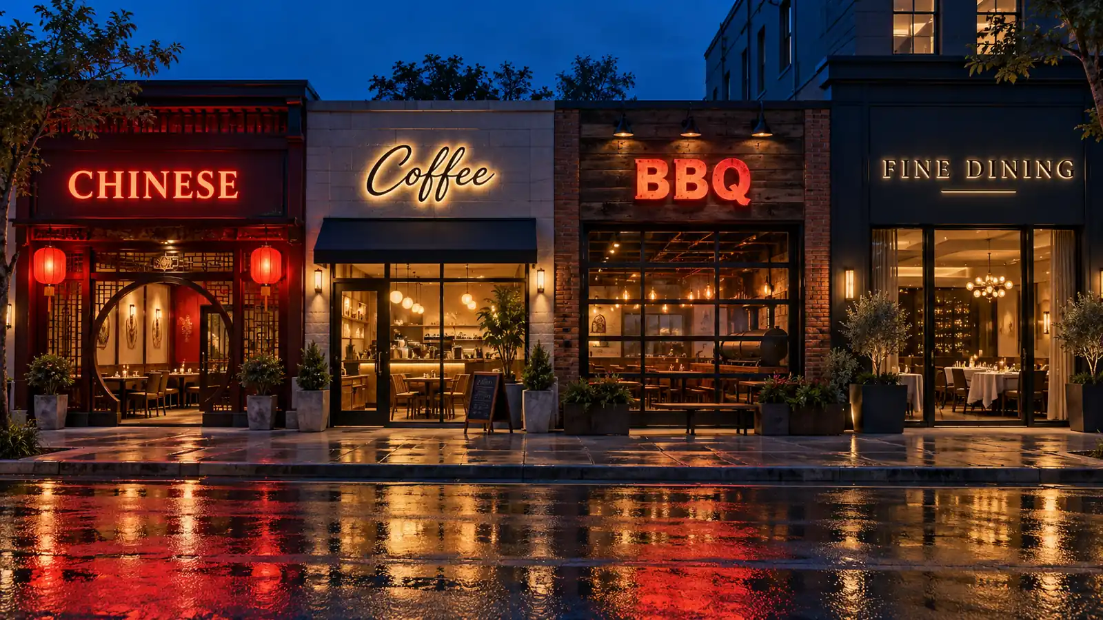
| Chinese / Asian | Front-lit, warm red or gold | Warm saturated color reads as inviting and appetite-driving; front lighting holds up in dense, competitive food districts. |
| BBQ / Smokehouse | Front-lit bold block letters | Short, heavy type conveys heartiness and approachability; maximum brightness helps in open, sunny lots and highway-adjacent sites. |
| Coffee / Cafe | Halo-lit script or neon accent | A soft glow or script form signals craft and calm, pairing well with a slower, intentional brand. |
| Bakery / Patisserie | Neon or flexible-neon script | Warm, hand-drawn lettering supports the artisan, made-with-care story and looks natural over a display window. |
| Pizza / Casual Italian | Front-lit letters, often with a neon accent | Casual brightness keeps it friendly; a neon accent adds personality without overwhelming a simple wordmark. |
| Hotpot / Buffet | Dual-lit letters | Dual lighting carries the impact needed to fill a large dining room and justify a premium price point to passing traffic. |
| Fine Dining | Halo-lit or dual-lit, restrained type | A quiet, refined glow signals quality and occasion; restraint is the whole point for a high-end room. |
| Fast Casual | Front-lit clean wordmark | Speed and legibility matter; a bright, simple face reads fast and supports high turnover. |
Reading the Style Logic by Cuisine
One principle runs under the table: match the lighting’s energy to the dining experience. Bold, high-traffic cuisines like barbecue, fast casual, and pizza reward direct front lighting for instant recognition and speed. Calm, premium, or experiential concepts like fine dining, specialty coffee, and hotpot reward the softer halo or dual-lit treatment to signal quality before the guest arrives. Neon sits in between, adding warmth to bakeries, coffee shops, and late-night spots.
Daytime Versus Nighttime Behavior
Do not pick a style by how it looks at night only. A halo that glows beautifully after dark can disappear against a bright afternoon sky. If your peak service is in the day or your sign sits on a sun-exposed block, front or dual lighting holds up better through daylight hours. The trade-off between the two is covered in our day versus night finishes guide, and the core distinction between the two lighting families in our backlit versus face-lit comparison.
Sizing the Letters to Your Facade
The best style will not work if the letters are the wrong size for the building and the speed of the traffic passing it. Letter height is driven by viewing distance and mounting height, not by the length of your name. Get it wrong and the sign is either an afterthought at highway speed or an eyesore up close. Our channel letter size guide covers the sizing logic and the readability thresholds for different streets.
Compliance: What Restaurant Signage Must Meet
Restaurant signage sits under more rules than almost any other business sign, combining general sign ordinances with food-safety and fire-code expectations. Understanding the three layers ahead of design saves you from a costly rework later.
Permit Requirements
Most jurisdictions require a sign permit before an illuminated sign is installed, with review focused on size, height, brightness, and sometimes color. Because channel letters are illuminated, your electrical and mounting plan becomes part of the submission. Requirements differ sharply by municipality, so understanding your local process before you lock in a design prevents rework. Our sign permit guide covers what to expect and how to start the application.
Health Department and Food-Safe Zones
Where your sign and its electrical run sit relative to food service areas matters. Raceways, junction boxes, and mounting hardware that penetrate walls near kitchens or serving lines must keep those spaces clean and code-compliant. In practice this means coordinating the install with your kitchen layout so wiring does not compromise sanitation seals or ventilation, a detail that is cheap to get right at the design stage and expensive to fix after the wall is closed.
Fire Code and Illuminated Sign Ordinances
Because channel letters are illuminated, they fall under your local illuminated sign ordinance and fire code. The sign and its electrical must be built and listed for outdoor use and installed to the applicable electrical code. The most common friction point is that a halo sign can project light onto a neighboring property, so ordinances sometimes limit brightness or spill. Getting those limits early prevents a beautiful install from being pulled by an inspector. You can reference the technical parts in our channel letter glossary.
ROI: How Much a New Sign Actually Earns
A restaurant sign is not a cost you hope pays for itself; it drives three specific outcomes. Measuring them lets you make the buy-versus-wait decision with numbers instead of a feeling.
Foot Traffic and Impulse Conversions
The clearest ROI is the lift in walk-in and drive-in traffic a legible, attractive sign produces. On a corridor where the competing sign is dark or unreadable, a new illuminated sign captures the impulse diners who would otherwise pass by. Track it simply: note covers per night before the install, then watch the same window for four to six weeks after. A meaningful new sign typically shows a visible step-change in the evening rush.
Brand Recall and Social Reach
The second payoff is softer but real. A distinctive sign becomes part of how people remember and share your restaurant, landing in the background of customer meal photos and extending your reach to people who have never been on your street. Over a year, this accumulated recall compounds into repeat visits and referrals that advertising cannot buy.
The Cost Side
Weight the upside against what the sign actually costs. The biggest variable is the lighting style: front-lit is the most economical of the lit options, halo and dual-lit cost more, and specialty finishes cost the most. Because the style decision is the biggest budget call, understand how the price breaks down before you commit. Our channel letters cost breakdown walks through the factors that move the number, with broader business context in our industries and applications material.
Maintaining Signage in Grease and Steam Environments
A restaurant sign works in conditions few other signs face: it sits meters from a kitchen that throws grease, steam, and heat across the facade. Left alone, that environment eats the finish and the electrical. A short maintenance routine keeps the investment looking new and running safely.
Cleaning the Letters and the Facade Around Them
Grease and steam settle on the letters and the wall behind them, dulling the finish and staining it over time. Wipe the letters down with a mild detergent on a soft cloth on a schedule matched to how busy your kitchen is, and rinse the facade so residue does not build in the mounting gaps. The halo gap in particular collects grime, so keeping it clean is what preserves the soft glow that makes halo lighting look premium. Our hotspot-avoidance guide covers how dirt in the channel causes the uneven, hot-looking patches that ruin a halo.
Protecting the Electrical from Moisture and Heat
The most expensive maintenance failure is water reaching the LED or transformer, which happens when the gaskets age or the install was not sealed for a wet, hot environment. Keep the seals and end-caps tight, make sure the drain path is clear, and have the electrical inspected yearly. For a dual-lit sign, which carries more heat in the channel, the sealing and transformer location deserve extra attention. Our front-and-back-lit sign line keeps those internal parts sealed and serviceable.
Re-lamping and Replacement Planning
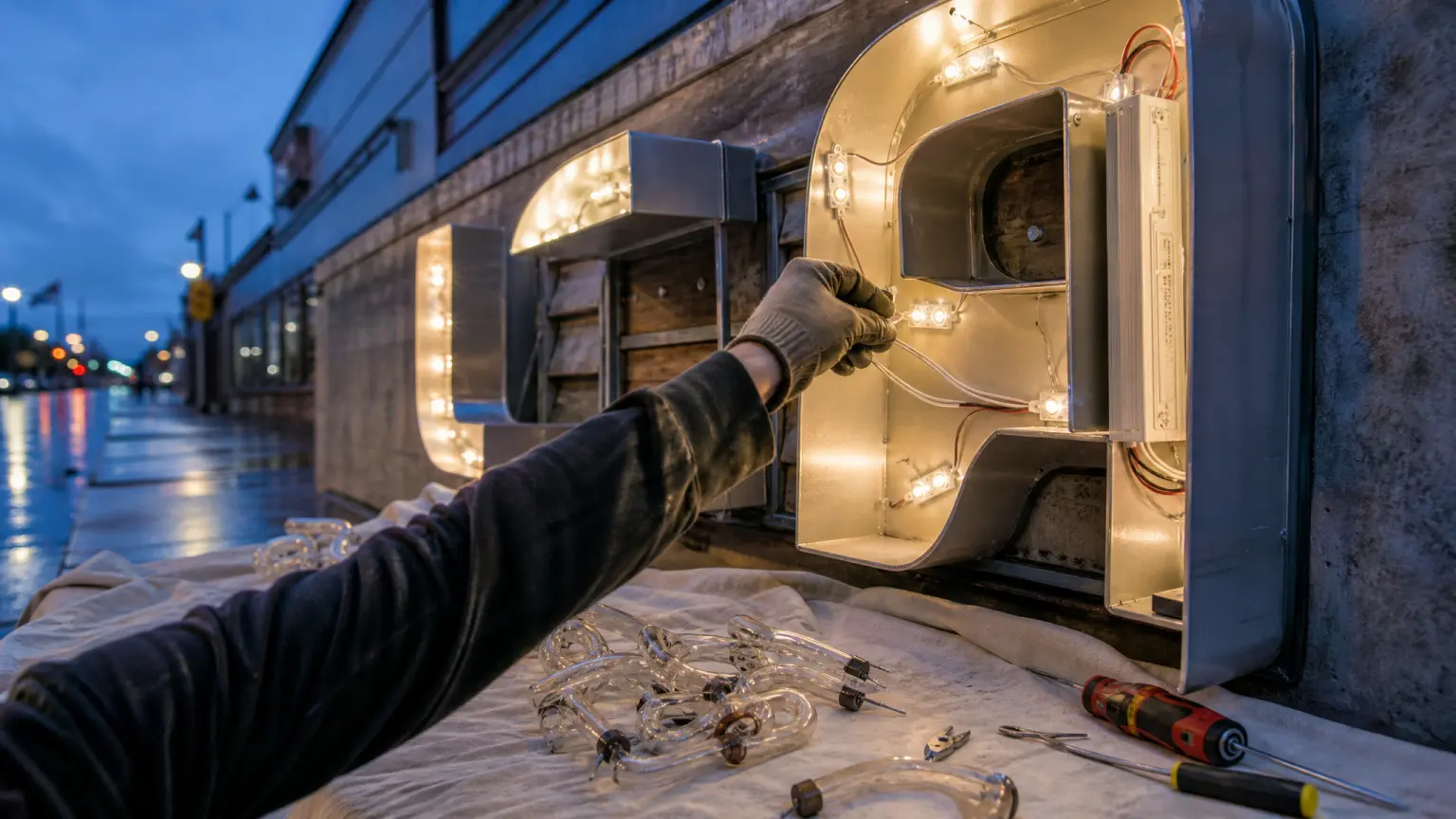
LEDs last a long time, but they still dim and shift color over the years, and a single failed module inside one letter makes that letter dimmer than its neighbors. Budget for re-lamping as a periodic service item rather than a surprise, and prefer a sign built for serviceability so a module swap does not require taking the whole sign down. Planning the maintenance from day one turns the sign from a one-time cost into a durable asset.
Common Mistakes Restaurant Owners Make
Knowing the five styles, the compliance layers, and the ROI makes the costly rework mistakes predictable. Avoid these and you will spend the budget once and keep the result.
- Choosing a style by its night look and ignoring how it vanishes in daylight. Decide for the hour your peak service actually happens.
- Letting the letter size be set by the length of the name instead of by viewing distance and mounting height.
- Skipping the permit and illuminated-sign ordinance review until the sign is already fabricated, then discovering a brightness or size limit was missed.
- Routing the electrical without coordinating with the kitchen, so the install compromises a sanitary or ventilation detail that later needs to be redone.
- Picking a bright, playful finish for a calm, premium concept, or a restrained halo for a high-traffic casual spot that needs loud legibility.
- Installing a sign that cannot be serviced, so a single failed LED module becomes a full teardown years later.
Most of these trace back to one decision: the style and the lighting were chosen first, and the size, compliance, and maintenance were bolted on afterward. Doing the style choice with the whole building and the whole business in view is what prevents the rest.
Frequently Asked Questions
What is the best channel letter style for a restaurant?
There is no single best style; the right one depends on your cuisine and your peak hour. High-traffic casual concepts like barbecue, pizza, and fast casual do well with bright front-lit letters. Premium or experiential concepts like fine dining, specialty coffee, and hotpot do better with a halo or dual-lit finish, and a warm neon accent suits bakeries and late-night spots. Match the lighting energy to the dining experience and the hour you want to win.
How much does a restaurant channel letter sign cost?
The cost is driven mainly by the lighting style, the letter size, and the facade. Front-lit is the most economical lit option, halo and dual-lit cost more, and specialty finishes cost the most. Size and mounting complexity add on top. Because the style decision is the biggest cost factor, understand how the price breaks down before you commit.
Do restaurant signs need a special permit?
Usually yes. Because channel letters are illuminated, they fall under your local sign ordinance and, for the electrical, your fire and electrical code. Requirements around size, height, brightness, and light spill differ by municipality, so confirm your local rules before fabrication. Restaurants also need to keep the install compatible with food-safety and ventilation details around the kitchen.
Will a halo sign still be visible in the daytime?
A halo-lit sign is designed to look its best after dark, and the soft glow can be hard to read against a bright afternoon sky. If your peak service is in the day or your location sits on a bright, open block, front-lit or dual-lit letters will hold up better through daylight. Many owners use dual-lit specifically to keep both daytime strength and nighttime refinement.
How do I keep a sign looking new next to a busy kitchen?
Grease and steam are the two things that dull a finish and damage the electrical, so a short routine does the work: wipe the letters and the wall gaps on a schedule matched to kitchen volume, keep the seals and end-caps tight so moisture stays out, and have the electrical checked yearly. Choose a sign built for serviceability so a single failed module is a quick swap rather than a full teardown.