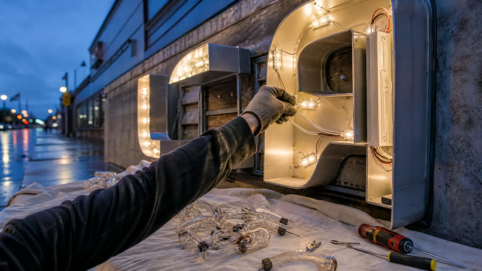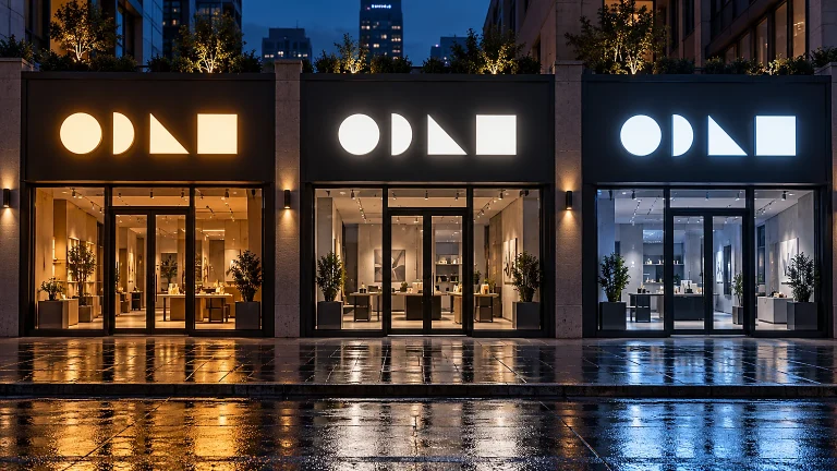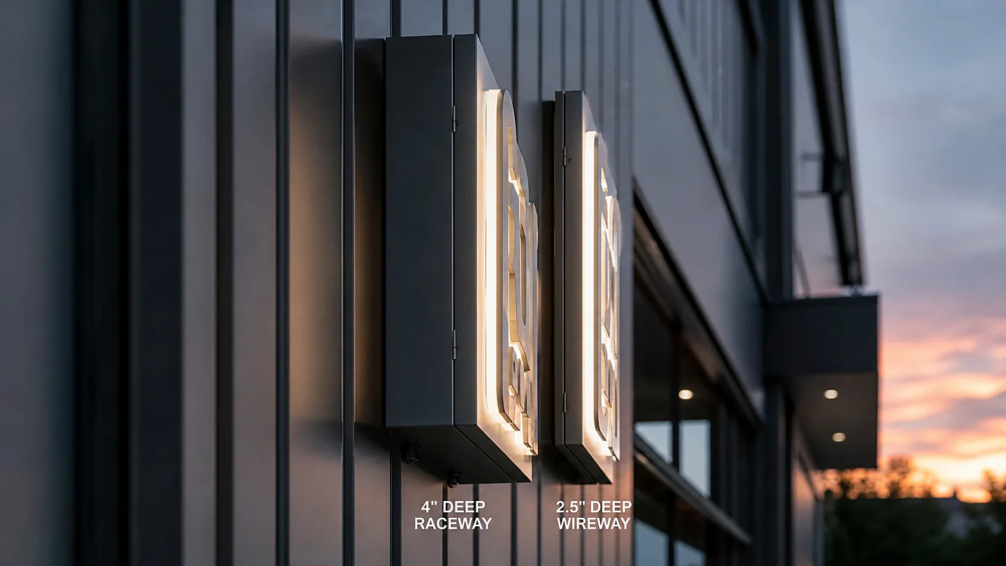
Run a salon, spa, or wellness clinic and you know your sign does more work than any brochure. It is the first thing a new client sees on the street or on Instagram, and it quietly tells them whether your space feels like a luxury retreat or a strip-mall stop. Beauty and wellness storefronts live or die on perception, so the right channel letters have to carry elegance, signal trust, and still photograph well at night. This guide breaks down the four lighting styles that fit beauty brands, the materials and colors that read as premium, how to make the sign Instagram-ready, and the ADA and permit details that keep the project on schedule. You will leave with a clear path to the right sign.
Why Salon and Spa Signs Are Different from Other Storefronts
Most commercial signs focus on one job: legibility from a parking lot. Beauty and wellness signs have to do four jobs at once — establish a mood, communicate a price point, support the brand’s social presence, and look intentional in daylight and after dark. The same wordmark that feels welcoming on a nail studio’s glass front can look clinical on a medical spa. That is why the style of the letters matters more here. A salon’s sign is judged not just on readability but on whether it matches the calm, curated atmosphere the client experiences the moment they walk in.
Beauty Brands Sell on Perceived Luxury
Walk into most premium salons and the first few seconds decide whether a new client books or leaves. That impression is manufactured before any conversation, and the exterior sign is its opening act. Channel letters with a soft, even glow read as upscale; a harsh, uneven, or overly bright sign reads as budget. Perceived luxury in beauty signage comes from restraint — a clean letterform, a high-quality face material, and a warm, controlled light rather than maximum brightness. When buyers compare two spas with identical services, the one whose exterior feels more refined wins the booking — the sign is your loudest quality signal.
The Sign Is Part of the Brand Experience
For a wellness business, the storefront is an extension of the interior promise. If the interior is warm wood, soft textiles, and candlelight, a jagged, neon-blasted sign undercuts it. If the brand is bold and youth-focused, a restrained white face can feel lifeless. Matching the sign’s material, color, and light to the in-store experience is what turns the exterior from decoration into brand reinforcement. It is also what turns the exterior into content, not just hardware — a fitting sign is what clients photograph and share.
The 4 Lighting Styles for Beauty & Wellness Business Signs
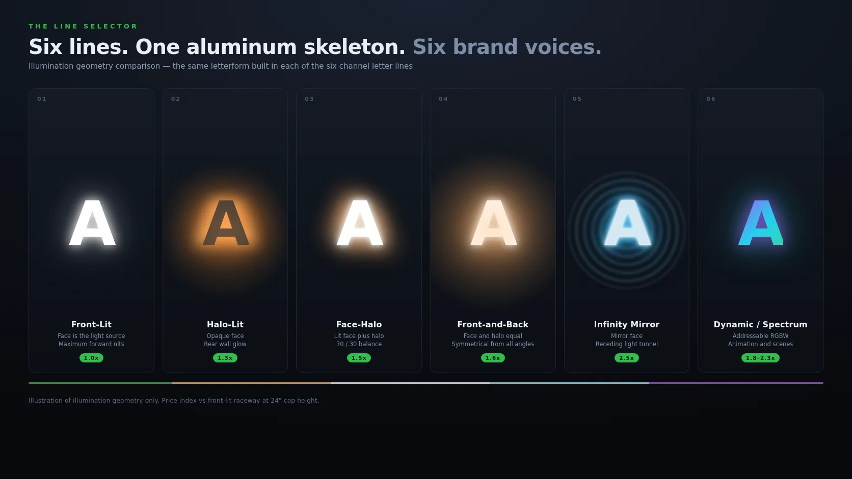
You do not have to use one style everywhere — different locations can use different lighting. Each of the four below fits a distinct kind of beauty business. Here is how to match them to your salon subtype.
Halo-Lit Channel Letters — the Premium Default
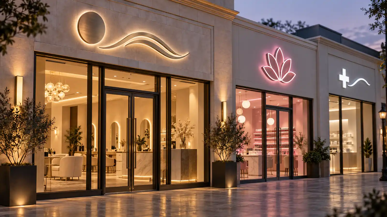
Halo-lit (backlit) letters are the default for premium salons and spas. The light sits behind the letter and washes onto the wall, creating a soft, floating glow. That glow is exactly what a calm, upscale spa wants: it signals “come in and relax” without shouting. Halo-lit letters also hide imperfections in the wall better than a fully lit face, which matters on older storefronts. The trade-off is that the front face of the letters is less readable in strong daylight, so a halo-lit sign works best on streets where the sign is viewed at dusk and night — the hours when beauty clients actually pass by. For the finish options that pair best with a stone or stucco facade, read our halo-lit letters materials guide. For the premium look described here, our halo-lit letters line is built around exactly this wall-glow effect.
Face-Halo (Front-and-Back-Lit) for Flagship Locations
When a salon has a single marquee location that carries the whole brand — the flagship store, the training academy, or the high-rent corner of a premium strip — a dual front-and-back-lit sign is worth the investment. The front face gives daylight readability, and the back halo gives the evening glow, so the sign works at every hour. For a beauty flagship, that dual presence translates into a bigger “this is the place” statement. The cost and electrical load are higher, but for the one location that defines the brand, the impact justifies it. Learn how the two lighting approaches compare head-to-head in our backlit vs face-lit channel letters guide.
Neon and Spectrum Glow for Trendy, Younger Demographics
Beauty brands that court a younger, style-forward audience often reach for a glowing, color-rich sign rather than a restrained white one. Dynamic spectrum-glow and prismatic LED letters shift color and add movement that reads as energetic and modern — ideal for a trendy nail bar, lash studio, or streetwear-adjacent hair salon. The risk is that too much “cool” looks like a nightclub and repels clients who want a calm spa, so use color as an accent, not the whole sign.
Front-Lit Letters for High-Traffic Street Visibility
When the salon sits on a busy street and the number one job of the sign is to be seen from a moving car, front-lit letters win on raw daytime visibility. The LED-lit face is the brightest option in daylight, which suits high-traffic corridors, strip malls, and locations where the sign has to compete with a hundred others. The look is less “luxury spa” and more “come in now” — ideal for quick-service hair, coloring-only salons, and high-turnover street-side locations.
Material Choices That Signal a Beauty Brand
The face material tells clients what your business is about before they read a word. In beauty, the finish does emotional work, and a few choices read far more “premium” than others.
Brushed Stainless, Mirror Chrome and Polished Aluminum
For premium spas and medical beauty clinics, brushed stainless and mirror-chrome faces are the go-to. Brushed stainless gives a warm, matte, high-end texture that pairs beautifully with a soft halo glow — it is the material you would expect at a five-star hotel, and it carries the “expensive” association. Mirror chrome is brighter and more reflective, great for a clean, modern clinic or a flagship. Polished aluminum is the cost-effective middle: bright enough to read premium, but cheaper to fabricate and finish. To understand which face material survives outdoors in your climate and what each option costs, our halo-lit materials guide breaks down stainless, aluminum, and acrylic head to head. If a term in that guide is unfamiliar, the sign glossary is a quick reference.
Acrylic Face Colors and Pantone Matching
When a brand already has a signature color — a specific blush pink, a calm sage green, a clinical white — the letter faces should match it precisely. Colored acrylic faces are dyed through the material, so the color stays consistent from the face to the edges, which is what keeps a custom brand color from looking faded over time. Send the factory your Pantone or hex code and the faces are matched to it; a tight tolerance (a delta-E under 2 or 3) is what separates a sign that looks “on brand” from one that looks “close but off.” This is especially important for multi-location beauty groups where every store must read as the same brand. For the exact process of getting your artwork and color specs to the factory, start with our prepare your logo for a channel letter quote guide.
Color Psychology for Beauty, Spa and Wellness Brands
In beauty, the color of your sign’s glow is a mood-setting decision, not just an aesthetic one. Color psychology research and decades of salon branding point to a shortlist of palettes that reliably read as “calm, clean, and premium.”
Warm Whites, Soft Golds and Calming Tones
The safest, most trusted palette for spas and wellness clinics is warm white to soft gold. A slightly warm 3000K glow reads as “relax and unwind” — the feeling a massage or spa clientele wants on arrival. A pure cool white reads as “clinical and clean,” right for a medical beauty clinic but cold for a day-spa client. Match the glow warmth to the mood you sell: warm for wellness, cool for medical, neutral for hair.
Pink, Blush and the Trendy Palette
For brands aimed at a younger, fashion-forward audience, pinks, blush, and coral glows signal approachability and fun — a strong fit for nail studios, lash bars, and color salons. The discipline is restraint: a soft blush halo that “sets the mood” beats a saturated bright pink that “sells nails cheaply.” If you run several sub-brands or locations, see how one palette stays consistent in our channel letters for multi-location brands article.
Instagram-Ready Lighting for Modern Salons
Modern beauty businesses are bought on the feed as much as on the street. The sign is now a content asset — clients photograph it and tag it, and it appears in hundreds of posts a month. A well-lit sign is free marketing.
Glow That Looks Great in Evening Photos
Evening and blue-hour is when beauty storefronts photograph best, and that is also when a sign’s glow does its best work. A soft, even halo glow gives a backdrop that flatters a phone photo without blowing out the sky. The goal is a glow that looks beautiful in an auto-exposed shot, not harsh glare; even light across every letter — no dark “hotspots” — is what makes it look intentional in a feed. If you are choosing a backlit style, our how to avoid hotspots in backlit letters article covers exactly how to keep the glow even and glare-free.
Consistent Color Temperature Across Locations
For a brand with multiple studios, the sign color temperature should be the same at every location so the exterior “looks” like one brand wherever the client is. If one store glows warm gold and the next glows cool blue, the feed shows two different brands. Holding one temperature — often 3000K — across all locations is the simplest way to make the social presence feel unified. Our multi-location brands guide walks through locking down color, font, and size across a chain.
Salon Sign Subtype Guide
Use this table to map your specific type of beauty business to the lighting style that fits it best. It is a starting point, not a rule — your street, facade, and client demographic will refine the choice.
| Salon / Wellness Subtype | Best-Fit Lighting | Why It Works |
|---|---|---|
| Day Spa / Wellness Retreat | Halo-lit, warm white | Calm, premium, relaxing mood on arrival |
| High-Traffic Street Hair Salon | Front-lit, bright | Maximum daytime visibility from moving traffic |
| Trendy Nail / Lash Bar | Face-halo or spectrum accent | Youthful, destination feel with on-brand color |
| Medical Beauty / Aesthetic Clinic | Dual front-and-back, cool white | Trust, clinical cleanliness, strong daytime read |
| Flagship / Training Location | Dual front-and-back | Marquee “this is the place” brand presence |
| Quick-Service Hair / Barbershop | Front-lit | Bold, approachable, high-turnover energy |
Reading the Table
Read the table top to bottom by business type: a calm day spa leans halo-lit and warm; a high-traffic street salon leans front-lit and bright; a trendy nail or lash bar adds a blush or spectrum accent; a medical beauty clinic favors a clean, cool, dual front-and-back sign; and a flagship earns the bigger dual-lit investment. When in doubt, the default for premium beauty is a soft warm-white halo-lit sign in brushed stainless — it is the safest high-end choice and the one that photographs best at dusk.
Compliance: ADA and Local Sign Ordinances for Salons
Beauty businesses are not exempt from sign law. ADA rules and local sign ordinances govern mounting height, lighting, and permits. Getting this right avoids costly rework after the letters are fabricated and shipped.
Accessible Mounting Height and Route
The ADA requires an accessible route to your entrance and that identifying signage sit at a consistent, reachable height — typically 54 to 84 inches above the ground for a projecting sign, with clear sight lines. For a salon serving wheelchair users, place the sign at a comfortable viewing height on the accessible-entrance side, not above stairs the route cannot reach. Confirm the approach with your local accessibility inspector, since the requirement is about the route, not just the sign.
Permits, Electrical Code and Landlord Approval
Almost every US city requires a sign permit for illuminated channel letters, an electrical permit for the wiring, and usually the landlord’s written approval. Each has its own timeline, and they must be sequenced — you do not want to fabricate letters that fail a size or illumination review. The process is predictable once you know the jurisdiction. Our do you need a sign permit article walks through US permit requirements, common size and illumination limits, and how to sequence approvals so your letters are not stuck on a shelf waiting for sign-off. Size itself is also regulated, so our channel letter size guide covers readable proportions so your sign is the right size for its viewing distance.
FAQ — Salon & Spa Channel Letters
The questions we hear most from salon and spa owners, answered plainly.
Which lighting style looks most premium for a spa?
A soft warm-white halo-lit sign in brushed stainless is the premium default for spas and wellness studios. The gentle wall glow reads as calm and expensive, and it photographs beautifully at dusk. Save dual front-and-back lighting for a flagship location, and keep color accents for younger, trend-focused brands.
Can the letters match my brand’s exact color?
Yes. Colored acrylic faces are matched to your Pantone or hex code, and a tight color tolerance keeps the sign looking “on brand” rather than “close.” Confirm the color reference and tolerance with the factory, especially if you run multiple locations that must match.
Are halo-lit letters readable in daylight?
Less than a front-lit sign. The face of a halo-lit letter is not strongly lit, so in bright sun the letters rely on contrast with the wall. That is why halo-lit signs suit locations viewed at dusk and night, and why a high-traffic daytime street is a better fit for front-lit letters.
Do I need a permit for a salon sign?
In most US cities, yes — a sign permit, an electrical permit for the wiring, and usually the landlord’s approval. The sequence matters. Our do you need a sign permit guide explains the requirements and how to avoid stalling the fabrication.
How do I keep signs consistent across multiple salons?
Lock down the font, the letter height, the color temperature, and the material finish in a single spec sheet, then use that sheet for every location so each store reads as the same brand. Our multi-location brands article has the step-by-step process.
Ready to spec your sign? Tell us the business type, the street it sits on, and the brand color you are matching, and we will recommend the lighting style, face material, and glow temperature that fit. Browse all styles by business type on our industries page and start a quote there.